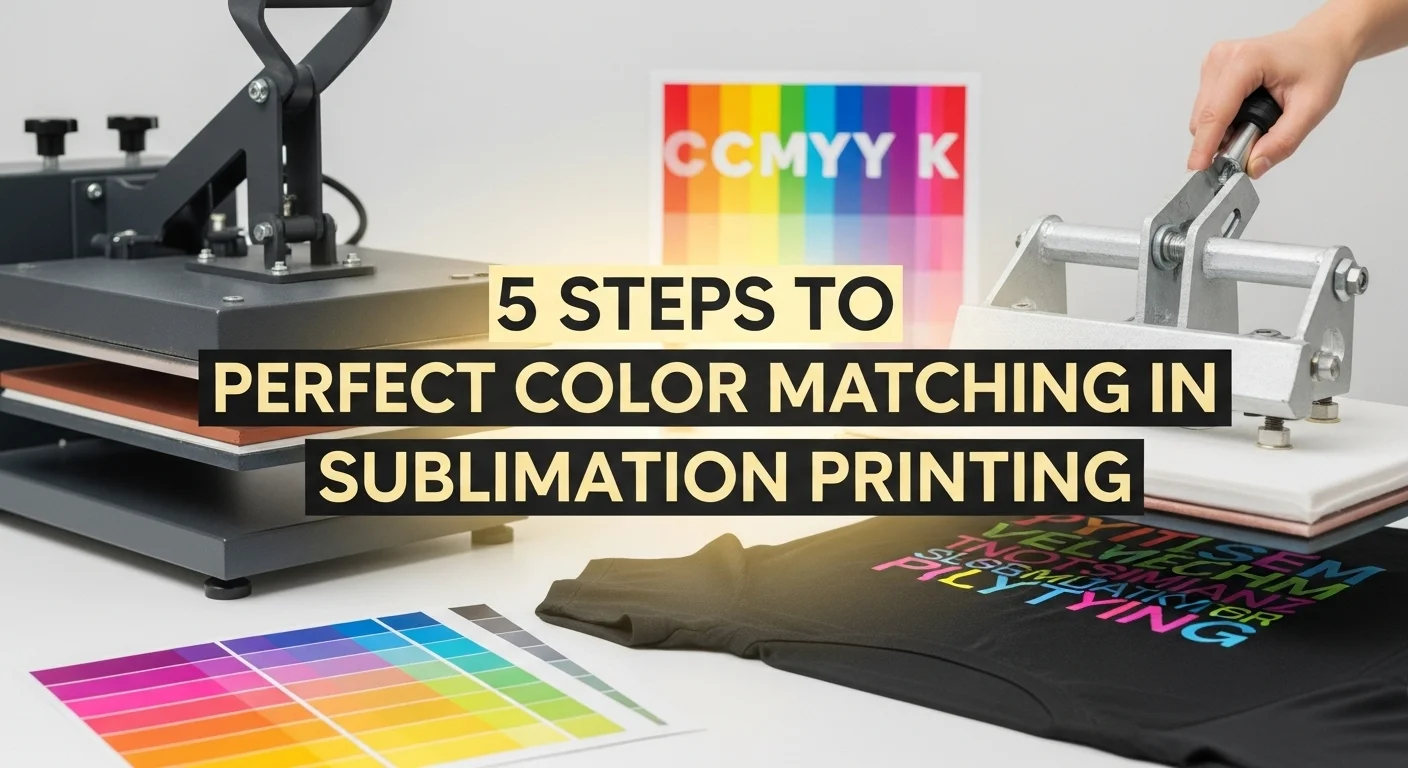
5 Steps to Perfect Color Matching in Sublimation Printing
Getting accurate colors in sublimation printing can feel tricky, but it doesn’t have to be. With the right setup, you can make your designs look the same on fabric as they do on screen.
This quick 5-step color matching guide covers everything from printing color charts to dialing in ICC profiles and heat press settings.
- ✅ Print and press a color chart on your chosen substrate
- 🖥️ Match screen colors to the printed chart
- 🧠 Use correct ICC profiles with no auto adjustments
- 🌡️ Press with consistent time, temp, and pressure
- 📝 Document color codes and keep reference charts updated
Accurate color matching ensures that the printed design closely matches what appears on the screen. In sublimation, this requires a structured approach to control variables that can cause shifts in color.
Key Color Terms in Sublimation Printing
RGB
Short for Red, Green, Blue. It’s the color system used by screens and digital devices. RGB colors look bright on screen but don’t always match print results because printers work differently.
CMYK
Stands for Cyan, Magenta, Yellow, and Black. This is the color model used by printers. When you print a design, your printer converts RGB colors into CMYK, which can cause slight shifts in how colors appear.
ICC Profile
A digital “translator” that ensures your printer, ink, and paper speak the same color language. The right ICC profile improves accuracy and keeps your prints consistent with what you see on screen.
Color Chart
A printed sheet with dozens of color swatches and their codes. Pressing this chart onto your actual substrate lets you see exactly how each color will look once transferred.
Color Calibration
The process of adjusting your screen, printer, or heat press so colors are displayed and produced consistently. Regular calibration helps eliminate unexpected shifts.
5 Steps Sublimation Printing Guide
Perfect color matching in sublimation printing starts with using high-resolution designs and the right ICC color profiles. Calibrate your printer regularly for accuracy.
Choose quality sublimation paper and inks to keep colors vibrant. Do a test print to spot issues early. Finally, adjust heat press settings to lock in true, consistent shades across every project.
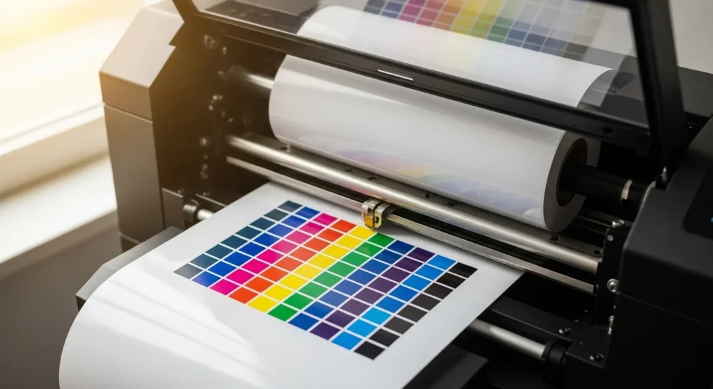
Step 1: Use a Printed Sublimation Color Chart
- A color chart contains printed swatches with corresponding RGB or CMYK codes.
- Print the chart using your sublimation printer, the same ink set, paper type, and settings used for your projects.
- This helps identify how each color will appear after pressing.
Tip: Always press the chart onto the same type of substrate you plan to use for final production.
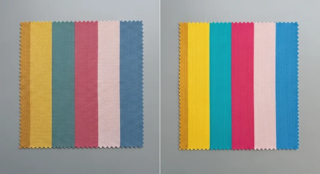
Step 2: Match Colors on Screen to the Chart
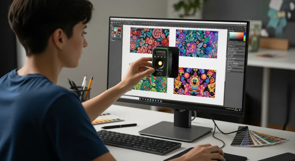
- Open your design software (Photoshop, CorelDRAW, Illustrator, etc.).
- Compare the printed chart with the colors displayed on screen.
- Select colors from the chart that match the intended design outcome, rather than relying solely on screen appearance.
Why it matters: Computer screens use RGB light, while printers interpret color in CMYK, causing possible differences in appearance. Check our guide on sublimation color chart.
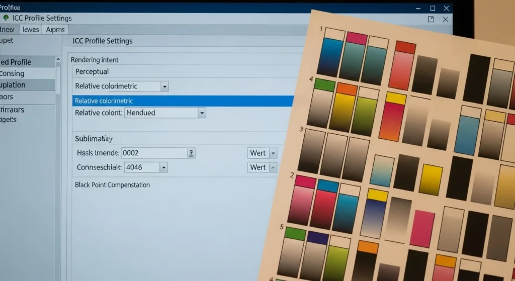
Step 3: Adjust Printer Settings for Consistency
- Set your printer’s color management settings to “No Color Adjustment” if using ICC profiles.
- Ensure you are using the correct ICC profile for your printer, ink, and paper combination.
- Disable auto-adjustments in the driver that can interfere with color accuracy. Check best ICC profiles for sublimation.
Table – Example ICC Profile Sources
| Printer Model | Ink Brand | ICC Profile Source |
|---|---|---|
| Sawgrass SG500 | Sawgrass Inks | Manufacturer’s Download Page |
| Epson ET-15000 | Hiipoo Inks | Supplier or Independent Creator |
| Epson F570 | Epson Inks | Epson Official Support |
Step 4: Maintain Proper Pressing Conditions
- Follow consistent temperature, time, and pressure settings.
- Variations in heat pressing can cause colors to appear lighter, darker, or shifted.
- Use a calibrated heat press to reduce fluctuations.
Example Press Settings for Polyester Fabric
- Temperature: 380°F (193°C)
- Time: 40 seconds
- Pressure: Medium
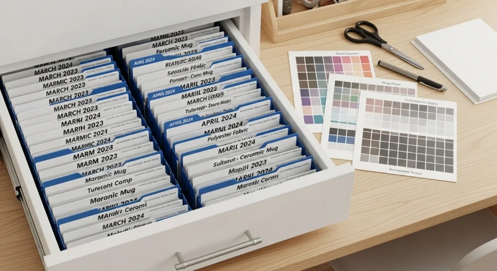
Step 5: Document & Standardize Your Process
- Keep a record of color codes used for specific projects.
- Store pressed charts in a clean, dry, and light-protected location to avoid fading.
- Update charts after changing inks, printers, or substrates.
Recommended Frequency for Updates
- New Ink Brand: Immediately print a new chart
- Printer Upgrade: Recalibrate and reprint
- Routine Check: Every 6 months
Color shifts often become easier to diagnose once you understand the full process of color matching in sublimation printing.
Troubleshooting Common Sublimation Color Problems
Even with a solid workflow, colors can sometimes act up. Here’s a quick fix-it guide for the most common issues:
| Problem | Likely Cause | Quick Fix |
|---|---|---|
| Colors look dull or faded | Low heat, short press time, or poor ink/paper quality | Check press settings (temp, time, pressure), use fresh inks and quality sublimation paper |
| Blues look purple | Incorrect ICC profile or printer driver color adjustments | Install the correct ICC profile for your printer–ink–paper combo, disable auto color corrections |
| Prints don’t match screen colors | Screen isn’t calibrated or you’re using on-screen colors not in your chart | Calibrate your monitor, choose colors from your pressed color chart instead of relying on screen |
| Blacks look washed out or brownish | Insufficient ink saturation or wrong press settings | Increase color density in print settings, check heat press temperature and time |
| Uneven colors or banding | Clogged nozzles or low-resolution designs | Run a nozzle check and cleaning, make sure your artwork is high resolution (300 DPI or more) |
| Color shifts after pressing | Inconsistent press temperature or uneven pressure | Use a calibrated heat press and double-check temperature accuracy across the platen |
Extra Tips
- Always run a test print on scrap material before doing a full batch.
- Keep ICC profiles updated whenever you change inks, printers, or paper.
- Store your sublimation blanks in a clean, dry space to avoid moisture issues that affect color.
Once you follow these five steps, your colors will stay sharp and consistent across every print. For more setup tips below.
Professional Sublimation Printing & Wholesale Custom Products
Looking for high-quality sublimation printing for apparel, drinkware, and promotional items? Subli Genius Print delivers vibrant color, sharp detail, and long-lasting results for businesses, brands, and resellers across the U.S.