Sublimation Color Problems & Fixes (How to Get Accurate Prints)
If you’ve ever pressed a design and immediately knew something was off, you’re not alone. Sublimation color issues hit beginners and experienced printers the same way, usually when time matters most.
The key thing to understand is this. Color problems aren’t random. They follow patterns. Once you recognize those patterns and check your output against a physical reference, troubleshooting gets faster and way less frustrating.
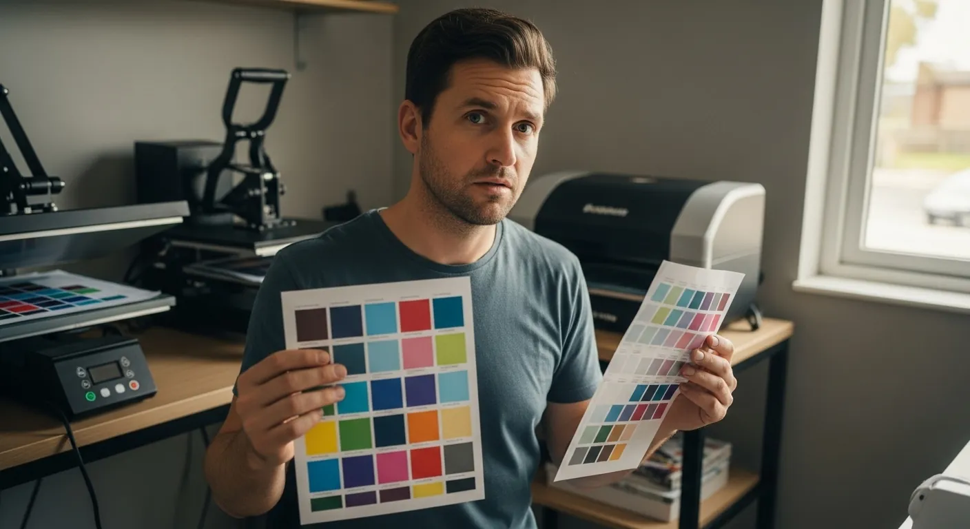
That’s why everything below ties back to using a printed sublimation color chart instead of trusting what you see on a screen.
Colors Don’t Match the Screen
What you notice
- Prints look darker than expected
- Colors feel dull or slightly shifted
- Whites look fine, but mid-tones feel wrong
Why it happens
- Screens display RGB light, not printed dye
- Monitors are usually set too bright
- Backlighting exaggerates contrast and saturation
What actually fixes it
- Lower your screen brightness to a realistic level
- Stop judging color accuracy on-screen
- Treat the monitor as a layout tool, not a color proof
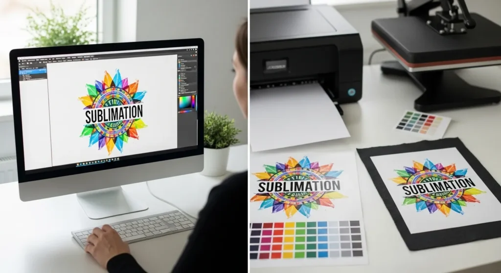
Why the chart matters
A printed chart shows real output, not a preview. When you compare your design to a physical reference, you immediately know whether the issue is expectations or production.
👉 Use a sublimation color chart as your baseline
Faded or Washed-Out Sublimation Prints
What you notice
- Pastels look weak
- Bright colors lack punch
- Prints feel flat after pressing
Common causes
- Low polyester content
- Incorrect heat or pressure
- Incomplete ink transfer
Fixes that actually work
- Choose substrates with enough polyester or proper coating
- Verify your press temperature with a probe, not the display
- Avoid guessing pressure, stay consistent
Reality check
If a color looks muted on a printed chart for that material, that’s the maximum depth you’ll get. No amount of file editing will push it further.
Unexpected Color Shifts After Pressing
Typical symptoms
- Red turns orange
- Blue leans purple
- Skin tones feel off
Why this happens
- Incorrect ICC profile
- Mixed ink brands
- Double color correction between software and printer
Fix it cleanly
- Use the correct ICC for your ink and paper
- Apply color correction in one place only
- Don’t stack adjustments
Smart move
Print chart swatches using your exact ICC setup. Comparing those swatches before pressing saves entire reprints later.
Colors Look Different on Different Materials
What’s happening
- Same file, same press
- Different blanks, different results
Why this is normal
- Fabric absorbs dye differently
- Coatings vary by manufacturer
- Texture and finish affect light reflection
Best practice
- Test once per material type
- Keep separate printed references
| Material Type | Expected Behavior |
|---|---|
| High-poly fabric | Strong, vibrant colors |
| Low-poly blend | Softer, vintage look |
| Hard coated blanks | Crisp but material-dependent |
A material-specific chart turns “why does this look different?” into “this is exactly what I expected.”
Prints Look Fine in the Shop but Wrong at Home
What customers say
- “It looked different when I picked it up”
- “The colors feel warmer at home”
Why this happens
- Shop lighting vs daylight
- Warm bulbs vs cool LEDs
How to avoid it
- Evaluate colors under neutral daylight
- Approve colors using physical samples
- Set expectations before final approval
Using a physical sublimation color chart removes screen-based assumptions and keeps everyone aligned.
Colors Change Between Print Runs
What you notice
- Repeat orders don’t match
- Nothing obvious changed
Hidden causes
- Ink batch changes
- Printer drift over time
- Settings reset after maintenance
How to stay consistent
- Maintain your printer regularly
- Lock proven settings
- Reprint references after any change
Any time ink, paper, ICCs, or hardware changes, your chart should change too.
When Manual Color Correction Is Actually Required
Manual correction isn’t always the answer.
When charts are enough
- General designs
- Non-critical brand colors
- Standard materials
When manual correction makes sense
- Strict brand matching
- Known material limitations
- Repeat commercial jobs
Even then, the chart comes first. It tells you what you’re correcting toward, instead of editing blindly and hoping it works.
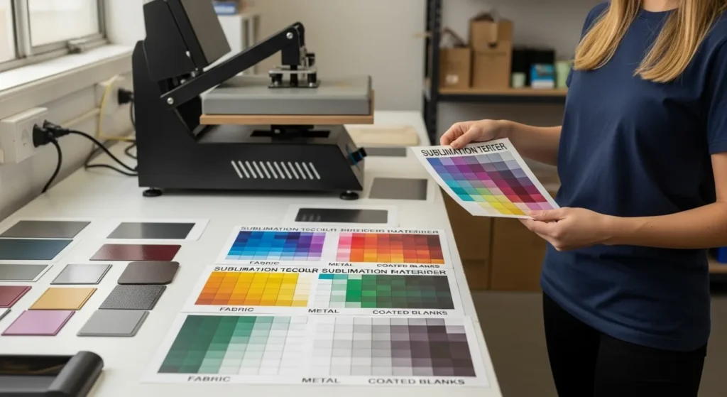
Preventing Color Problems Before They Happen
Most color issues disappear when you follow a simple loop.
- Print a chart first
- Test once per setup
- Lock settings
- Repeat confidently
If there’s one habit that saves the most time, money, and frustration, it’s this.
👉 Use a sublimation color chart before pressing and let real output guide every decision.
Accurate sublimation colors aren’t about luck. They’re about references, consistency, and trusting what’s printed, not what’s glowing on a screen.
FAQs
How do I fix printer color problems on an Epson sublimation printer?
Start by checking your ICC profile, ink type, and paper settings, then compare the output to a printed color chart instead of your screen.
Why is my Epson sublimation printer not printing correct colors?
Incorrect colors usually come from screen brightness, wrong ICC profiles, mixed inks, or double color correction in the printer and design software.
Why are my sublimation colors dull?
Dull colors are often caused by low polyester content, incorrect heat or pressure, or judging color based on a screen instead of printed output.
How do I get vibrant colors with sublimation?
Use high-polyester or properly coated blanks, verify heat press settings, and confirm achievable color depth with a physical sublimation color chart.
