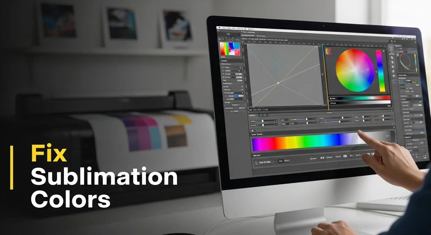
Manual Color Correction and ICC Profiles: Fix Sublimation Colors
Most sublimation color problems aren’t caused by bad ink or cheap paper.
They’re caused by using manual color correction to fix problems that only ICC profiles can solve or trusting ICC profiles when the system itself is broken.
If your prints look dull, muddy, over-saturated, or inconsistent, this post explains what to trust, what to ignore, and what order things must happen in.
If you’re unsure why colors shift between screen and print, understanding RGB vs CMYK and how to choose the right ICC profile will clarify where most sublimation color problems actually start.
The Decision You’re Actually Making (Most People Miss This)
You’re not choosing between:
- Manual color correction or
- ICC profiles
You’re choosing between:
- Predictable color
- Endless trial-and-error
Manual correction is reactive.
ICC profiles are structural.
Treating them as equals is what breaks workflows.
What Manual Color Correction Is Good For (And What It Isn’t)
Manual correction works when you’re solving one-off visual problems.
It works when:
- You’re printing a single design
- You control the printer, ink, paper, and press
- Small color shifts are acceptable
- Speed matters more than repeatability
You’re making judgment calls: saturation, contrast, warmth, skin tone.
That’s fine — as long as the system underneath is stable.
Where it fails
Manual correction collapses the moment you:
- Switch substrates
- Change ink brands
- Use a different printer
- Reprint the same design weeks later
If you’re constantly “fixing” colors file-by-file, you’re compensating for a deeper issue — usually color space or profiling.
What ICC Profiles Actually Do (And Why They Matter More)
ICC profiles don’t make prints look better.
They make color behave consistently across devices.
They translate:
- RGB → printer color limits
- Screen color → ink on substrate
- File intent → physical output
If you don’t understand the relationship between color spaces and profiles, start here:
👉 RGB vs CMYK and choosing the right ICC profile
Without this foundation, manual correction is just educated guessing.
The Hidden Dependency Everyone Ignores: Screen Calibration
An ICC profile assumes one thing before it does anything useful:
Your screen is telling the truth.
If your display is too bright or too cool:
- You’ll underexpose prints
- Colors will look dull on paper
- You’ll chase saturation that isn’t missing
Before blaming ink, paper, or profiles, fix this first:
👉 Screen calibration tips to fix sublimation color mismatch
If the screen lies, every correction you make is wrong, even if the print “looks better” by accident.
The Correct Order (This Is Where Most People Break It)
This sequence matters more than any setting.
The only order that works:
- Calibrate your screen
- Apply the correct ICC profile
- Soft proof if available
- Then manually correct inside those limits
If you manually adjust before profiling, you’re fixing a fake preview.
If you manually override profiles every time, your profiles aren’t the problem your setup is.
Choosing the Right ICC Profile for Sublimation
Not all ICC profiles are interchangeable.
You need one that matches:
- Your printer model
- Your ink brand
- Your paper
- Your intended substrate behavior
If you’re unsure where to start, this guide breaks it down practically:
👉 Best ICC profiles for sublimation (fix color accuracy & print quality)
Using the wrong profile is worse than using none it creates confidently wrong color.
When Manual Correction Is Still Necessary (Even With Profiles)
ICC profiles define limits, not taste.
You still need manual correction to:
- Recover shadow detail lost on transfer
- Reduce oversaturated reds and blues
- Adjust contrast for matte vs glossy finishes
- Fine-tune designs for specific substrates
This is normal.
What’s not normal is relying on manual correction to fix system-level color problems.
If you’re seeing recurring issues like dull prints, unexpected shifts, or inconsistent results, diagnose the root cause instead of chasing sliders:
👉 Sublimation color problems & fixes: how to get accurate prints
The Rule That Saves Ink, Time, and Sanity
Use ICC profiles to control behavior.
Use manual correction to express intent.
If a color problem repeats:
- Fix the system
If it’s unique:
- Fix the file
Mix those up, and sublimation becomes frustrating, expensive, and unpredictable.
Manual Color Adjustment in Photoshop
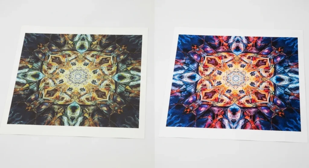
If you encounter subtle color inconsistencies, ICC profiles may not be enough to perfect your sublimation prints. For the best results, manual color adjustments in Photoshop can assist in fine-tuning your designs in these cases.
Steps to Adjust Colors Manually in Photoshop:
- Open Your Image: Start by opening the image you want to adjust in Photoshop.
- Check Color Settings: Go to Edit > Color Settings to ensure your workspace is set to the right color mode (RGB or CMYK, depending on your printer settings).
- Use Levels or Curves:
- Levels: Go to Image > Adjustments > Levels. Adjust the shadows, midtones, and highlights to correct any color shifts.
- Curves: For finer control, go to Image > Adjustments > Curves. Adjust the curve for the specific color channel (Red, Green, or Blue) to balance out color discrepancies.
- Hue/Saturation: If your colors look too intense or muted, adjust the Hue/Saturation via Image > Adjustments > Hue/Saturation. This lets you tweak the overall color tone and saturation.
- Preview Changes: Always use the preview option to compare the adjusted image to the original one before applying the changes. This helps ensure that the colors look natural.
- Save the Image: Once satisfied with the changes, save the image and print a test sheet to ensure colors match your expectations.
Manual Color Correction on Windows and Mac
If profiles aren’t providing the color accuracy you need, Windows and Mac users have the option to manually correct color at the system level.
For Windows:
- Open Color Management: Type “Color Management” in the search bar and select the app from the results.
- Add Profile: Go to the Devices tab, choose your monitor from the drop-down list, and click Add to select a display ICC profile that matches your monitor’s capabilities.
- Adjust Color: Click on Advanced tab, and tweak the color balance settings to adjust the brightness, contrast, and gamma levels.
- Test and Save: After adjustments, save the profile, and run test prints to check the color accuracy.
For Mac:
- Open ColorSync Utility: Navigate to Applications > Utilities > ColorSync Utility.
- Select Your Display: In the Devices tab, choose your monitor, and click on Profiles to select or install a new color profile.
- Calibration: Use Display Calibration in the Profiles section for more precise adjustments. Follow the on-screen prompts to manually adjust brightness, contrast, and other settings.
- Test Prints: Like Windows, it’s important to print test images after adjusting color settings to ensure they match the colors on-screen.
Tailored Workflow: Match the System You Actually Print With
This is where color finally stops being theoretical.
Color problems aren’t personal skill issues. They’re almost always mismatched systems. Your workflow should change based on hardware and substrate, not personal preference.
1. Lock the Variables First (Before Any Color Work)
If any of these change, your color results will change:
- Printer model (not just brand)
- Ink type (OEM vs third-party)
- Paper (brand and coating)
- Substrate (poly count, coating, hardness)
Rule:
If you switch any one of these, assume your old color corrections are invalid.
2. Printer + Ink: Decide Who’s in Control
OEM ink
- Use manufacturer or lab-tested ICC profiles
- Minimal manual correction
- Best for consistency and reprints
Third-party ink
- Use ink-specific ICC profiles
- Expect more manual correction
- Re-test after head cleanings or ink aging
If your prints shift over time, it’s usually ink behavior, not your file.
3. Paper: The Silent Color Shifter
Sublimation paper affects:
- Ink release rate
- Saturation ceiling
- Shadow density
High-release paper
- Less manual saturation boost
- Watch for blown highlights
Low-release paper
- Requires contrast and saturation compensation
- Softer gradients, safer skin tones
Never reuse corrections from one paper on another.
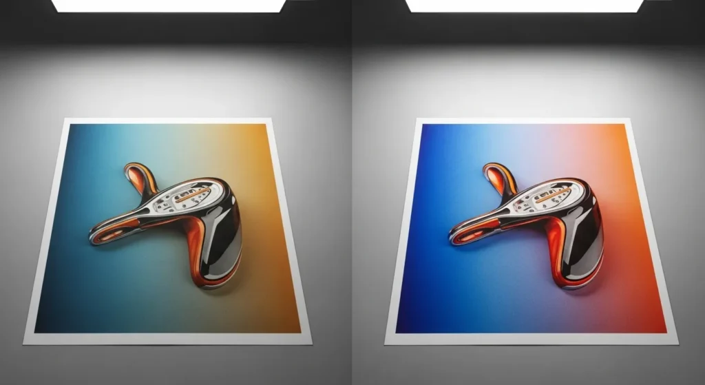
4. Substrates: Where Profiles Stop and Judgment Starts
ICC profiles assume ideal transfer conditions.
Reality doesn’t.
| Substrate | What Breaks | What to Adjust |
|---|---|---|
| Polyester fabric | Blacks flatten | Add midtone contrast |
| Hard blanks (metal, glass) | Oversaturation | Pull vibrance, not saturation |
| Coated plastics | Color shift | Warm/cool balance manually |
| Low-poly blends | Muted color | Accept limits or redesign |
Rule:
Profiles control translation.
Manual correction controls material behavior.
5. The One-Page Decision Checklist
Before printing, ask:
- Is my screen calibrated?
- Am I using the correct ICC for this exact setup?
- Has any variable changed since last successful print?
- Am I correcting inside known limits—or fighting them?
If you can’t answer all four, don’t adjust color yet.
6. When to Rebuild the Workflow (Not Tweak It)
Rebuild — don’t tweak — when:
- You change ink brands
- You switch paper types
- Prints suddenly need “extra fixing”
- Results drift without explanation
Tweaking hides problems.
Rebuilding solves them.
FAQs:
What is the difference between manual color correction and ICC profiles?
Manual color correction is when you adjust colors by eye using editing tools. ICC profiles are files that translate colors accurately between your screen, printer, ink, paper, and substrate. Manual correction changes appearance. ICC profiles control consistency.
Do I need ICC profiles for sublimation printing?
Yes. ICC profiles are required for predictable sublimation color. Without them, colors may look acceptable on screen but print inaccurately or inconsistently, especially when materials or printers change.
When should I use manual color correction in sublimation printing?
Manual color correction should be used after applying the correct ICC profile. It is best for fine-tuning contrast, saturation, and tone based on the specific substrate, not for fixing system-level color problems.
Why do sublimation prints look dull even with an ICC profile?
Sublimation prints often look dull because the screen is too bright, the paper releases ink differently, or the substrate has color limitations. ICC profiles do not adjust for screen brightness or material quality.
Should I manually adjust colors before printing or trust the ICC profile?
You should trust the ICC profile first. Only apply manual adjustments after you confirm the correct profile, calibrated screen, and proper print settings are in place. Manual correction should never replace profiling.
Can I use the same color settings for different sublimation substrates?
No. Different substrates absorb and display color differently. Even with the same ICC profile, manual color adjustments must be reviewed whenever the substrate changes.
Is manual color correction bad for consistent printing results?
Manual color correction is not bad, but relying on it alone causes inconsistency. For consistent and repeatable results, ICC profiles should control color behavior, and manual correction should be minimal.