Sublimation Printing with Affinity Designer: Settings, Color Accuracy, and Pro-Level Results
Most sublimation color problems don’t start at the heat press. They start inside the design file.
Once you set up Affinity Designer correctly, your prints stop looking dull or unpredictable and finally match what you see on screen.
When setting up your sublimation printer in Affinity Designer, your specific settings will depend on your printer model, sublimation paper, and ink. However, there are some general guidelines you can follow to get started.
Why Affinity Designer Works Well for Sublimation
Affinity Designer is a solid choice for sublimation because it offers precise color control, vector-based design accuracy, and full export control without a subscription.
It works especially well if you:
- Design logos, typography, or flat graphics
- Need consistent color across repeat orders
- Want full control over ICC profiles
Pairing it with a properly configured sublimation printer keeps both your design and output consistent.
Core Affinity Designer Settings for Sublimation Printing
These settings give you a reliable starting point before dialing in printer-specific tweaks.
Color Mode
CMYK/8
- Aligns with how sublimation printers process color
- Produces smoother transitions than RGB
- Reduces unexpected color shifts after pressing
If CMYK results still feel off, learning how ICC profiles work in sublimation makes a noticeable difference.
Resolution
300–600 DPI
- 300 DPI is enough for most apparel and hard goods
- 600 DPI helps with fine details and small text
- Higher values rarely improve transfer quality
Document Size
- Match your exact sublimation paper size
- Lock orientation before designing to prevent scaling issues
Color Profile (Critical Step)

Always use the ICC profile made for your ink, paper, and printer combination.
Skipping this step commonly causes:
- Reds shifting orange
- Faded blacks
- Purple or gray blues
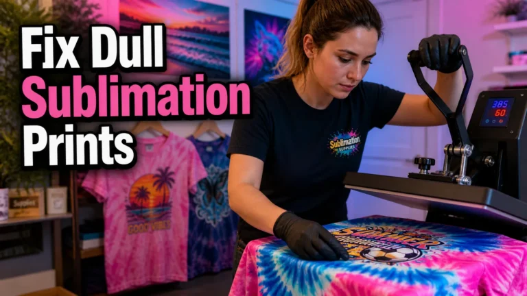
This breakdown on why sublimation colors look dull and how to fix them walks through the most common profile mistakes.
Rendering Intent
Perceptual
- Preserves overall color balance
- Prevents harsh clipping
- Ideal for photos and colorful artwork
Printer Driver Quality
- Use High Quality for final prints
- Avoid draft modes
- Always test before production
Export Settings in Affinity Designer (Often Missed)
Incorrect export settings can undo perfect design work.
Use these export best practices:
- Export as PDF (Print) or TIFF for best color fidelity
- Disable color conversion during export if using ICC profiles
- Avoid JPEG compression for final prints
- Keep scaling at 100 percent
These steps help preserve color accuracy before files reach the printer driver.
Printer Setup Tips That Prevent Wasted Prints
These steps save ink, paper, and frustration.
- Mirror designs unless your driver does it automatically
- Disable printer color correction when using ICC profiles
- Print a small test area first
- Don’t mix ink brands in one printer
Incorrect press settings can undo perfect design work. This heat press sublimation settings guide helps eliminate that issue.
Designing for Sublimation Inside Affinity Designer
Sublimation behaves differently than vinyl or screen printing, so design choices matter.
Use Vector Graphics When Possible
- Sharp edges under heat
- No pixel distortion
- Easy resizing for different products
Favor High-Contrast Colors
Sublimation ink is transparent.
- Light colors fade on light fabrics
- Bold contrasts remain visible
Be Careful with Gradients and Shadows
- Fine gradients can band
- Soft shadows may disappear
Test before production.
Match Designs to the Right Materials
Not all surfaces hold color equally. This substrate compatibility guide shows which materials produce the best results.
Common Sublimation Problems and Fixes
Colors Look Dull After Pressing
- Wrong ICC profile
- Low press temperature
- Incorrect paper selection
Prints Look Fine on Paper but Bad on Fabric
- Normal behavior
- Always judge results after pressing
Blurry or Soft Edges
- Low export DPI
- Overstretched raster images
- Scaling during print setup
For deeper fixes, this sublimation troubleshooting guide breaks issues down by symptom.
Real-World Workflow Example
A small apparel shop switched from RGB exports to CMYK/8 with proper ICC profiles in Affinity Designer.
Within a week, reprints dropped, especially on red-heavy designs printed on polyester shirts.
The biggest improvement came from understanding polyester sublimation behavior, not changing ink or equipment.
Helpful Video Resource
A step-by-step walkthrough for setting up ICC profiles in Affinity Designer on Windows:
Print Safety and Prep Notes
- Follow your printer manufacturer’s guidelines
- Never mix regular ink and sublimation ink
- Use protective paper during pressing
- Expect a short testing phase when dialing in settings
FAQs
Final Thoughts
Once your color mode, ICC profile, and printer settings are aligned, sublimation printing with Affinity Designer becomes predictable and repeatable.
That consistency is what turns test prints into sellable products and keeps reprints to a minimum.