
Why Are My Sublimation Colors Dull? Causes and Fixes

A sublimation print that looks dull on the transfer paper is usually normal. The real test is what the design looks like after it has been pressed onto a compatible polyester or sublimation-coated blank.
If the finished product still looks faded, washed out, patchy, or noticeably different from your expected color, something in the printing or transfer process needs attention.
Start with the printer before changing heat or ICC settings. A missing ink channel, wrong paper side, incompatible blank, incorrect press setting, or color-management problem can all produce similar symptoms.
Find the Problem Before Changing Your Settings
The fastest fix depends on where and how the dull color appears.
| What you see | Check first |
|---|---|
| Transfer looks dull before pressing but finished blank looks good | Nothing may be wrong |
| Everything looks faded after pressing | Nozzles, blank compatibility, heat and color management |
| One color is weak or missing | Nozzle check and ink flow |
| Shirts look dull but hard blanks look good | Polyester content and shirt color |
| One type of mug or tumbler looks faded | Coating and recommended press settings |
| Some areas are bright and others faded | Contact, pressure, press temperature and moisture |
| Colors changed suddenly | Nozzle check, software/driver settings or ink |
| Colors are consistently wrong but otherwise strong | ICC profile and color-management workflow |
| Print becomes dull after washing | Fabric compatibility, original transfer quality and care method |
Work through the problem in that order. Changing several variables at once makes it much harder to discover what actually fixed the print.

Is It Normal for Sublimation Colors to Look Dull Before Pressing?
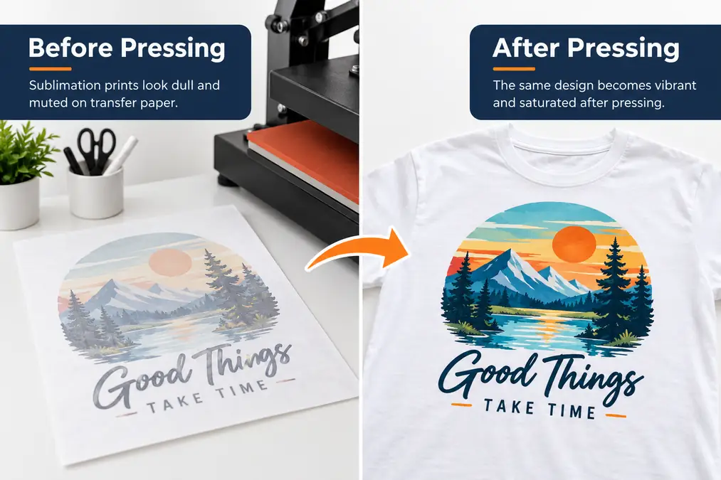
Yes. Sublimation ink often looks muted, flat, or darker on transfer paper compared with the finished pressed product.
The transfer paper is only carrying the dye to the blank. You should judge color accuracy after pressing onto a compatible test material, not by comparing the unpressed paper directly with your computer screen.
When dull color is probably normal
You probably do not have a problem if:
- the transfer looks evenly printed
- there are no missing colors or horizontal lines
- the paper is printed on the correct side
- previous transfers from the same setup press correctly
- the design becomes much brighter after pressing
Do not increase saturation or start changing ICC profiles simply because the unpressed transfer looks pale.
When the paper may show a real problem
Check the printer before pressing if you notice:
- one color is almost missing
- horizontal lines or banding
- large areas are unusually pale
- colors suddenly changed from previous prints
- parts of the design are completely missing
A color printer test page can help separate a printer-output problem from a heat-transfer problem.
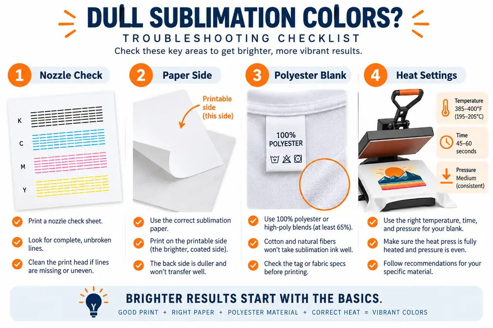
Step 1: Run a Printer Nozzle Check
Run a nozzle check before reinstalling an ICC profile or increasing your heat press temperature.
A partially clogged nozzle can make an otherwise correct design look dull because the printer is no longer laying down the expected amount of cyan, magenta, yellow, or black.
Run a nozzle check when:
- colors suddenly become weak
- one color looks different from previous prints
- you see missing lines
- horizontal banding appears
- the printer has been sitting unused
- cleaning or changing settings has not solved the problem
Look closely at each color pattern.
If lines or sections are missing, follow the cleaning procedure recommended for your printer instead of trying to compensate by adding more saturation to the artwork.
Epson specifically recommends a nozzle check when output has missing segments, broken lines, uneven color, or unusually light printing. Sawgrass also recommends checking printer output when primary colors appear missing or faded.
For recurring lines or missing colors, see the guide to preventing banding, clogging, and print-head problems.
Step 2: Check Which Side of the Sublimation Paper You Printed On
Sublimation paper usually has a designated printable side designed to hold the ink until heat transfers it to the blank.
Printing on the wrong side can result in:
- faded color
- speckling
- poor ink release
- inconsistent transfer
- unexpected drying problems
Do not assume the brightest or smoothest side is always printable. Paper brands use different coatings and markings.
Check the package instructions. Some papers identify the back with a watermark or printed logo.
Sawgrass specifically lists printing on the wrong side of sublimation paper as a possible cause of faded or speckled results.
Check the paper itself too
Paper can also contribute to inconsistent results if it is:
- damp
- curled
- stored in a humid area
- incompatible with your printer workflow
- loaded using the wrong media setting
Store unused paper flat and protected from moisture.
Step 3: Check the Blank or Polyester Content
A perfect printer cannot make traditional sublimation work properly on an incompatible surface.
Sublimation performs best when the dye has polyester or a compatible polymer coating to bond with.
For shirts and fabric
Higher polyester content usually produces stronger sublimation color.
A 100% polyester shirt normally gives a brighter result than a cotton-rich blend. Lower-polyester blends are often used deliberately when a softer or vintage appearance is wanted.
If your mugs look vibrant but your shirts look faded, check the shirt label before changing your printer.
Fabric color matters too. Sublimation ink is transparent and does not create an opaque white base, so white and light-colored garments give the dye the cleanest background.
For more help choosing compatible materials, use the sublimation material guide.
For mugs, tumblers, metal and other hard blanks
The surface needs a coating intended for sublimation.
Two white mugs can look almost identical but behave very differently if one is properly sublimation-coated and the other is an ordinary ceramic mug.
If the problem happens on only one blank type or one batch, check:
- whether it is actually sold for sublimation
- which side or surface is coated
- whether protective film needs removing
- the supplier’s pressing instructions
- whether the coating is damaged
Do not compensate for an unsuitable blank by continuously increasing temperature.
Step 4: Check Heat, Time, Pressure and Contact
If the printer output and blank are correct, check the transfer process.
Dull color after pressing can result when the dye does not transfer evenly into the substrate.
Start with the blank manufacturer’s settings
There is no single temperature and time that should be used for every sublimation product.
A polyester shirt, aluminum panel, ceramic mug, MDF blank, glass panel and stainless tumbler can require very different transfer conditions.
Use the instructions supplied for the specific blank as your starting point.
Heat Press Nation, for example, lists a range for polyester garments and different specifications for other sublimation products rather than one universal setting.
Verify that your heat press is actually reaching the set temperature
A press display tells you what the controller is trying to maintain. It does not automatically prove that every part of the platen is heating evenly.
If the same area repeatedly comes out faded, test the press rather than continuously changing your design.
The heat press temperature accuracy guide explains how to check this more carefully.
Look at contact and pressure
Patchy color is often more useful diagnostically than an entirely faded design.
If one section transfers correctly while another stays pale, inspect:
- pressure across the blank
- flatness of the surface
- paper contact
- platen alignment
- seams, collars or raised areas
- wrinkles or air gaps
More pressure is not automatically better. Use the amount recommended for the substrate and concentrate on achieving consistent contact.
Adjust one setting at a time
If testing is required:
- Start from the blank supplier’s recommended settings.
- Make one controlled adjustment.
- Press the same test artwork.
- Label the sample.
- Compare the final pressed results.
- Keep the best combination as your reference.
Changing heat, time, pressure and color settings together gives you no reliable way to know which variable mattered.
Step 5: Check Moisture
Moisture can interfere with transfer quality, particularly with fabrics, paper and other materials that absorb humidity.
Common signs include:
- uneven or cloudy areas
- patchy color
- soft-looking sections
- inconsistent results between otherwise identical blanks
For polyester garments, a short pre-press can remove wrinkles and moisture before the transfer is positioned. Heat Press Nation includes pre-pressing in its polyester sublimation workflow for this reason.
Also keep transfer paper in its packaging or another dry storage location instead of leaving open sheets exposed for long periods.
Avoid treating humidity as the automatic cause of every faded print. Check the nozzles, paper, blank and press process too.
Step 6: Check the ICC Profile and Color Management
Move to color management once you know the printer is producing complete output and the transfer process is working correctly.
An ICC profile helps translate color between your design, printer, ink, paper and intended output.
Problems can occur when:
- the wrong profile is selected
- a profile belongs to a different ink or printer combination
- printer color correction and software color management are both being applied
- the wrong print workflow is selected
- media or quality settings do not match the intended setup
Avoid double color management
One common mistake is letting the design software manage color while the printer driver applies another correction on top.
The correct setup depends on the printer, ink and software combination.
Do not follow a generic instruction such as “always turn printer color management off” for every machine.
For example, Sawgrass recommends using its Print Utility and the appropriate settings for the selected paper, ink and substrate. Its support documentation also recommends RGB workflows for its color profiles.
Converted Epson workflows can differ because third-party ink manufacturers may provide their own ICC profiles and printing instructions.
Use the ICC profile guide for sublimation when you need to troubleshoot the profile itself.
For driver-specific problems, see sublimation printer settings.
Step 7: Print and Press a Color Test Chart
Do not choose sublimation colors from your monitor alone.
A physical pressed color chart shows what your actual combination of:
- printer
- ink
- paper
- profile
- press
- substrate
produces after heat transfer.
How to use a sublimation color chart correctly
- Print the chart without changing its color values.
- Use your normal production print workflow.
- Press it onto the same type of substrate used for your projects.
- Let the sample cool.
- Compare the pressed swatches with the colors you need.
- Record the settings and substrate used.
- Keep that physical sample near your workstation.
Judge the pressed chart, not the transfer paper.
You can use the Subli Genius sublimation color chart to build a repeatable physical color reference.
This is especially useful for brand colors, customer orders, skin tones, reds, blues and dark neutral colors that need more careful matching.
Fix Dull Sublimation Colors by Symptom
Color symptoms can narrow the list of possible causes, but they should not be treated as a guaranteed diagnosis.
The entire design looks faded
Check:
- whether you judged the design before or after pressing
- nozzle output
- printable paper side
- blank compatibility
- press settings and actual temperature
- color-management workflow
If everything is equally pale, start with the variables that affect the whole print rather than manually increasing the saturation of every design.
One color looks weak or is almost missing
Start with the printer.
For example, weak cyan can make blues and greens shift dramatically even though magenta and yellow still look normal.
Run a nozzle check before touching the ICC profile.
Blacks look brown or muddy
Possible causes include:
- excessive heat or time
- incorrect color management
- unexpected ink-channel output
- artwork using a color mixture that does not reproduce as expected
First check whether other colors have shifted too.
If several colors are wrong, investigate printer output and color management rather than changing only the black artwork.
Red looks orange
Possible causes include:
- incorrect ICC/profile workflow
- printer color correction
- ink output imbalance
- the actual RGB color selected in the artwork
- pressing conditions
Press a known color chart before manually altering red values. Otherwise, you may correct one design while making future designs less accurate.
Blue looks purple or strangely muted
A weak cyan channel or excessive magenta contribution can move blues toward purple.
Start with a nozzle check.
If printer output is complete, compare a pressed test chart and review the color-management setup.
Skin tones look gray or unnatural
Skin tones contain subtle mixtures of several colors, so small color-management errors can become noticeable quickly.
Check:
- the source image
- monitor expectations
- ICC/profile workflow
- printer output
- pressed color chart
A bright computer display can also make a physical print appear darker than expected. For closer screen-to-print expectations, see the screen calibration guide for sublimation.
Only part of the print looks faded
Look at the transfer process first.
Common areas to inspect include:
- uneven paper contact
- pressure differences
- cold areas in the platen
- wrinkles
- curved surfaces
- seams or raised garment areas
- moisture
An ICC profile normally affects the color-management workflow across the image. It is less likely to explain one isolated pale corner.
Shirts are faded but mugs look good
The printer is less likely to be your first suspect if the same design and printing workflow produces strong color on a compatible hard blank.
Check:
- polyester content
- shirt color
- fabric construction
- heat settings
- fabric moisture
A lower-polyester garment can intentionally produce a softer appearance even when the transfer process is working.
One type of mug or tumbler is dull
Check the blank before rebuilding your printer settings.
Verify:
- sublimation coating
- supplier instructions
- correct press or oven procedure
- transfer contact
- pressure
- time and temperature
If another blank presses correctly from the same printer, paper and artwork, compare the blanks and pressing method first.

A Better Way to Test Sublimation Color Problems
Randomly changing settings wastes blanks and makes troubleshooting harder.
Use a controlled test instead.
Keep these variables the same
- design
- printer
- ink
- paper
- ICC workflow
- blank type
Change only the variable you are testing.
For example, if you suspect temperature, keep time and pressure unchanged.
Label every sample immediately.
A simple record might look like this:
| Test | What changed | Result |
|---|---|---|
| A | Supplier starting settings | Slightly faded |
| B | Temperature adjustment only | Better |
| C | Different pressure only | Patchiness reduced |
| D | Different ICC workflow | Color hue changed |
The goal is not to find a universal sublimation setting. It is to build a repeatable setting for your printer, supplies, press and blank.
Not sure what is causing your sublimation colors to look dull? Use this free 1-page troubleshooting checklist to quickly check the printer, paper, blank, heat, pressure, moisture, and color settings in the right order.
Quick Dull-Color Troubleshooting Checklist
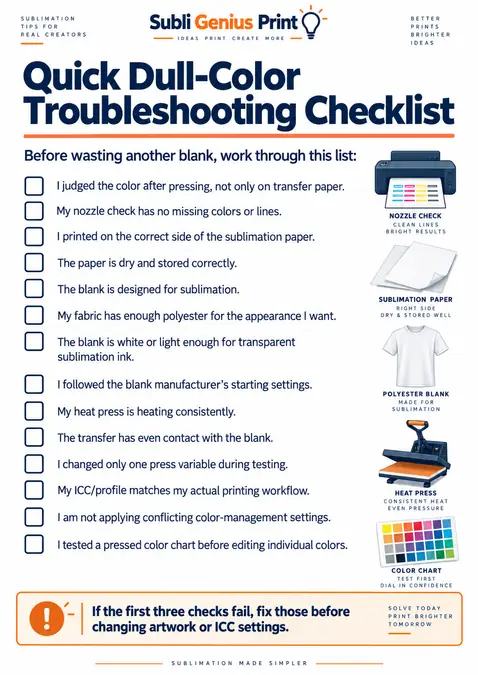
Before wasting another blank, work through this list:
- I judged the color after pressing, not only on transfer paper.
- My nozzle check has no missing colors or lines.
- I printed on the correct side of the sublimation paper.
- The paper is dry and stored correctly.
- The blank is designed for sublimation.
- My fabric has enough polyester for the appearance I want.
- The blank is white or light enough for transparent sublimation ink.
- I followed the blank manufacturer’s starting settings.
- My heat press is heating consistently.
- The transfer has even contact with the blank.
- I changed only one press variable during testing.
- My ICC/profile matches my actual printing workflow.
- I am not applying conflicting color-management settings.
- I tested a pressed color chart before editing individual colors.
If the first three checks fail, fix those before changing artwork or ICC settings.
How Fabric Type Affects Sublimation Color
Polyester content has a major effect on how strong and vibrant sublimation colors appear. Use this chart as a practical guide, then test your specific blank before production.
| Material | Expected Color Result | What to Expect |
|---|---|---|
| 100% Polyester | Very vibrant | Usually gives the strongest and most saturated sublimation color on light fabric. |
| High-Polyester Blend | Vibrant | Good color retention, but slightly softer than 100% polyester depending on the blend. |
| 65% Polyester Blend | Moderately vibrant | Often produces a softer or slightly faded look compared with higher-polyester fabric. |
| 50% Polyester Blend | Soft / vintage | Only part of the fabric can accept the dye, so the final print usually looks noticeably lighter. |
| Tri-Blend | Varies | Results depend heavily on the polyester percentage and fabric construction. Expect a softer appearance. |
| 100% Cotton | Not suitable for direct sublimation | Traditional sublimation dye does not bond properly to untreated cotton. A compatible coating or transfer method is required. |
| Sublimation-Coated Hard Blank | Potentially very vibrant | Results depend on coating quality, blank color, and correct time, temperature, pressure, and contact. |
Tip: Do not compare different materials using one universal color expectation. Press a test chart on the same blank or fabric you plan to use for production.
For more guides, charts, and helpful tools, check out the full collection at Subli Genius Print Resources.
FAQs
Why do sublimation colors look dull on paper?
Dull sublimation colors on transfer paper are usually normal. The paper is a carrier for the dye, and the final color should be evaluated after the design is pressed onto a compatible polyester or sublimation-coated surface. If the pressed result looks good, do not change your settings simply because the paper looks muted.
Why are my sublimation colors still dull after pressing?
Start with a nozzle check, then verify the paper side, blank compatibility, heat-transfer settings and color-management workflow. If only one substrate looks faded, investigate that blank and its pressing method before changing your entire printer setup.
How can I make sublimation colors more vibrant?
Use a compatible light-colored polyester or sublimation-coated blank, confirm complete printer output, follow the blank manufacturer’s transfer settings, maintain even contact and use the correct color-management workflow. A pressed color chart is more useful than increasing saturation by guesswork.
Why is my Epson sublimation printer printing faded colors?
Run a nozzle check first. Epson recommends checking the nozzles when print quality becomes too light, uneven or banded. If the nozzle pattern is complete, check the paper/media setting, print quality and color-management workflow next. Do not assume the ICC profile is responsible before checking printer output.
Why do my sublimation shirts look faded but my mugs look bright?
The shirt is often the variable to investigate first. Sublimation dye bonds with polyester, while mugs and other hard blanks use a polymer coating. Lower polyester content, garment color, fabric structure or incorrect shirt pressing conditions can produce a softer result even when the printer works correctly.
Can too much heat make sublimation colors look bad?
Yes. More heat is not automatically better. Incorrect time and temperature can change the final appearance and may damage some blanks. Start with the manufacturer’s instructions and make controlled adjustments instead of increasing heat whenever a print looks faded.
Does pressure affect sublimation color?
Poor or uneven contact can leave sections of a transfer pale or inconsistent. Use the pressure recommended for your substrate and make sure the paper sits evenly against the blank. If one area repeatedly stays faded, also check platen temperature and blank flatness.
Why does my sublimation fade after washing?
If the print looked good initially and faded later, that is a different troubleshooting problem. Fabric composition, the original transfer, washing conditions and product care can all matter. See the guide to washing sublimation shirts and tumblers without fading for the appropriate care workflow.
Get the Printer Right Before Editing the Design
If the transfer paper looks muted but the finished print looks right, leave the settings alone. If the pressed result is dull, identify the symptom before editing the artwork or increasing saturation.
First run a nozzle check to rule out missing ink or banding.
Next, confirm the printable paper side and blank compatibility. Check the blank manufacturer’s heat instructions and even contact before reviewing the printer driver’s color-management setup.
For a persistent color mismatch, print and press a test chart on the same type of blank used for your products. Change one variable at a time and label every sample so you can identify what helped.
Keep the successful pressed sample and a record of the printer, ink, paper, profile, blank and press settings. That reference is more reliable for future orders than judging colors from transfer paper or the screen alone.