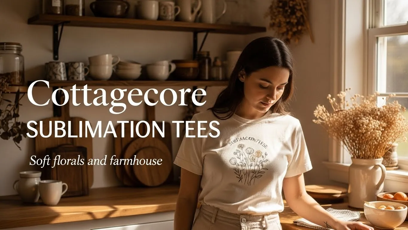
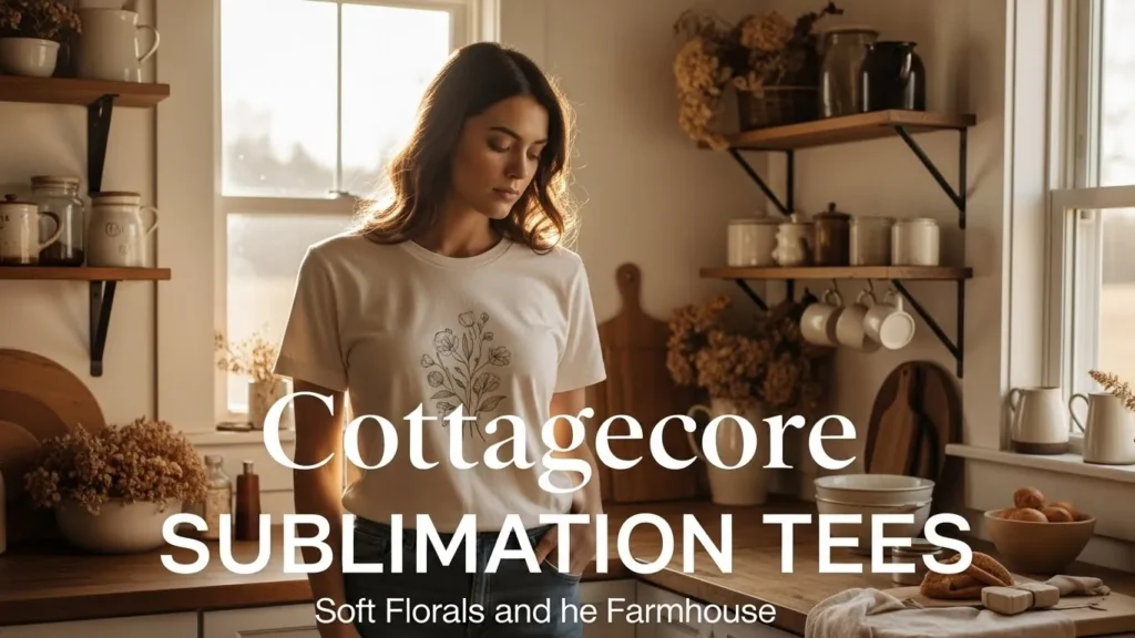
Cottagecore Sublimation Tees: Floral & Farmhouse Style Ideas
I used to think cottagecore was all lace dresses and wildflower fields until I tried printing a simple daisy tee on polyester and saw how calm and cozy it felt right away. That one shirt made me realize why these soft, farmhouse-style designs connect so fast with buyers who want comfort, not trends.
Cottagecore sublimation tees blend nature, nostalgia, and wearable warmth, and when you design them right, they feel handmade while staying easy to print.
What cottagecore style really means for sublimation tees
Cottagecore is all about slowing things down. Think nature, comfort, and a little nostalgia mixed together. For sublimation tees, that means designs that feel calm instead of loud and thoughtful instead of trendy. Florals, countryside elements, and soft textures tend to work better than sharp graphics or bold slogans.
This style pairs especially well with sublimation because the ink becomes part of the fabric, not something sitting on top. Once you understand what sublimation printing actually is, it becomes easier to create tees that feel smooth, breathable, and naturally worn-in instead of stiff or heavy.
Best color palettes for cottagecore sublimation shirts
Color choice can make or break the cottagecore vibe. Soft, muted tones feel cozy and timeless, while bright or high-contrast colors instantly push the design into a modern look.
Popular cottagecore palettes usually include:
- Cream, off-white, and warm beige
- Sage green and olive
- Dusty blue and faded navy
- Soft brown, clay, and muted terracotta
These shades behave differently once pressed, which is why checking a sublimation color chart helps you avoid colors that come out too harsh or washed out.
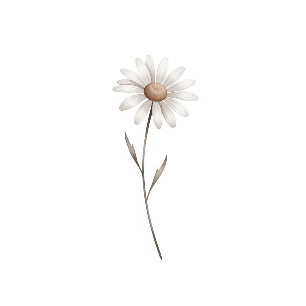
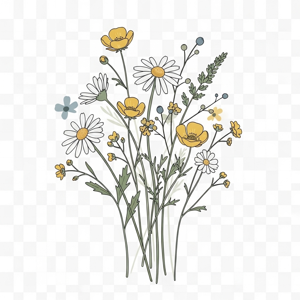
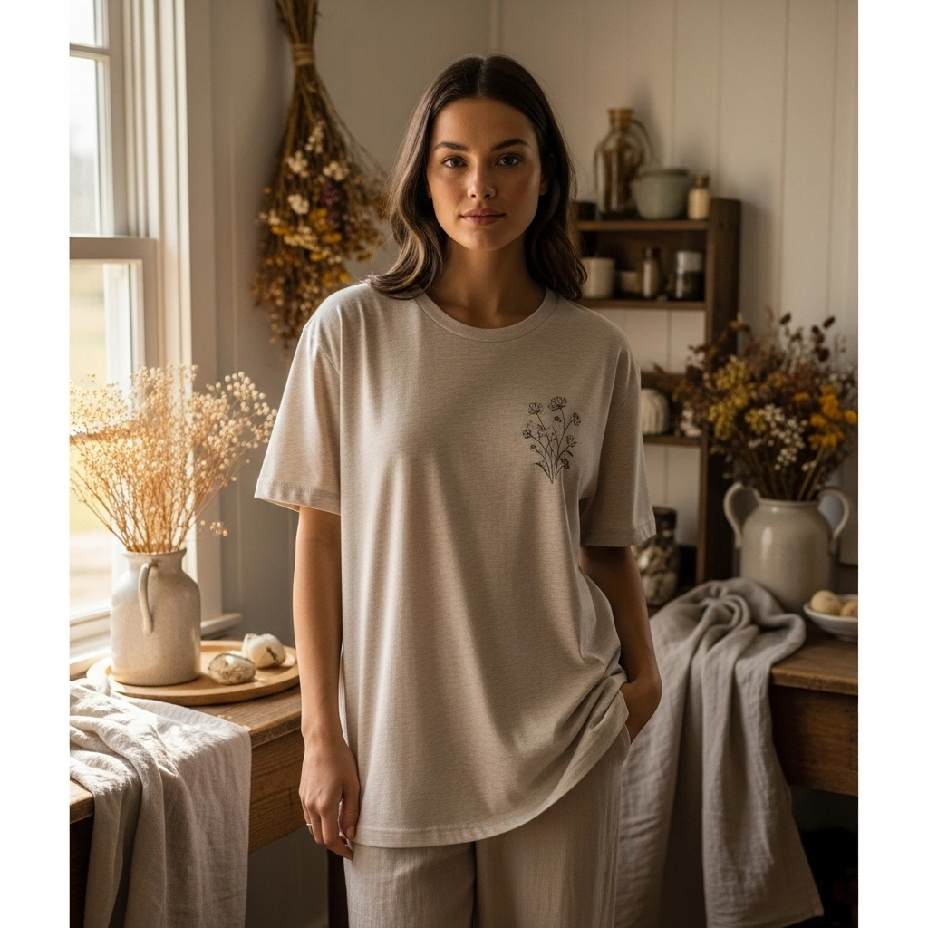
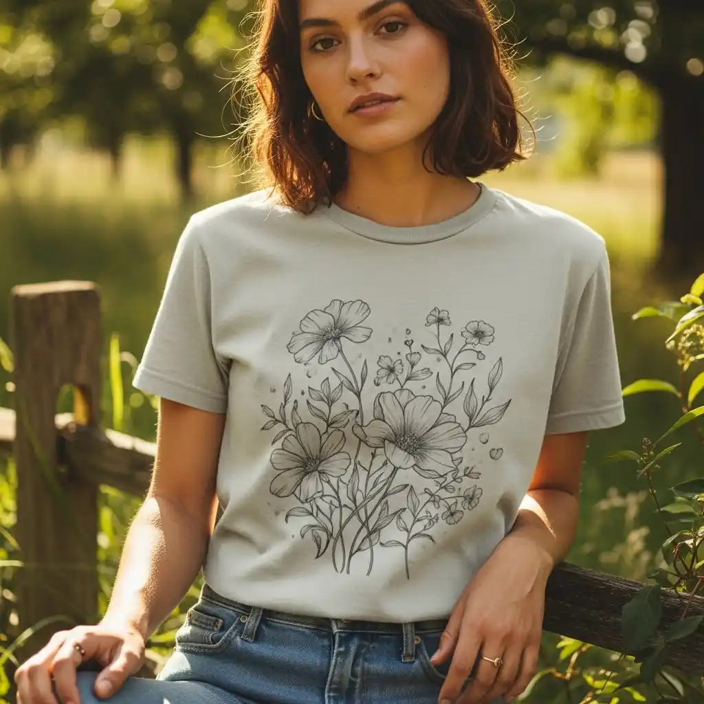
Floral cottagecore sublimation tee ideas
Florals sit at the heart of cottagecore. The goal isn’t perfection, it’s softness and flow.
Design ideas that print beautifully:
- Loose wildflower bunches
- Single daisy or lavender sprigs
- Pressed-flower layouts with airy spacing
- Watercolor florals with gentle fades
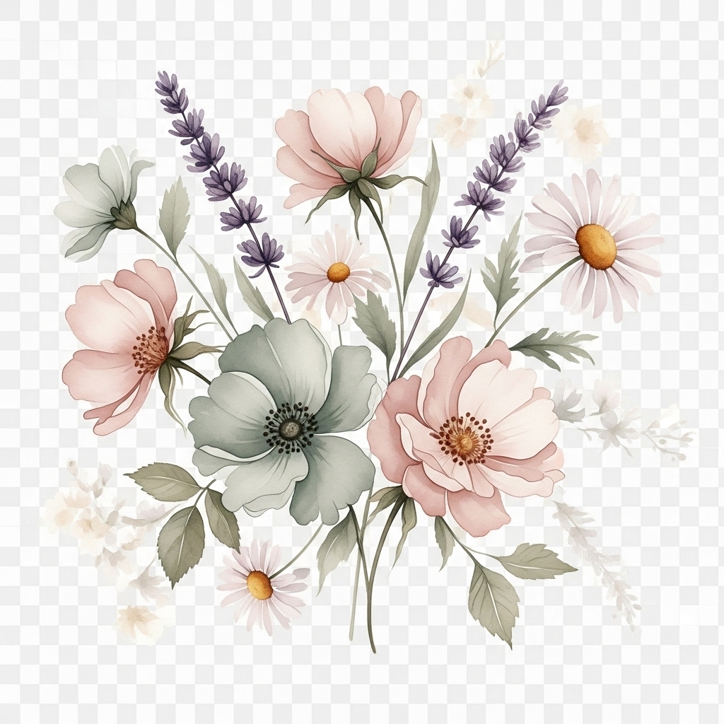
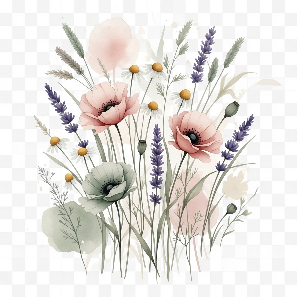
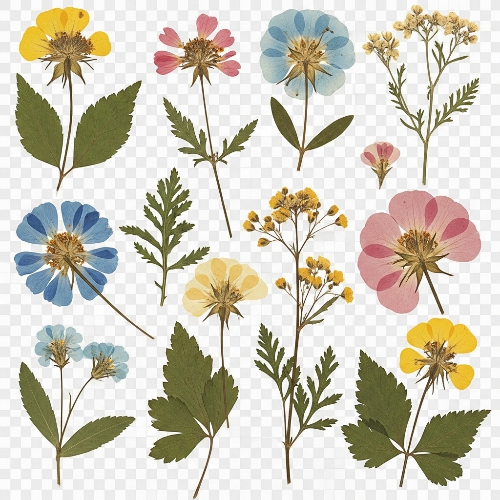
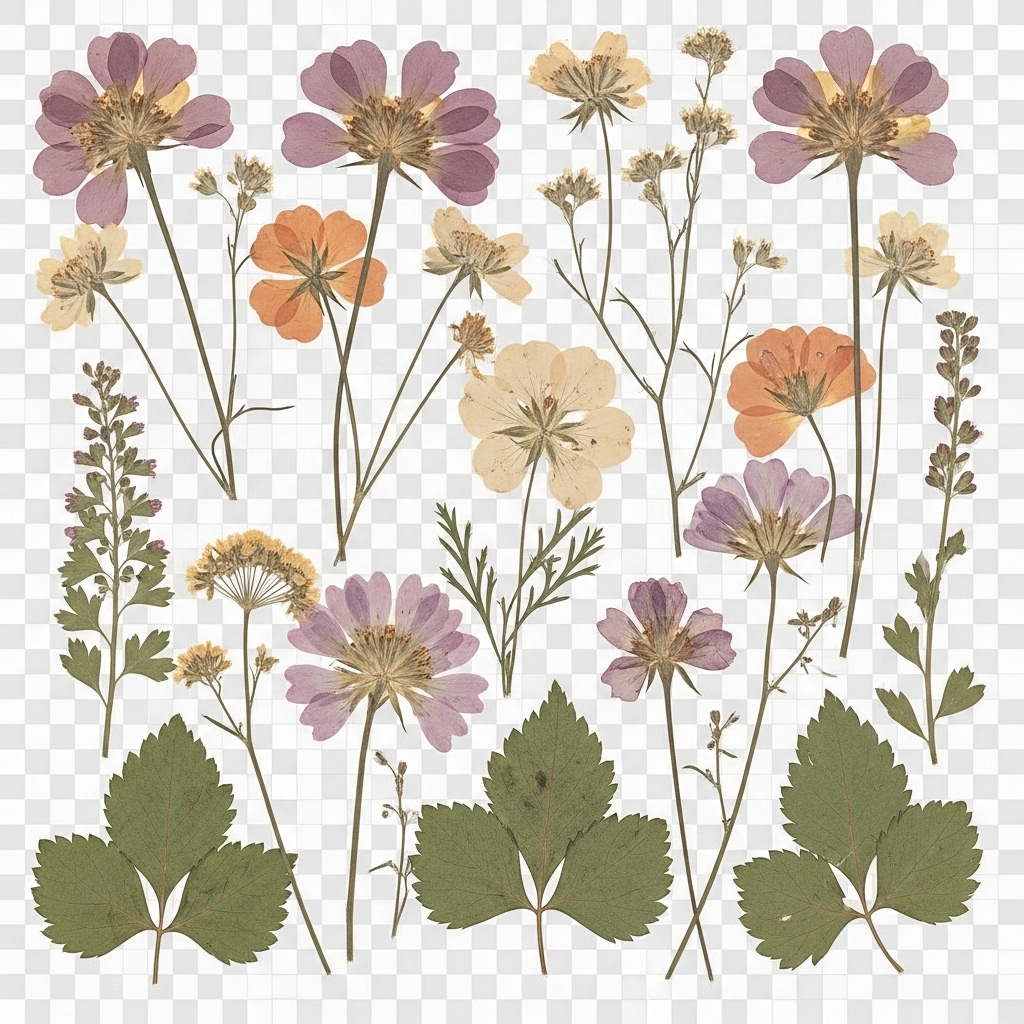
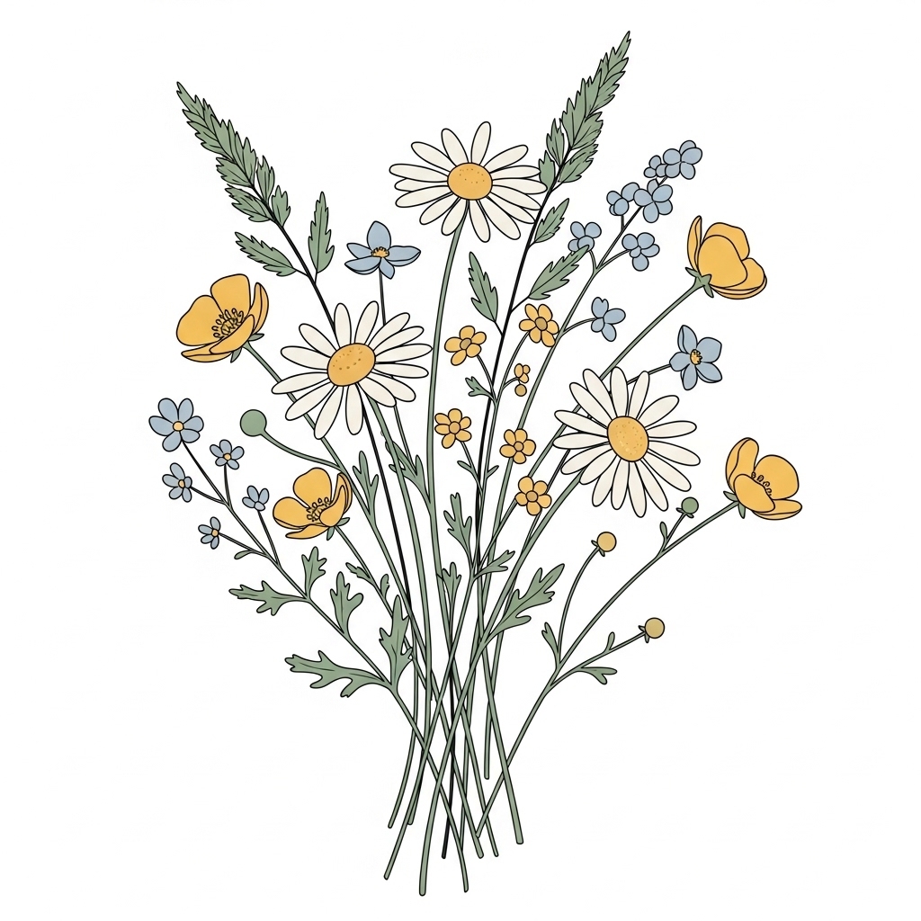
Many styles from feminine aesthetic sublimation designs translate perfectly here when you tone down saturation and keep edges soft.
Farmhouse-inspired graphics that actually sell
Farmhouse designs add warmth and familiarity. These tees often feel personal, like something you’d wear around the house or gift to someone you care about.
Strong ideas include:
- Short quotes in handwritten or serif fonts
- Simple cottage, barn, or fence illustrations
- Wheat, vines, or countryside symbols
Layouts inspired by creative sublimation designs that sell fast tend to perform best when they stay uncluttered and easy to read after pressing.
Shirt styles that fit the cottagecore vibe
The blank shirt sets the tone before the design even prints. Cottagecore works best on tees that already feel relaxed.
Good options usually include:
- Light-colored polyester or poly-blend shirts
- Slightly oversized or unisex fits
- Heathered fabrics for a softer look
Choosing the right blank matters, which is why knowing what shirts are best for sublimation printing helps maintain that cozy, farmhouse feel.
Cottagecore Sublimation Collection Planner
Plan one design, then expand it into a cohesive product set.
| Product | Design Variation | Recommended Colors | Why It Works |
|---|---|---|---|
| T-Shirt | Central floral illustration | Cream, sage, heather oatmeal |
Core Item Sets the visual tone for the entire collection. |
| Tote Bag | Simplified line-art version | Natural canvas, soft beige |
Easy Add-On Great impulse item that matches the tee. |
| Sweatshirt | Text-only or small emblem | Dusty blue, muted brown |
Seasonal Boost Works well for fall and cozy collections. |
| Pillow Cover | Floral border or corner detail | Off-white, light flax |
Lifestyle Tie-In Extends the cottagecore story into home décor. |
| Kitchen Towel | Minimal botanical accent | Ivory, soft gray |
Gift Friendly Pairs well with tee as a thoughtful bundle. |
Sublimation design tips for soft, vintage results
Cottagecore tees shouldn’t look freshly printed. They should feel gently broken-in.
Helpful adjustments:
- Slightly lower ink density
- Use faded textures or grain overlays
- Replace pure black with charcoal or brown
- Leave breathing room around the artwork
Small tweaks in sublimation printer settings can make a big difference in keeping designs soft instead of overpowering.
Cottagecore Tee Design Checklist
Use this before you press your design.
Common mistakes that ruin cottagecore tees
Even beautiful artwork can miss the mark if a few details are off.
Common problems include:
- Neon or overly saturated colors
- Crowded layouts
- Fonts that are too thin
- Printing on the wrong fabric shade
Many of these issues are covered in common sublimation printing problems, which can save you time and wasted blanks.
Who buys cottagecore sublimation tees
Cottagecore tees attract buyers who value comfort and emotional connection. They do especially well with:
- Gift shoppers
- Small boutiques
- Seasonal spring and fall collections
The long-lasting, soft feel aligns naturally with the benefits of sublimation printing, which is why repeat buyers are common.
Cottagecore tee ideas you can bundle or upsell
Once a design works on a tee, it usually works across other products too.
Easy extensions include:
- Matching tote bags
- Lightweight sweatshirts
- Pillows or kitchen textiles
Using one design across multiple items is easier when you explore broader creative sublimation ideas and build small, cohesive collections.
Cottagecore Sublimation Tee Trends to Watch
Quiet shifts shaping what buyers save, share, and actually wear.
Cottagecore Tee Buyers Prefer Soft Designs by a Wide Margin
Small design tests and seller feedback across handmade and print-on-demand shops show a clear pattern: softer designs convert better in the cottagecore niche.
Observed trends from seller data and product testing:
- Muted floral tees see noticeably higher save and wishlist rates than bold graphic tees
- Neutral shirt colors like cream and sage outperform pure white in repeat sales
- Minimal text designs tend to age better across seasons
Why this matters, cottagecore buyers aren’t impulse shoppers. They save, compare, and come back later. Designs that feel calm and timeless stick longer in their memory.
Cottagecore Sublimation Trends Gaining Momentum Right Now
Cottagecore isn’t static. It evolves quietly, and spotting these shifts early gives your designs an edge.
Current movement worth designing for:
- Smaller chest graphics instead of oversized center prints
- Botanical illustrations with imperfect, hand-sketched lines
- Nature motifs mixed with short affirmations, not quotes
- Earth-tone palettes inspired by dried flowers and herbs
These trends lean toward designs that feel personal rather than decorative, which fits sublimation tees perfectly.
Expert Tip: How Pros Keep Cottagecore Designs From Looking Flat
Pro insight from experienced sublimation designers:
Designs meant to feel soft shouldn’t rely on full opacity. Reducing ink density and adding subtle texture before printing keeps the shirt breathable and visually warm after pressing.
This approach avoids the shiny, overprinted look that instantly breaks the cottagecore feel.
Quick Self-Check: Does Your Tee Really Feel Cottagecore?
Before printing, run your design through this fast check.
- Would this design feel out of place in a quiet farmhouse kitchen
- Are the colors still pleasant if you imagine them slightly faded
- Does the design rely on emotion more than decoration
- Would someone wear this for comfort, not just style
If you hesitate on more than one, the design may need softening.
Cottagecore Sublimation Tees: Myth vs Fact
| Belief | Reality |
|---|---|
|
Myth Cottagecore tees need complex floral artwork to look premium. |
Fact Simple florals with space feel more natural and print cleaner with sublimation. |
|
Myth A vintage look means low-quality printing. |
Fact Soft fading is intentional and often preferred for a cozy, worn-in feel. |
|
Myth Bright colors help cottagecore designs stand out. |
Fact Muted, earthy tones create stronger emotional connection and longer wear appeal. |
|
Myth More design elements make a tee feel handmade. |
Fact Fewer elements make the design feel calmer, more intentional, and timeless. |
Why Cottagecore Designs Feel Comforting (Material & Color Science)
Soft colors reduce visual fatigue. From a material perspective, lighter tones allow sublimation dyes to diffuse more naturally into polyester fibers, which reduces harsh edges and keeps prints feeling smooth.
Muted palettes also reflect light instead of absorbing it, which makes designs appear calmer and less dense on fabric. That’s why cottagecore tees often feel more wearable over time than high-contrast prints.
Real-World Example: One Design, Two Results
A floral line-art design printed on bright white polyester looked sharp but slightly clinical. The same artwork printed on an off-white heather tee appeared warmer, more organic, and sold faster when displayed alongside neutral accessories.
The design didn’t change. The blank choice did.
Cottagecore Collection Planner (Printable-Ready Idea)
Instead of launching single tees, cottagecore works better as a small story.
One-design collection idea:
- Tee with central floral motif
- Tote bag with simplified line version
- Sweatshirt with text-only variation
This approach increases average order value and keeps the aesthetic consistent.