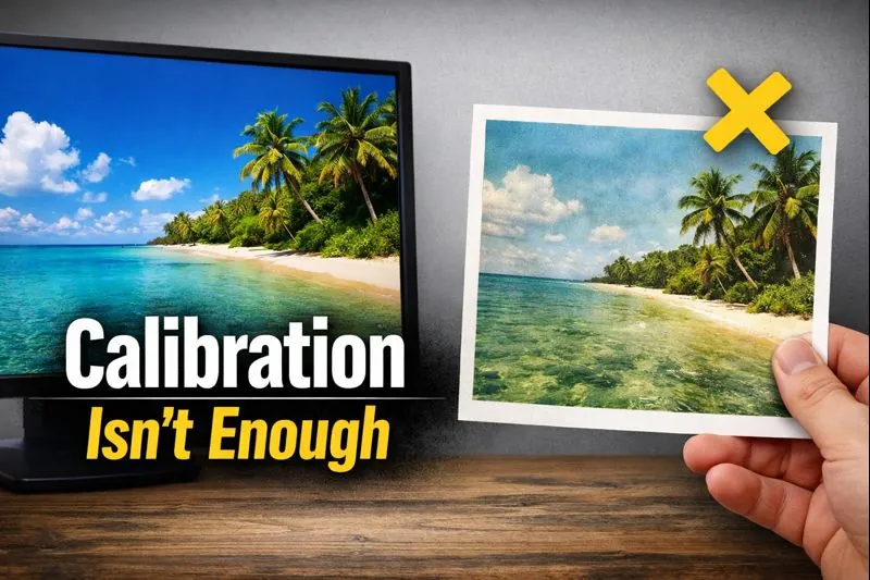
Screen Calibration Tips to Fix Sublimation Color Mismatch
Most sublimation color problems don’t start at the printer.
They start right in front of your face.
If your screen is lying to you, every design decision you make after that is already off. We’ve seen people tweak ICC profiles, reprint charts, even swap inks, when the real issue was a too-bright, too-blue display from day one.
This is why color troubleshooting should always begin before printer changes, something we also break down in our deeper sublimation printing troubleshooting guide.
Why Your Screen Is the First Cause of Sublimation Color Mismatch
Here’s the simple truth.
You can’t judge color accurately if the thing showing you the color is wrong.
Your monitor controls how bright, warm, cool, and contrast-heavy your design looks. Sublimation just transfers what you send, it doesn’t correct bad expectations.
That’s why screen calibration should happen before:
- ICC profile changes
- Printer setting tweaks
- Heat press experiments
If your screen is off, you’re solving the wrong problem.
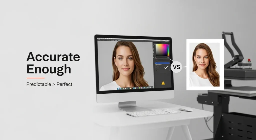
What “Accurate Enough” Color Really Means for Sublimation
Quick reset.
Perfect screen-to-press color matching doesn’t exist.
Sublimation ink looks different:
- On backlit screens
- On paper
- After heat activates the dye
So “accurate” really means:
- Skin tones aren’t radioactive
- Reds aren’t orange
- Grays don’t turn green
- What you see is predictable, not surprising
Chasing perfection usually leads to overcorrection. The goal is consistency you can trust, not lab-grade color science.
Brightness Settings That Make Sublimation Prints Look Washed Out
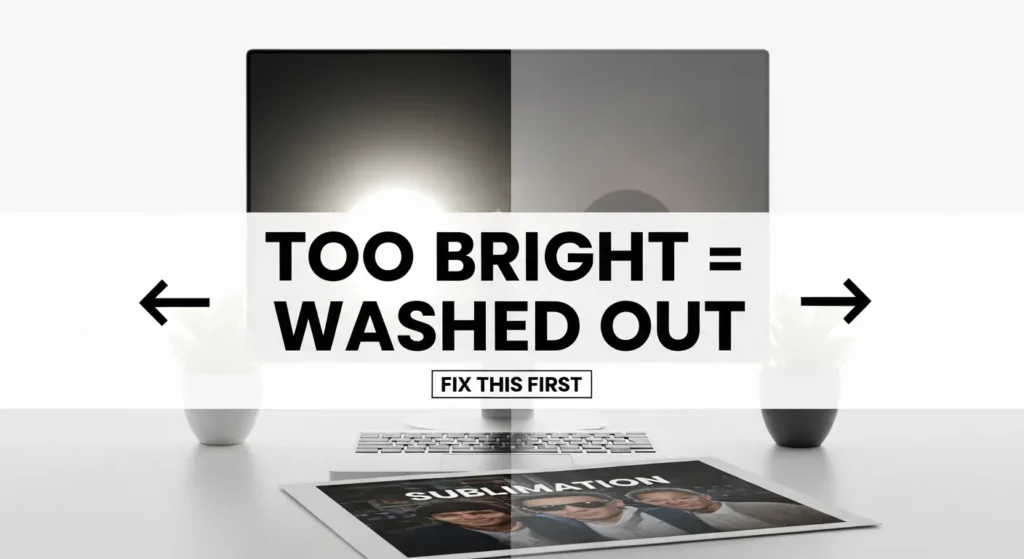
This is the biggest offender.
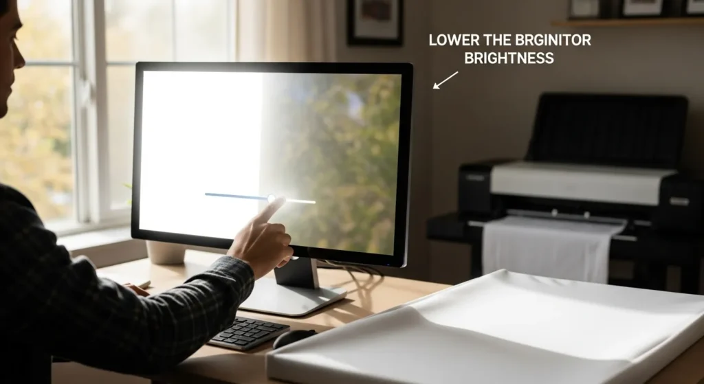
Most monitors ship way too bright, especially laptops and newer displays. When your screen is cranked up:
- Designs look vibrant on-screen
- Prints come out flat and faded
- You assume ink coverage is the issue
What’s actually happening is your screen is exaggerating brightness your printer can’t reproduce.
Fix this first:
- Lower brightness until white isn’t glowing
- Text on white should look comfortable, not blinding
- If your screen looks slightly dull at first, you’re probably closer to correct
Washed-out prints almost always start here.
Color Temperature and Why Cool Screens Ruin Warm Tones
Most screens default to a cool, blue-heavy color temperature.
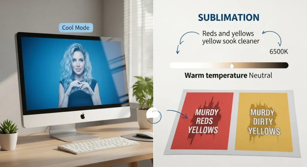
That makes:
- Whites look crisp
- Blues pop
- Reds, yellows, and skin tones look cleaner than they really are
Then you press the design and suddenly:
- Reds go muddy
- Yellows look dirty
- Faces turn orange or gray
That’s because your screen was compensating with extra blue.
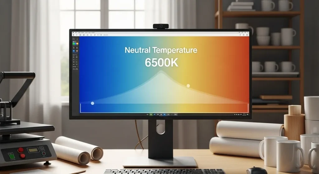
Aim for:
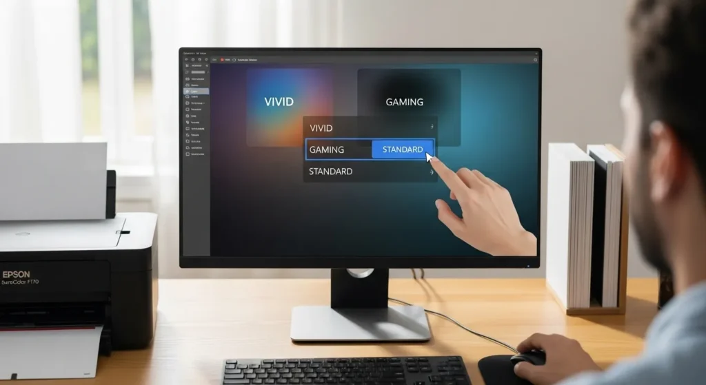
- A neutral or warm preset
- Avoid “Cool”, “Vivid”, or “Gaming” modes
- If you see options like 6500K or “Standard”, start there
Warm tones live or die by this setting.
Contrast and Shadow Detail That Disappear After Pressing
Ever lose details in dark designs after pressing?
That’s usually contrast.
High contrast screens make blacks look deep and dramatic. Sublimation can’t always hold that same shadow range, especially on fabric.
Results:
- Blacks crush together
- Dark gradients disappear
- Fine detail vanishes
To fix it:
- Reduce contrast slightly
- Make sure you can see detail in dark gray areas
- If shadows look flat on screen, they’ll vanish in print
Designing with visible shadow detail saves reprints.
Resolution and Scaling Settings That Affect Design Sharpness
This one’s sneaky.
Operating system scaling and display resolution affect how sharp your design appears, not how it actually prints.
Common issues:
- UI scaling at 125% or 150%
- Designing zoomed in without realizing it
- Assuming softness is a print issue
Best practice:
- Work at 100% scaling when possible
- View designs at actual size before exporting
- Don’t rely on zoomed-in clarity
Screen sharpness can fake you out.
Screen calibration is just one piece of the workflow, especially when you’re dealing with broader sublimation color problems and fixes.
How to Calibrate Your Screen Without Professional Equipment
You don’t need expensive hardware to get most of the way there.
Here’s a realistic DIY approach that works for sublimation shops.
➡️ Reset your display to factory or “Standard” mode
➡️ Disable dynamic contrast, vivid, or enhancement settings
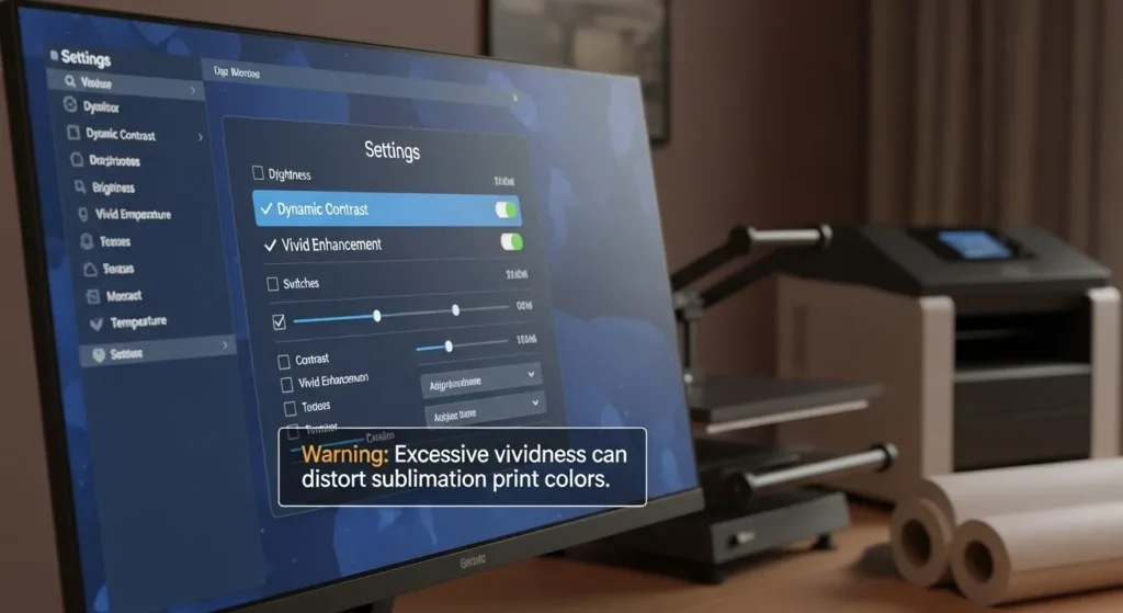
➡️ Lower brightness until white feels natural
➡️ Set color temperature to neutral or warm
➡️ Use your operating system’s built-in calibration tool
This won’t make your screen perfect, but it’ll stop it from actively sabotaging you.
Quick Visual Test to Check If Your Screen Is Still Lying
Here’s a fast reality check.
Open:
- A grayscale gradient
- A photo with skin tones
- A design you’ve already sublimated successfully
If:
- Grays look tinted
- Skin looks overly pink or gray
- Known-good prints don’t match at all
Your screen still needs adjustment.
This test is simple, but it catches most calibration problems instantly.
What Screen Calibration Can’t Fix in Sublimation Printing
This part matters.
Screen calibration won’t fix:
- Wrong ICC profiles
- Low-quality sublimation paper
- Incorrect press temperature or time
- Polyester content issues
- Coating quality on blanks
Calibration sets expectations.
Printing settings deliver results.
Once your screen is honest, troubleshooting gets way faster because you’re no longer guessing where the problem started.
If your screen looks right but prints still feel off, a sublimation color chart reveals where the mismatch actually happens.
FAQs
Can I skip screen calibration if my prints look okay?
You can, but you’re building habits on luck, not control.
Do I need a calibration device for sublimation?
No, software calibration gets you most of the benefit for this workflow.
Is it normal for prints to look different than the screen?
Yes. Predictable difference is normal. Surprising difference means something’s off.
Should I recalibrate my screen often?
Anytime lighting changes, displays age, or you notice color drift.