
Sublimation Color Chart Made Simple: Match Colors Before You Press
Struggling with color inaccuracies in your sublimation prints? Download our free sublimation color charts, including CMYK and Epson-specific PDFs, to achieve vibrant and consistent results. Resolve color challenges with our printable charts, sublimation color codes, and expert test print resources today.
Sublimation Color Chart – Get Accurate Colors on Every Print
If your sublimation prints don’t match your screen design, you’re not alone. Color shifts happen, but they don’t have to ruin your work.
Quick Fix: Grab our free chart to see exactly how colors will look on your material before you print.
Color charts allow you to visualize how colors will appear on different materials and help to fine-tune your workflow.
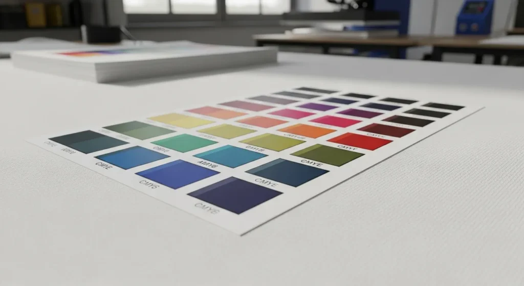
Sublimation Color Chart Printable

- Visualizing Final Colors: A printable color chart shows how various colors transfer to your specific substrate, helping you predict the outcome more accurately.
- Saving Time and Resources: Instead of trial-and-error with each design, use a chart to match colors efficiently, reducing wasted materials.
- Customizing for Your Setup: A printed chart tailored to your printer, ink, and material ensures you work with realistic expectations of your equipment’s capabilities.
Sublimation Color Chart PDF:
- Download Convenience: Sublimation color charts in PDF format are readily available online, making them easy to access and print.
- Compatibility Across Devices: PDFs ensure consistent formatting and accurate colors when viewed on calibrated monitors or printed.
- How to Use:
- Print the chart using your sublimation printer.
- Heat press the chart onto your material.
- Use the transferred colors as a reference for future designs.
CMYK Sublimation Color Chart PDF: Matching Screen Colors with Printed Results
- RGB to CMYK Challenges: Since sublimation printers often interpret RGB designs as CMYK outputs, a CMYK color chart bridges this gap.
- Improving Color Consistency: By referencing a CMYK chart, you can adjust designs to achieve colors closer to what you envision on screen.
- How to Apply It:
- Use the CMYK chart to pick colors directly for your design.
- Match these choices with the closest achievable colors in your printer’s gamut.
Why You Need a Sublimation Color Chart
- Predict color results: See exactly how each color will appear on your chosen material before printing.
- Save materials: Reduce trial-and-error and avoid wasting ink, paper, and blanks.
- Stay consistent: Keep colors accurate across multiple projects and reorders.
How to Print & Use It

1. Print the Chart
- Use a high-quality printer compatible with sublimation.
- Set resolution to 300 DPI and disable scaling.
- Select the correct ICC profile for your printer and ink.
2. Press Onto Fabric
- Choose 100% polyester fabric or polymer-coated material.
- Heat press at 385°F (196°C) for 60 seconds with medium pressure.
- Let it cool completely before handling.
3. Reference During Design
- Place the printed chart near your workstation.
- Compare on-screen colors to the chart under neutral lighting.
- Match design colors to the closest swatch for predictable results.
4. Maintain Accuracy
- Store charts in a dry, dark place to prevent fading.
- Label each chart with printer, ink, and date.
- Reprint charts after switching ink, paper, or printer models.
How Sublimation Color Charts Are Made
A sublimation color chart only works if it’s created the same way you actually print.
A real sublimation color chart isn’t just software-generated. It’s made through the full sublimation process so the colors reflect real-world results.
- Printed with real sublimation ink, not simulated CMYK values, so the chart shows true ink behavior under heat.
- Heat pressed with proper temperature and pressure, because colors don’t fully exist until sublimation activates them.
- Tested on actual substrates, like polyester fabric or coated blanks, since materials directly affect final color.
Why Generic CMYK Charts Aren’t Enough
Standard CMYK charts are built for traditional printing. They don’t account for heat activation, ink gas conversion, or material bonding. That’s why sublimation color accuracy comes from physical testing, not formulas alone.
A true sublimation color chart bridges the gap between screen colors and finished prints.
Sublimation Color Chart vs Manual Color Correction
Color charts help you choose colors. Manual correction helps you fix them.
When a Color Chart Is Enough
A sublimation color chart works great when:
- You’re picking colors for new designs
- You want to see how colors really print before pressing
- Your printer settings and ICC profile stay consistent
- You’re matching previous successful prints
In these cases, the chart acts like a visual shortcut. You see the result before you commit.
When Manual Color Correction Is Required
Color charts help you choose colors. Manual correction helps you adjust them.
When a Color Chart Is Enough
Use a sublimation color chart when:
- You’re selecting colors for new designs
- You want to preview how colors print after pressing
- Your printer, ink, and ICC profile stay the same
- You’re matching previous successful prints
A chart works as a visual reference so you know the result before printing.
When Manual Color Correction Is Needed
Manual adjustment is required when:
- Prints look too dark, dull, or oversaturated
- You need to match a specific brand color
- You change ink, printer, paper, or ICC profile
This involves adjusting brightness, contrast, or color balance in your design software.
The Key Point
Color charts don’t fix colors.
They help you predict results and decide what adjustments are needed.
Online Color Matching vs Printed Sublimation Charts
Online tools are fast. Printed charts are accurate. Use online tools to move fast. Use printed charts to get it right.
| Factor | Online Color Matching Tools | Printed Sublimation Color Charts |
|---|---|---|
| Speed | Very fast, instant previews | Slower, requires printing and pressing |
| Accuracy | Approximate, screen-based | High, shows real sublimated results |
| Best Stage | Design and planning | Production and final approval |
| Material Awareness | None, screen only | Tested on real fabrics or blanks |
| Ink & Heat Impact | Not included | Fully reflected |
| Consistency for Reorders | Low | High |
| Client Proofing | Helpful for concepts | Best for final sign-off |
| Risk of Color Surprises | High | Very low |
When to Use Online Color Matching Tools
- Brainstorming designs
- Exploring color options
- Early client discussions
When to Rely on Printed Sublimation Charts
- Final color approval
- Matching brand or logo colors
- Repeat orders and bulk production
Why Lighting Affects Sublimation Colors
Lighting changes how colors look, not the print itself.
- Daylight shows the most accurate colors
- Indoor lighting can shift prints warmer or cooler
- The same print may look different in different rooms
Best practice: Check finished prints in natural light and view them from a normal distance.
Downloadable Resources
Get these ready-to-use sublimation color charts and references. Each file is optimized for accurate color output and easy printing.
| Resource | Format | Best Print Settings |
|---|---|---|
| PDF CMYK Chart | Print at 300 DPI, High Quality, No Scaling | |
| PDF Epson-Specific Chart | Epson ICC Profile, High Quality, 100% Scale | |
| RGB Hex Reference Chart | Color-Managed Print, Use ICC Profile | |
| Printer-Ready ICC Profile Chart | Match with supplied ICC profile for printer/ink combo |
Printer & Ink Compatibility Table
This chart works across most sublimation printers and ink types.
For the best results, match the ICC profile and print settings to your exact setup.
| Printer Brand / Model | Ink Type | Works With Chart | Recommended ICC Profile Source | Notes |
|---|---|---|---|---|
| Sawgrass SG500 / SG1000 | Sawgrass SubliJet UHD | ✅ Yes | Sawgrass Print Manager | Use default high-quality setting |
| Epson F170 / F570 | Epson DS Sublimation | ✅ Yes | Epson Support Site | Disable color correction in driver |
| Epson EcoTank (converted) | Hiipoo Sublimation Ink | ✅ Yes | Ink Manufacturer Website | Print at 300 DPI, High Quality mode |
| Ricoh SG3110DN / SG7100 | SubliJet-R Ink | ✅ Yes | Sawgrass ICC Profiles | Avoid scaling in print dialog |
| Mutoh RJ-900X | Mutoh Sublimation Ink | ✅ Yes | Mutoh ICC Library | Ideal for larger format projects |

Tips on Managing Printer Maintenance, Ink Quality, and Materials
- Clean print heads weekly: A quick clean can prevent 90% of print quality issues.
- Check ink levels daily: Running low on ink can cause color shifts. Stay topped up!
- Use manufacturer-recommended inks: Off-brand might save a buck, but it could cost you in quality.
When it comes to materials, keep in mind that garbage in and garbage out. Here’s a quick comparison of the quality of materials and their impact:
Material Quality | Color Vibrancy | Longevity | Cost-Effectiveness |
|---|---|---|---|
Premium | Excellent | 5+ years | High initial cost, better long-term value |
Standard | Good | 2-3 years | Moderate cost, suitable for most projects |
Economy | Fair | 6-12 months | Low cost, best for short-term use |
Pro Tips for Consistency
- Calibrate monthly – Regularly check your monitor and printer settings to keep colors stable.
- Keep separate charts – Store a printed color chart for each fabric type or coated surface.
- Update after ink changes – Reprint the chart whenever you switch to a new ink brand or formula.
CMYK vs RGB in Sublimation

The Conversion Challenge
Design software often uses RGB for on-screen colors. Printers translate these to CMYK inks. This shift changes how colors appear, especially vibrant tones like neons and deep blues.
Why Screens Mislead
Monitors emit light, making colors appear brighter. Printed colors rely on pigment, which can’t reproduce certain digital shades. The result? Your perfect teal on screen turns dull in print.
How a Color Chart Helps
A sublimation color chart shows the actual printed output for each color code. By comparing your design to the chart, you can choose shades that print exactly as intended. This minimizes trial-and-error and saves ink, time, and blanks.
How Fabric and Substrate Choice Changes Sublimation Colors
The same color never looks identical on every material.
100% Polyester vs Blends
- 100% polyester gives the brightest, truest colors
- Poly blends reduce vibrancy as cotton content increases
The more polyester, the closer the result matches the chart.
White vs Off-White Materials
- Bright white materials reflect color better
- Off-white or cream fabrics mute colors and add warmth
Even small tone differences change the final look.
Coated Blanks vs Fabrics
- Coated hard blanks often appear sharper and more vibrant
- Fabrics absorb ink differently, softening some colors
This is why mugs, metal, and shirts never match perfectly.
Why Charts Should Be Tested Per Material
A single chart can’t represent every surface.
For best results, test charts on the materials you use most.
If your printed results still feel off, this guide on troubleshooting sublimation color problems explains the most common causes and how to fix them before adjusting your workflow.


This color chart guide fixed my washed out reds instantly. The test print PDF saved me hours, highly recommend grabbing it!