Sublimation Color Swatches and Palettes Explained Without Guesswork
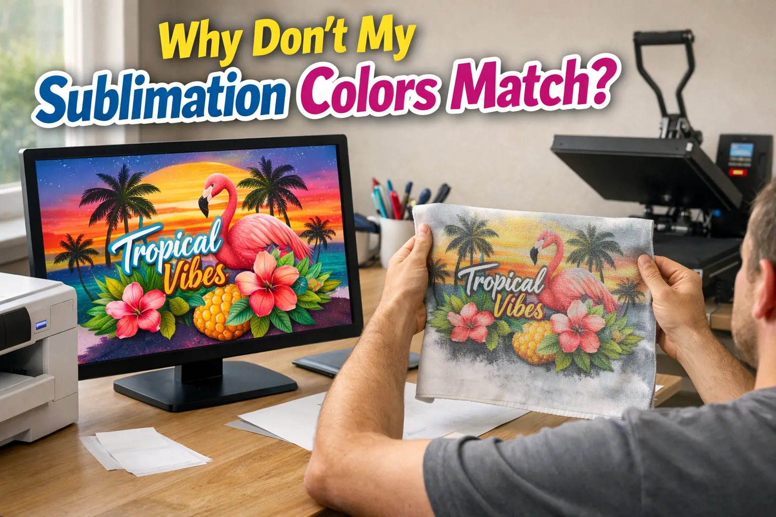
If your sublimation colors never look the way you expect, the problem usually isn’t your printer, it’s that you’re designing without knowing how colors actually transfer.
Most people rely on screen colors and hope for the best, and that’s why results feel inconsistent.
Sublimation color swatches and palettes exist to remove that guesswork, but they’re often explained poorly or treated like optional extras. That leaves beginners and small business owners unsure what to trust before pressing.
If your finished prints often look muted or off compared to your screen, this issue is directly tied to color behavior after pressing
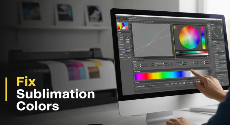
Why Sublimation Colors Look Dull and How to Fix It
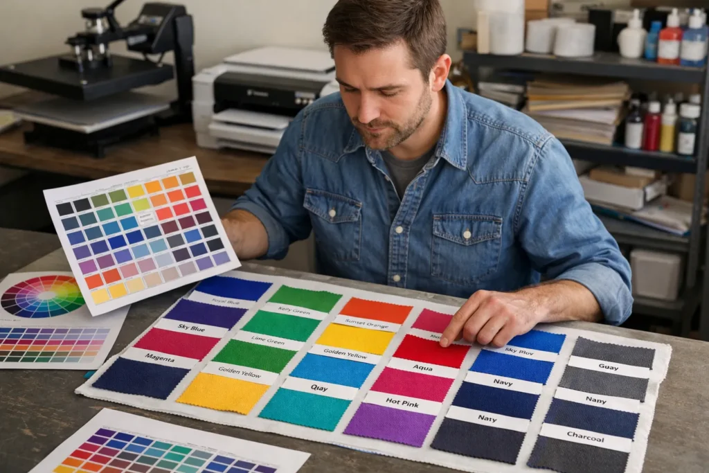
What Sublimation Color Swatches Actually Represent
Sublimation color swatches are printed color samples, not digital references. They show how ink behaves after heat, pressure, and time interact with a real surface.
This matters because sublimation ink turns into gas and bonds with coatings or fibers. That process changes color in ways your screen can’t preview.
Swatches answer one critical question before you press, what will this color actually look like when it’s finished?
They don’t promise perfection. They provide reliability.
What Sublimation Color Palettes Are and Where They’re Used
Color palettes exist on the design side.
A sublimation color palette is a set of digital colors chosen for stability, not appearance alone. Designers use palettes to avoid colors that are known to shift badly during sublimation.
Palettes help reduce risk early.
Swatches confirm results later.
That distinction is where most explanations fall apart online.
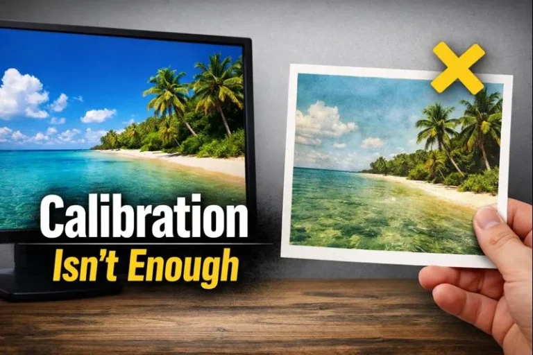
Why Screen Colors Can’t Be Trusted for Sublimation
Screens use light. Sublimation uses dye and heat.
Even with good software settings, your screen can only simulate color. Heat press variables, material coatings, and ink limits all affect the final result.
That’s why relying on screen previews alone leads to wasted blanks and frustration.
This is also why swatches exist at all, to show reality, not theory.
How Swatches and Palettes Work Together in a Sublimation Workflow
Palettes guide your design choices.
Swatches verify your production results.
Used together, they remove most of the guesswork from sublimation color decisions.
If you want a deeper look at how printed color references are built and used, this guide connects directly to this workflow without turning this page into a tutorial
Sublimation Color Chart Made Simple: Match Colors Before You Press
Why Different Materials Change the Same Sublimation Colors
The same color file will look different on polyester, ceramic, metal, or coated wood.
That’s normal.
Each surface absorbs dye differently and reflects light in its own way. Even blanks from different suppliers can shift color slightly.
This is why serious consistency comes from matching swatches to your materials, not just your printer.
When You Need Swatches and When You Don’t
You don’t need swatches for casual testing or one-off crafts.
But once color accuracy matters, swatches stop being optional.
If you sell sublimation products, repeat designs, or want predictable results across orders, swatches are what close the gap between expectation and reality.
Material choice plays a major role in this decision, and understanding how blanks affect color helps you decide when swatches become essential: Sublimation Blanks and Substrates Explained
FAQs:
Do I really need sublimation color swatches?
If color accuracy matters, yes. Swatches show how colors actually look after pressing, not how they appear on screen.
Are sublimation color palettes the same as swatches?
No. Palettes guide color choices during design, while swatches confirm final color results after heat and transfer.
Can ICC profiles replace color swatches?
No. ICC profiles help improve accuracy, but swatches are the only way to see real, pressed color output.
Why do the same sublimation colors look different on different products?
Materials absorb and reflect dye differently, so the same color can shift depending on the blank and coating.
Are color swatches only for advanced or professional users?
No. Anyone selling sublimation products or repeating designs benefits from swatches because they reduce guesswork and waste.
If colors still look off after calibration, your ICC profile for sublimation is the next place to check.