3 Before-and-After Color Chart Comparisons That Will Change Your Prints
Color accuracy in sublimation printing depends on how well your monitor display matches your final print. Small differences in ICC profiles, printer settings, or material coating can produce noticeable shifts.
These before-and-after color chart comparisons show how setup changes can impact results.
Why Compare Before-and-After Color Charts?
- Helps identify color shifts caused by printer settings or materials.
- Reveals the impact of ICC profiles on vibrancy and accuracy.
- Saves time by minimizing trial-and-error.
- Creates a baseline for consistent future prints.
Comparison 1: Without vs. With ICC Profile
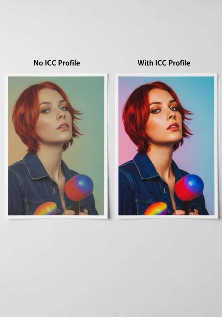
ICC profiles translate digital colors into printer-friendly values, reducing mismatches.
| Test Condition | Observations (Before) | Observations (After) |
|---|---|---|
| No ICC Profile | Colors appeared muted, reds leaned toward orange | Colors matched screen reference closely, improved saturation |
| Printer: Epson ET-15000 | Washed-out blues, skin tones less natural | Balanced tones, better shadow details |
| Substrate: 100% polyester | Color fade after washing | Maintained vibrancy after washing |
Tip: Always download ICC profiles specific to your printer, ink, and paper combination.
Comparison 2: Standard vs. High-Quality Print Mode
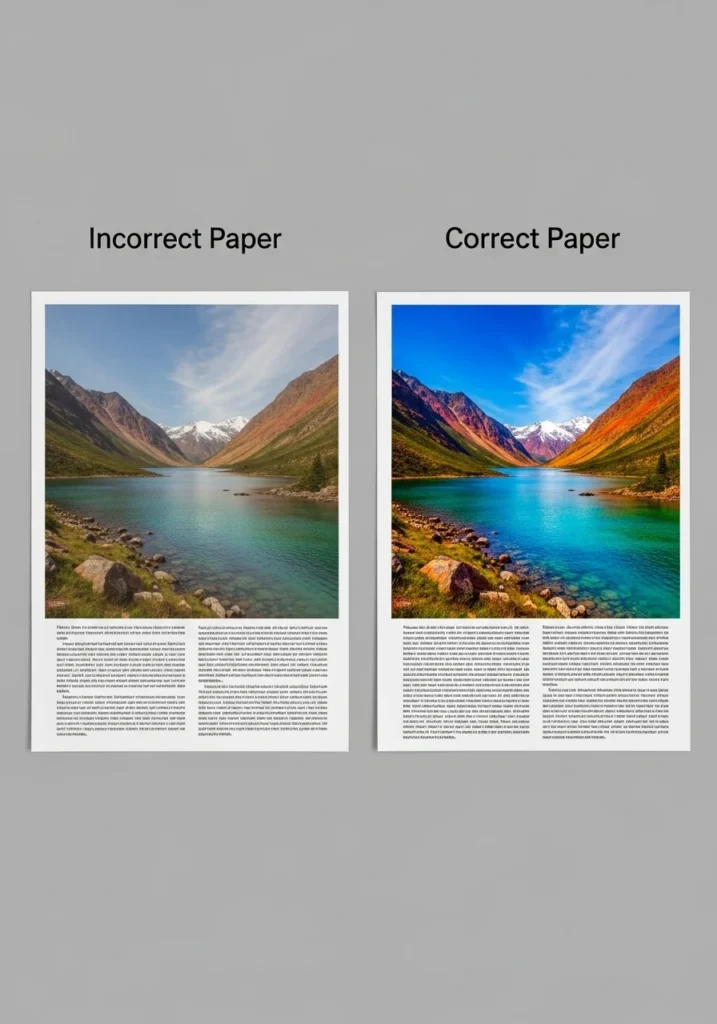
Print mode settings influence ink density and precision.
| Test Condition | Observations (Before) | Observations (After) |
|---|---|---|
| Standard Mode | Faster print speed but visible banding in gradients | Smooth gradients, deeper blacks |
| Printer: Sawgrass SG500 | Color transitions looked abrupt | Better blending, no harsh edges |
| Paper: A-Sub 125g | Slight color bleed | Crisp edges and clean lines |
Tip: Use high-quality mode for final prints, especially for detailed designs or photography.
Comparison 3: Incorrect vs. Correct Heat Press Settings

Time, temperature, and pressure control how ink bonds to the substrate.
| Test Condition | Observations (Before) | Observations (After) |
|---|---|---|
| Press: 350°F, 40 sec | Dull colors, incomplete transfer | Full, even color transfer |
| Material: Ceramic mug (poly-coated) | Patchy areas, white spots | Consistent coverage |
| Pressure: Medium | Uneven tones at edges | Even saturation across surface |
Tip: Always follow substrate manufacturer guidelines for press settings.
Practical Tips for Accurate Color Matching
- Print a reference chart before starting production runs.
- Use color calibration tools to align monitor and printer output.
- Test on the actual substrate before finalizing designs.
- Store inks and papers properly to avoid environmental degradation.
- Document your settings to repeat results reliably.
Professional Sublimation Printing & Wholesale Custom Products
Looking for high-quality sublimation printing for apparel, drinkware, and promotional items? Subli Genius Print delivers vibrant color, sharp detail, and long-lasting results for businesses, brands, and resellers across the U.S.