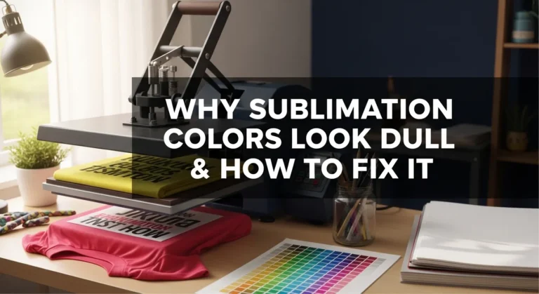
Why Sublimation Prints Look Better After Pressing
Sublimation prints look better after pressing because heat activates the dye and permanently bonds it with polyester or coated surfaces.
If your transfers still look faded after pressing, the issue is usually related to heat settings, materials, pressure, or color management rather than the printer itself.
Once your workflow becomes consistent, you will notice much sharper details, stronger blacks, and more vibrant sublimation colors across all your projects.
Why Sublimation Prints Change Color After Pressing
Sublimation printing works differently from standard inkjet printing. The colors you see on sublimation paper are only part of the process.
When heat and pressure are applied, sublimation ink changes from a solid into gas and permanently bonds with polyester fibers or polymer-coated surfaces. This heat activation process is what creates the final bright appearance.
That is why sublimation prints almost always look better after pressing.
Why Sublimation Paper Never Shows Final Colors Accurately
Sublimation transfer paper is designed to hold ink temporarily, not display final colors accurately.
Before pressing, you may notice:
- dull blacks
- faded reds
- gray-looking dark areas
- muted blues
- washed-out skin tones
This is completely normal in most sublimation workflows.
The transfer paper only carries the sublimation dye until heat activates it. Once the dye bonds with the blank material, the colors become more saturated and vibrant.
Many beginners think something is wrong with their printer when they first see faded transfer sheets. In reality, the print usually transforms during pressing.
What Happens to Sublimation Ink During Heat Pressing
During heat pressing, sublimation ink goes through a chemical change.
The process looks like this:
- Heat raises the ink temperature
- Sublimation dye converts into gas
- Polyester fibers open under heat
- Dye enters the material surface
- Fibers cool and trap the color permanently
Because the dye becomes part of the material instead of sitting on top of it, sublimation prints often appear brighter, smoother, and more detailed after pressing.
This is also why sublimation designs resist cracking or peeling better than many vinyl or transfer methods.
Why Some Sublimation Prints Still Look Dull After Pressing
If your sublimation transfer still looks faded after pressing, the issue is usually related to settings, materials, or color management. Common troubleshooting concerns also appear repeatedly throughout search results and community discussions.
A common sublimation mistake is assuming heat alone fixes everything. Vibrant results depend on several workflow factors working together.
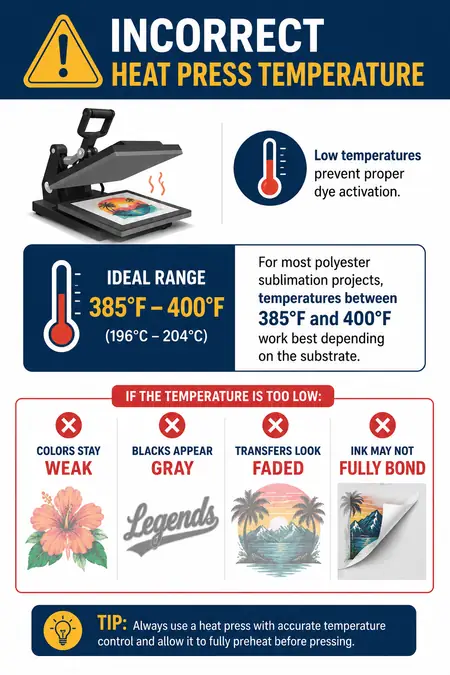
Incorrect Heat Press Temperature
Low temperatures prevent proper dye activation.
For most polyester sublimation projects, temperatures between 385°F and 400°F work best depending on the substrate.
If the temperature is too low:
- colors stay weak
- blacks appear gray
- transfers look faded
- ink may not fully bond
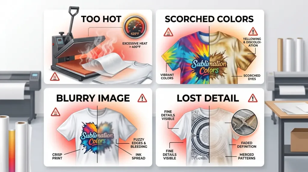
If the temperature is too high:
- colors can scorch
- images may look blurry
- over-gassing can reduce detail
You can improve consistency by following proper sublimation heat press settings.
Wrong Pressure or Pressing Time
Pressure matters just as much as heat.
Too little pressure can create uneven color transfer, while excessive pressure sometimes causes ghosting or blurry edges.
Signs of under-pressed sublimation include:
- patchy colors
- weak blacks
- inconsistent saturation
- faded edges
Most sublimation blanks also require specific pressing times. Even a 20–30 second difference can affect final color quality.
Poor ICC Profile or Color Management
Color management problems are one of the biggest causes of dull sublimation prints.
If your printer uses the wrong ICC profile, colors may shift dramatically after pressing.
You may notice:
- greenish blues
- weak reds
- muddy dark tones
- oversaturated skin colors
Proper ICC profiles for sublimation printing help your printer translate digital colors more accurately during the sublimation transfer process.
Many beginners also accidentally mix RGB and CMYK workflows, which can affect final print vibrancy.
Low Polyester Content or Incorrect Blank Material
Sublimation works best on polyester fabrics or polymer-coated blanks.
The higher the polyester content, the brighter the colors usually appear.
For example:
| Material | Expected Vibrancy |
|---|---|
| 100% Polyester | Excellent |
| 65% Polyester Blend | Moderate |
| Cotton | Very Faded |
| Dark Fabrics | Poor without special methods |
If you are unsure about material compatibility, review this sublimation material guide.
Low-Quality Sublimation Paper or Ink
Cheap sublimation supplies often produce weaker transfers.
Low-quality paper may hold too much ink instead of releasing it efficiently during pressing.
Poor-quality ink can also create:
- dull colors
- inconsistent saturation
- weak black tones
- reduced sharpness
In most sublimation setups, better paper and proper printer settings noticeably improve final color depth.
How to Get More Vibrant Sublimation Prints Every Time
Consistent sublimation results come from workflow control, not guesswork.
Use the Correct Heat Press Settings
Always match the blank manufacturer’s recommendations whenever possible.
Pay attention to:
- temperature
- pressure
- pressing time
- heat distribution
Even slight variations in heat press calibration can affect final color vibrancy.
Print Using High-Quality Settings
Many beginners accidentally print using standard or draft quality settings.
Using “Best Quality” print mode increases ink coverage and improves color saturation before transfer.
This often creates:
- stronger blacks
- brighter reds
- smoother gradients
- sharper detail
Use Proper ICC Profiles
A properly configured ICC profile helps your sublimation printer reproduce accurate colors.
If your colors consistently look wrong after pressing, test:
- different ICC profiles
- printer driver settings
- paper compatibility
- color correction settings
You can also learn more about fixing sublimation color accuracy.
Pre-Press Your Blanks
Moisture inside fabric can interfere with dye transfer.
Pre-pressing removes:
- moisture
- wrinkles
- trapped air
This helps improve color consistency and sharpness.
A quick 5–10 second pre-press is often enough for polyester shirts.
Test Small Before Large Production
Experienced sublimation users rarely trust settings blindly.
Different blanks react differently even when using the same printer, paper, and heat press.
Small test prints help you catch:
- color shifts
- overheating
- pressure problems
- substrate compatibility issues
Testing saves time, ink, and ruined blanks.
Common Myths About Sublimation Colors
“My Printer Is Broken Because Prints Look Dull”
This is one of the most common beginner concerns.
Sublimation transfer sheets almost always look less vibrant before pressing. The final appearance develops during heat activation.
“More Heat Always Means Better Colors”
Too much heat can actually damage sublimation colors.
Overheating may cause:
- faded blacks
- brownish tones
- blurry edges
- reduced detail
Balanced settings matter more than extreme heat.
“Any Fabric Works for Sublimation”
Sublimation is heavily dependent on polyester content.
Cotton absorbs sublimation dye poorly because the gas cannot permanently bond with natural fibers the same way it bonds with polyester.
That is why polyester fabrics produce the brightest results.
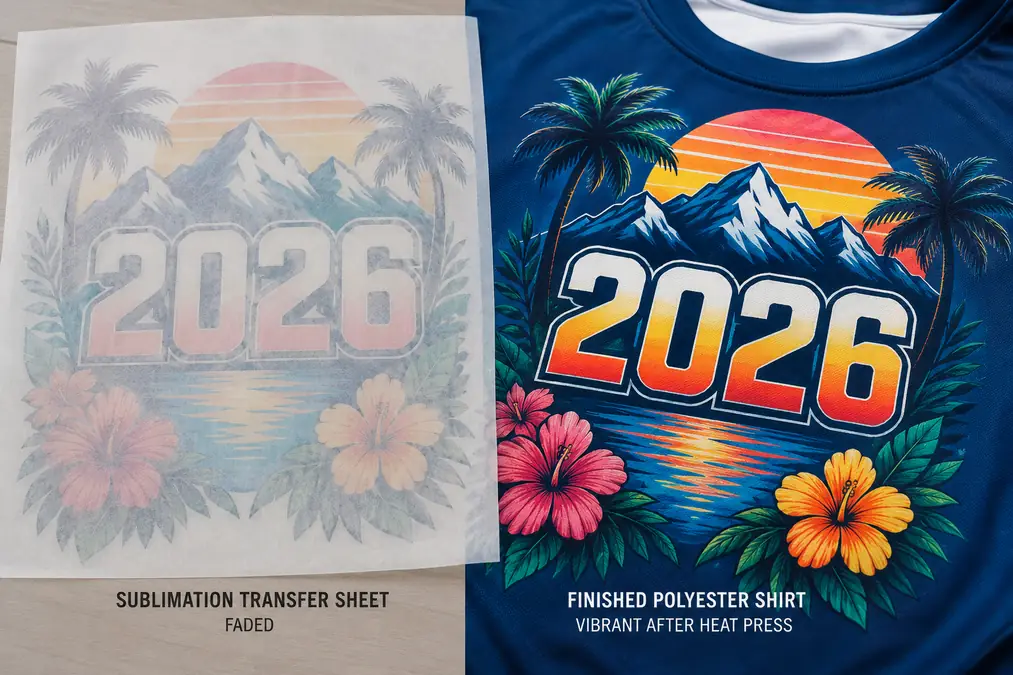
Before and After: What Good Sublimation Should Look Like
Before pressing, sublimation transfers usually appear:
- dull
- faded
- slightly gray
- low contrast
After pressing onto the correct material, the final result should look:
- vibrant
- sharp
- smooth
- deeply saturated
Good sublimation should not feel raised or textured because the dye becomes part of the substrate itself.
Best Materials for Bright Sublimation Results
Some materials naturally produce stronger sublimation colors than others.
The best options include:
- 100% polyester shirts
- polymer-coated mugs
- aluminum photo panels
- coated hardboard blanks
- polyester tumblers
- coated glass blanks
Higher-quality sublimation blanks usually provide better dye bonding and stronger color saturation.
Frequently Asked Questions
Why does sublimation look faded before pressing?
Sublimation ink is not fully activated until heat is applied. Transfer paper only holds the dye temporarily, so colors often appear dull before pressing.
Why are my sublimation colors dull after pressing?
Dull colors usually come from incorrect heat settings, poor ICC profiles, low polyester content, or weak ink saturation.
Can you over-press sublimation prints?
Yes. Too much heat or pressing time can reduce sharpness, distort colors, or scorch the material.
Does sublimation look brighter on polyester?
Yes. Polyester fibers bond much better with sublimation dye, which creates brighter and more vibrant colors.
Do ICC profiles affect sublimation color vibrancy?
Yes. Incorrect ICC profiles can create inaccurate or faded colors after pressing.
Why do sublimation prints look different on paper?
Transfer paper is only a carrier for sublimation ink. The final color appears after heat activates the dye and bonds it with the substrate.