Printers Jack Sublimation Color Chart: Free Printable Reference

Printers Jack sublimation colors can look very different on your monitor, on freshly printed transfer paper, and after heat pressing. For related planning, see Silhouette Studio for Sublimation.
That makes choosing an exact red, teal, blue, green, or skin tone harder than it should be.
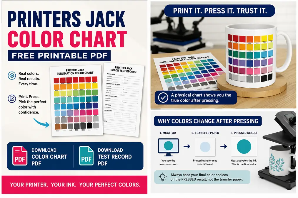
The Printers Jack color chart gives you a better reference. Print the chart using your normal Printers Jack ink setup, press it onto a white sublimation-compatible surface, and keep the finished chart beside your printer. For related planning, see Free Heart Fonts for Sublimation Shirts, Mugs, and Gifts.
The pressed swatches become the useful part. They show what your printer, ink, paper, color settings, substrate, and heat process actually produce.
Download: Printers Jack Sublimation Color Chart PDF
Download: Printers Jack Color Test Record
Important: Do not choose colors from the unpressed transfer sheet alone. Sublimation ink changes noticeably when activated by heat. Use the finished pressed chart as your working reference.
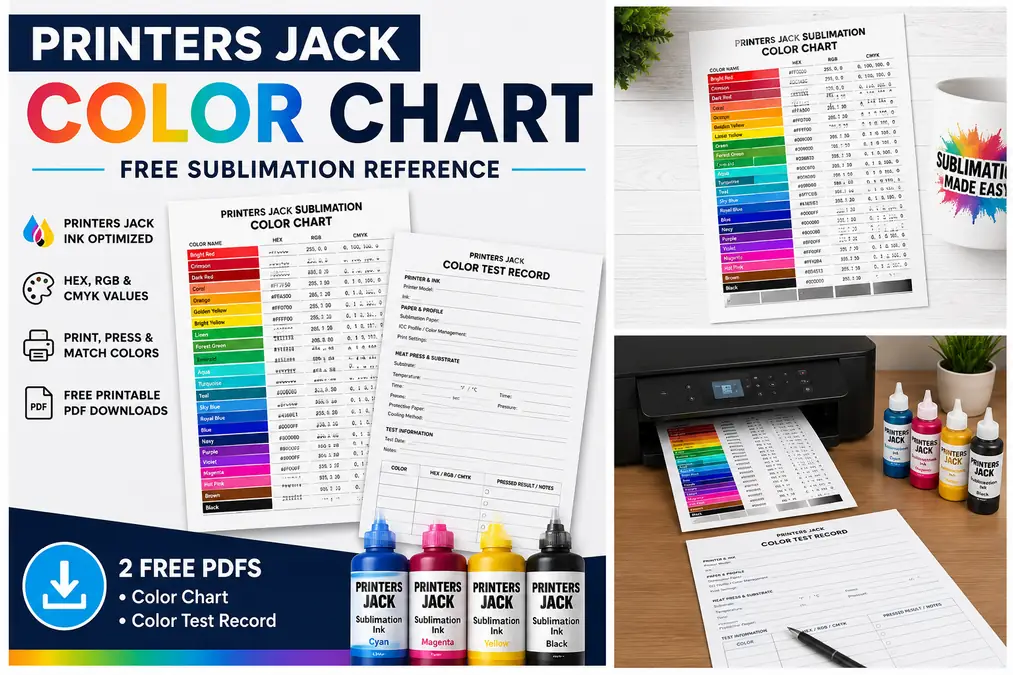
What’s Included in the Printers Jack Color Chart
The printable chart is designed as a practical production reference rather than a generic color wheel.
It includes:
- Color names
- HEX values
- RGB values
- CMYK reference values
- Common reds and pinks
- Cyan, aqua, turquoise, and teal
- Common blues and greens
- Neutral grays
- Dark shades and black
- Space for recording your printer setup
The values identify the digital color sent to the printer. They do not claim that every Printers Jack setup will produce an identical physical color.
That difference is exactly why the chart needs to be printed and pressed.
Core Color Reference
| Color | HEX | RGB | CMYK Reference |
|---|---|---|---|
| Bright Red | #FF0000 | 255, 0, 0 | 0, 100, 100, 0 |
| Crimson | #DC143C | 220, 20, 60 | 0, 91, 73, 14 |
| Dark Red | #8B0000 | 139, 0, 0 | 0, 100, 100, 45 |
| Coral | #FF7F50 | 255, 127, 80 | 0, 50, 69, 0 |
| Orange | #FFA500 | 255, 165, 0 | 0, 35, 100, 0 |
| Golden Yellow | #FFD700 | 255, 215, 0 | 0, 16, 100, 0 |
| Bright Yellow | #FFFF00 | 255, 255, 0 | 0, 0, 100, 0 |
| Lime | #00FF00 | 0, 255, 0 | 100, 0, 100, 0 |
| Green | #008000 | 0, 128, 0 | 100, 0, 100, 50 |
| Forest Green | #228B22 | 34, 139, 34 | 76, 0, 76, 45 |
| Emerald | #50C878 | 80, 200, 120 | 60, 0, 40, 22 |
| Aqua | #00FFFF | 0, 255, 255 | 100, 0, 0, 0 |
| Turquoise | #40E0D0 | 64, 224, 208 | 71, 0, 7, 12 |
| Teal | #008080 | 0, 128, 128 | 100, 0, 0, 50 |
| Sky Blue | #87CEEB | 135, 206, 235 | 43, 12, 0, 8 |
| Royal Blue | #4169E1 | 65, 105, 225 | 71, 53, 0, 12 |
| Blue | #0000FF | 0, 0, 255 | 100, 100, 0, 0 |
| Navy | #000080 | 0, 0, 128 | 100, 100, 0, 50 |
| Purple | #800080 | 128, 0, 128 | 0, 100, 0, 50 |
| Violet | #8F00FF | 143, 0, 255 | 44, 100, 0, 0 |
| Magenta | #FF00FF | 255, 0, 255 | 0, 100, 0, 0 |
| Hot Pink | #FF69B4 | 255, 105, 180 | 0, 59, 29, 0 |
| Brown | #8B4513 | 139, 69, 19 | 0, 50, 86, 45 |
| Black | #000000 | 0, 0, 0 | 0, 0, 0, 100 |
Use these as digital input references. Your pressed versions are the colors worth recording.
For a broader reference that is not tied to one ink brand, use the sublimation color chart.
Print and Press the Chart Before You Trust the Colors
The sheet coming out of your printer is only an intermediate step.
Sublimation dye is designed to develop under heat. A transfer that looks flat, dark, dull, or strange on paper can look very different once pressed.
Your useful workflow is:
digital color → printed transfer → pressed swatch → final color choice
Step 1: Print With Your Normal Printers Jack Setup
Do not create a special printer configuration just for the chart unless you plan to use that configuration for your normal projects.
Use the same:
- Printer
- Printers Jack ink
- Sublimation paper
- Print quality
- Color-management method
- Design software
- ICC profile, if used
A chart produced with settings you never use again will not be a useful production reference.
Also print at 100% or actual size rather than allowing the software to automatically resize the page.
Step 2: Press the Entire Chart
Press the chart onto a clean, white sublimation-compatible test surface.
A white surface is important because sublimation ink is transparent. The color underneath the transferred dye influences what you see.
For the most useful comparison, keep these variables consistent across the chart:
- Substrate
- Temperature
- Pressing time
- Pressure
- Protective paper
- Cooling method
Use the manufacturer-recommended settings for the test substrate rather than treating one temperature as correct for every material.
Step 3: Label the Finished Chart
Write the complete setup on the back of the pressed chart.
Record:
| Setting | Your Test |
|---|---|
| Printer | __________ |
| Ink | Printers Jack |
| Sublimation paper | __________ |
| ICC/profile | __________ |
| Design software | __________ |
| Print setting | __________ |
| Test substrate | __________ |
| Temperature | __________ |
| Time | __________ |
| Pressure | __________ |
| Date | __________ |
This simple record becomes especially useful months later when you change paper, install another profile, or start using a second printer.
Step 4: Pick Colors From the Pressed Swatches
Suppose you need a turquoise logo.
Instead of choosing turquoise from the monitor and hoping it transfers correctly:
- Look at the finished pressed chart.
- Find the physical turquoise closest to the color you want.
- Read the HEX, RGB, or CMYK reference beside that swatch.
- Enter that value into your design software.
- Print the production design using the same setup used for the chart.
This turns the chart into a repeatable color-selection tool.
Why Printers Jack Colors Can Look Wrong Before Pressing
The printer is not producing the finished product when it prints your transfer.
It is placing sublimation dye onto transfer paper so that the dye can later move into polyester fibers or a compatible coating under heat.
That creates three different visual stages:
1. Monitor
Light from the screen displays the digital color.
2. Transfer paper
The printer lays down sublimation dye, which can appear muted or different from the screen.
3. Pressed substrate
Heat activates the dye and the final color develops inside the compatible material or coating.
This is why changing your artwork because the transfer sheet “looks wrong” can make the final result worse.
If this part of the process is confusing, see why sublimation prints look better after pressing.
Why Turquoise May Look Blue or Purple
Turquoise, aqua, cyan, teal, and blue sit close together, but small changes in cyan and magenta can produce visibly different results.
If your turquoise transfer looks much bluer or more purple than expected, press the test first.
Then compare the finished swatches, not the unpressed paper.
If the pressed turquoise is still wrong, start troubleshooting the color workflow rather than repeatedly editing the design based on the transfer sheet.
Why Sublimation Prints Look Dull on Paper
A dull transfer does not automatically mean the print has failed.
Check the final pressed test before increasing saturation, changing the ICC profile, or adjusting individual channels.
If the pressed version is bright and accurate, there is nothing to fix.
Printers Jack Colors That Need Extra Testing
Some color families reveal color-management problems faster than others.
For that reason, the printable chart should contain several neighboring shades instead of only one red, one blue, and one green.
| Color family | If the result looks wrong | Compare these swatches |
|---|---|---|
| Red | Orange, coral, pink, too dark | Bright red, crimson, dark red, coral |
| Turquoise | Blue or purple | Aqua, turquoise, teal, cyan |
| Green | Too blue or dull | Lime, green, emerald, forest green |
| Blue | Purple, dark, muted | Sky blue, royal blue, blue, navy |
| Black | Brown, gray, weak | Black and gray test shades |
Red Presses Orange or Pink
Do not start by adding large manual amounts of magenta or yellow.
First compare several pressed reds.
For example, the bright red swatch may move warmer than expected while the crimson reference produces the physical red you actually need.
The winning digital value is the one attached to the pressed swatch closest to your target.
If every red on the chart is significantly wrong, the problem is probably broader than the individual color value.
Check:
- Nozzle condition
- Color-management settings
- ICC profile
- Paper
- Ink
- Substrate
- Pressing conditions
Turquoise, Cyan, and Teal Shift Toward Blue
These shades are good diagnostic colors because they make changes in cyan, blue, green, and magenta easy to notice.
Keep several adjacent swatches in the chart.
The goal is not to force your printer to reproduce the monitor perfectly. The practical goal is to learn which digital input gives you the physical result you need.
Greens Look Too Blue
Compare several greens rather than repeatedly changing the artwork.
Check:
- Lime
- Standard green
- Emerald
- Forest green
- Teal
If all of them show the same unwanted shift, investigate the print workflow.
If only one shade is unsuitable, choose a neighboring swatch instead.
Black Looks Brown, Gray, or Weak
Black can reveal problems with color management, nozzle performance, substrate quality, or pressing.
Add a neutral test strip to your physical chart containing:
- Black
- Near black
- Charcoal
- Medium gray
- Light gray
If neutral grays carry an obvious unwanted color tint after pressing, changing only the black artwork is unlikely to solve the underlying problem.
The sublimation color problems and fixes guide covers the wider troubleshooting process.
Does This Printers Jack Chart Work With Every Epson Printer?
You can print the test file with different compatible converted Epson setups, but the resulting physical chart belongs to the setup that produced it.
Do not assume a chart pressed from one printer represents every other printer.
| Variable | Can It Affect the Pressed Color? |
|---|---|
| Printer model | Yes |
| Ink | Yes |
| Sublimation paper | Yes |
| ICC profile | Yes |
| Driver settings | Yes |
| Design software/color management | Yes |
| Substrate | Yes |
| Heat and time | Yes |
For example, two people can print the exact same HEX value using Printers Jack ink but use different printers, paper, profiles, and substrates.
Their final results do not have to match perfectly.
That does not make the chart useless. It makes printing your own copy more important.
Your pressed chart becomes a reference for your actual production workflow rather than somebody else’s setup.
When Should You Reprint the Color Chart?
A color chart remains useful only while the workflow behind it stays reasonably consistent.
Print and press a fresh chart after a major change such as:
- Switching ink brands
- Moving to another printer
- Changing ICC profiles
- Making major color-management changes
- Switching to a substantially different sublimation paper
- Building a separate workflow for another substrate
- Seeing repeat jobs stop matching the existing chart
You do not need a new chart every time you replace an empty bottle with the same ink or open another pack of the same paper.
The goal is to document meaningful workflow changes, not create unnecessary test prints.
Keep Old Charts Instead of Throwing Them Away
Write the date and settings on every chart.
Older charts can help diagnose changes later.
For example:
Chart A: Printers Jack + Paper A + Profile A
Chart B: Printers Jack + Paper B + Profile A
If the same turquoise changes noticeably between the charts, you have narrowed the cause to one part of the workflow instead of guessing across ten variables.
Do You Need a Printers Jack ICC Profile With the Color Chart?
An ICC profile and a pressed color chart solve related problems, but they do different jobs.
| Tool | Main Job |
|---|---|
| ICC profile | Helps color-managed software translate digital colors for a specific printing workflow |
| Pressed color chart | Shows what your current physical workflow actually produces |
You can use both.
A properly matched ICC profile can improve the color-management process, while the pressed chart gives you a practical reference you can see and compare with the finished product.
Problems start when users install several profiles, switch driver settings, adjust color channels, change software settings, and change paper at the same time.
You then have no reliable way to identify what improved or damaged the result.
Change one major variable at a time, then print a new test.
For Printers Jack ICC information and installation guidance, use the sublimation ICC profile guide.
Keep the ICC troubleshooting there and use this page for the physical color-reference workflow.
What to Check When the Whole Color Chart Looks Wrong
A color chart helps you select colors. It cannot repair a printer or compensate for a failing print process.
If nearly every pressed swatch looks wrong, check the system before editing dozens of individual colors.
1. Run a Nozzle Check
Missing cyan, magenta, yellow, or black nozzles can change an entire section of the chart.
A partial cyan problem, for example, can affect blues, greens, turquoise, and many mixed colors at once.
Run a nozzle check before blaming the chart.
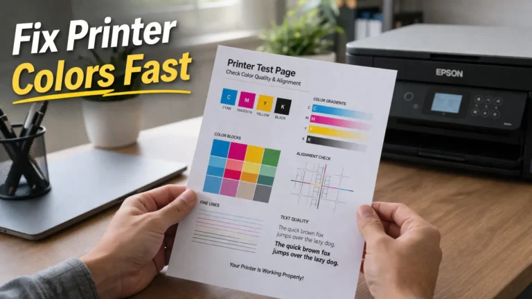
The printer test page guide explains how to diagnose missing lines, uneven output, and basic printer problems.
2. Check Your Color Management
Avoid accidentally applying two different correction systems to the same print.
A color-managed program, ICC profile, printer driver, and manual adjustment can interact with one another.
Use one repeatable workflow rather than stacking corrections until one test happens to look acceptable.
3. Confirm the Correct Side of the Sublimation Paper
Many sublimation papers have a printable side.
Printing on the wrong side can reduce transfer performance and create confusing results.
Check the paper manufacturer’s instructions if the correct side is not obvious.
4. Press the Test Before Correcting the Design
This deserves repeating because it prevents a large amount of wasted testing.
Do not judge sublimation color from the transfer sheet alone.
Press the sample first.
Then decide whether a color correction is actually necessary.
5. Change One Variable at a Time
Suppose your blues are wrong.
Changing all of these simultaneously will make troubleshooting much harder:
- ICC profile
- Paper setting
- Photoshop settings
- RGB values
- Press temperature
- Sublimation paper
Instead:
- Record the existing setup.
- Print and press a baseline.
- Change one variable.
- Print and press again.
- Compare the two results.
- Keep the better configuration or return to the baseline.
Your color-test record is useful here because it prevents you from forgetting which settings produced each chart.
Printers Jack Color Chart vs a Generic Sublimation Color Chart
Both resources are useful, but they serve different jobs.
| Generic Sublimation Color Chart | Printers Jack Color Chart |
|---|---|
| Broad sublimation reference | Printers Jack-specific testing workflow |
| Good for learning color selection | Good for building a Printers Jack production reference |
| Can be printed with many ink systems | Intended to be tested with Printers Jack ink |
| Establishes the color-chart method | Documents your specific Printers Jack results |
| Parent resource | Brand-specific reference |
Use the main sublimation color chart if you need the broader system or want to compare multiple workflows.
Use this page when Printers Jack ink is already part of your setup.
Build Your Own Printers Jack Color Library
One pressed chart is enough for many hobby users.
A small sublimation business may benefit from maintaining several clearly labeled charts.
The most useful split is usually by material, not by creating dozens of nearly identical sheets.
For example:
Polyester Fabric Chart
Use when most production is:
- Shirts
- Pillow covers
- Fabric panels
- Polyester accessories
Ceramic Chart
Use for compatible:
- Mugs
- Ornaments
- Tiles
- Ceramic blanks
Coated Metal Chart
Useful for:
- Aluminum signs
- Photo panels
- Name plates
- Metal ornaments
Do not assume that the physical appearance of a swatch on polyester will perfectly match the same digital color on another coated material.
Keep the digital values consistent and record the physical differences.
For more help building repeatable palettes, see sublimation color swatches and palettes.
Printers Jack Color Chart FAQs
Why do Printers Jack colors look different after pressing?
Sublimation dye is activated by heat. The printed transfer is an intermediate stage, so colors can appear muted or different before pressing. Judge important colors from a properly pressed test rather than the transfer paper alone.
Should I use RGB or CMYK with Printers Jack sublimation ink?
There is no universal RGB-versus-CMYK setting that guarantees the same result on every Printers Jack setup. Your software, printer driver, ICC profile, printer, and paper all affect color handling. The chart includes both references so you can identify and reproduce tested colors within your own workflow.
Why does my red sublimate orange or pink?
First press several neighboring red swatches and compare the finished results. If all reds show a large unwanted shift, check nozzle condition, color management, ICC settings, paper, and the press workflow before manually correcting every design.
Why does turquoise print blue or purple?
Turquoise contains a balance of blue and green components, so a color-management shift can move it toward blue or purple. Do not diagnose the result from the transfer sheet. Press the chart first and compare aqua, turquoise, teal, cyan, and nearby blues.
Do I need an ICC profile for Printers Jack ink?
Not every successful workflow requires the same ICC setup. If you use an ICC profile, it should match your printing workflow as closely as possible. A pressed chart is still useful because it shows the real output produced by your current settings.
Can I use the same Printers Jack chart with ET-2720, ET-2800, and ET-15000 printers?
You can use the same digital test file, but you should print and press a separate physical chart from each production setup. Different printer models, settings, paper, profiles, and substrates can produce different results.
Does sublimation paper change color results?
Paper is part of the transfer process and can affect how ink is held and released. If you make a major paper change and color consistency matters to your work, print a fresh chart and compare it with your previous reference.
Should I make a new chart after changing sublimation ink?
Yes, if you change to another ink brand. An old Printers Jack pressed chart should not be treated as an accurate reference for another ink system.
Keep the Pressed Chart Beside Your Printer
The most useful Printers Jack color chart is not the PDF sitting on your computer.
It is the copy you:
- Print with your normal settings.
- Press onto a compatible white test surface.
- Label with the exact setup.
- Keep near your printer.
- Use before committing an important color to a finished blank.
When a customer wants a particular teal, red, green, or blue, choose it from the physical pressed reference instead of trying to predict the result from your monitor.
If you later change printers, ink, paper, profiles, or materials, make another chart and label it separately.
That small habit turns color matching from repeated trial and error into a documented production process.