Cosmos Sublimation Color Chart: Free Print-and-Press Reference PDF

A Cosmos color chart is most useful after you print and press it with your own sublimation setup. The color on your monitor and the dull-looking transfer paper cannot tell you exactly what the finished substrate will look like.
Use the printable chart below to create a physical Cosmos Ink reference for your printer, paper, color settings, and substrate. Once pressed, the swatches give you something far more useful than guessing from the screen: a record of the colors your setup actually produces.
Download: Cosmos Sublimation Color Chart PDF
Important: Judge colors from the pressed chart, not from the transfer paper.
Download the Cosmos Ink Color Chart
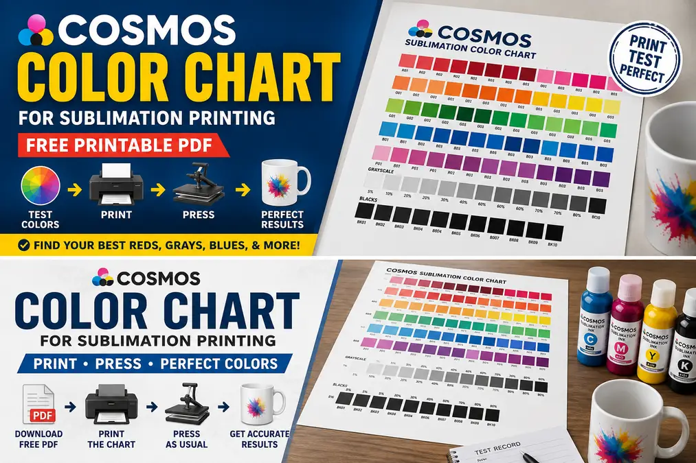
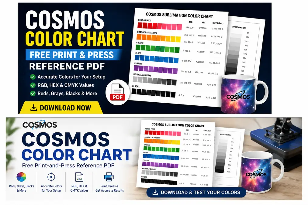
The printable Cosmos sublimation color chart is designed to be printed without editing the individual swatches, then transferred using the same workflow you normally use for your projects.
The chart should include:
- reds and burgundies
- oranges and yellows
- greens
- blues
- purples
- pinks
- neutral colors
- grayscale steps
- dark and black variations
- RGB values
- HEX values
- CMYK reference values
The goal is not to make your printer reproduce every screen color perfectly. It is to help you identify which swatch produces the finished color you want.
What This Chart Can and Cannot Tell You
A pressed reference chart can help you:
- find a better red, blue, green, gray, or black
- compare neighboring colors without repeated design edits
- build a repeatable color-selection workflow
- document results from a particular printer and ink setup
- reduce wasted sublimation blanks
It cannot guarantee that another printer, paper, ICC profile, mug, shirt, or metal blank will produce the same result.
Sublimation color is affected by the complete production setup. Treat the PDF as a test chart, then let the pressed result become your actual reference.
Print and Press the Cosmos Color Chart Before Choosing Colors
Print the chart using the same setup you use for normal production. Changing settings just for the test defeats the purpose.
- Download the Cosmos color chart PDF.
- Print it without changing the swatch colors.
- Select your normal printer and paper settings.
- Use your normal color-management workflow.
- Press the chart onto a compatible sublimation substrate.
- Allow the substrate to cool enough for comfortable evaluation.
- Compare the finished swatches under consistent lighting.
- Mark the colors you want to reuse.
Sublimation transfers commonly look muted before heat activates the dye. The finished substrate is the useful reference, not the sheet coming out of the printer.
The same principle explains why sublimation prints look different after pressing.
Use the Substrate You Actually Sell
A chart pressed onto polyester fabric is useful for polyester projects. It should not automatically become your only reference for ceramic mugs, coated aluminum, or other substrates.
For color-critical work, create separate physical references for the materials you use most often.
A small label on the back can record:
Cosmos Ink + printer + paper + profile/settings + substrate + press settings
That simple habit prevents old test charts from being confused with your current setup.
Record Your Cosmos Ink Setup Before Testing
Color testing becomes difficult when you cannot remember which settings produced each sheet.
Use a separate test record whenever you compare ink versions, profiles, papers, printer settings, or substrates.
Download: Cosmos Color Test Record PDF
Record at least these details:
| Test detail | Record |
|---|---|
| Printer model | |
| Cosmos Ink version | 1.0 / 2.0 |
| Sublimation paper | |
| Paper/media setting | |
| Print quality | |
| ICC profile | Profile name / None |
| Design software | |
| Substrate | |
| Press temperature | |
| Press time | |
| Pressure | |
| Test date | |
| Best red | |
| Best gray | |
| Best black | |
| Notes |
Best testing rule: Change one variable at a time.
If you change the ICC profile, paper setting, print quality, and heat setting together, a better result will not tell you which change fixed the problem.
Why Cosmos Ink Colors Can Look Different From Your Screen
The design file is only the beginning of the color workflow.
Several stages influence the result:
Design color → software color management → printer settings → Cosmos Ink + paper → heat transfer → substrate → finished color
Common variables include:
- printer model
- Cosmos Ink formulation
- RGB or CMYK source values
- ICC profile
- application color management
- printer driver settings
- paper/media selection
- print quality
- transfer paper
- substrate coating or fabric
- temperature
- time
- pressure
- monitor calibration
- viewing light
This is why copying another person’s RGB value or printer setting does not guarantee an identical result.
For a deeper explanation of how the design side affects output, see RGB vs CMYK and ICC profiles for sublimation.
Cosmos Ink Red Looks Orange, Pink, or Too Warm
Red is one of the colors worth testing with multiple nearby swatches instead of repeatedly editing a single red.
Your printable chart should include several red families such as:
| Red family | What to compare |
|---|---|
| True red | balanced general red |
| Crimson | deeper, slightly cooler red |
| Warm red | stronger yellow influence |
| Burgundy | dark red |
| Coral | lighter orange-red |
| Orange-red | warmer result |
| Pink-red | lighter magenta-leaning result |
Cosmos currently notes that its tested sublimation paper and printer recommendations are intended to improve colors including reds and blacks. Since manufacturer settings can change as new printers and products are tested, check current Cosmos guidance rather than assuming an old screenshot or preset still applies.
Start With the Pressed Swatches
If only one design red looks wrong, do not immediately rebuild your entire color-management setup.
Find the closest red on your pressed reference, then use that swatch’s recorded value in a test design.
This separates a color-selection problem from a broader printer or color-management problem.
If Every Red Looks Wrong
Check the system in this order:
- Run a nozzle check.
- Confirm all required colors are printing cleanly.
- Verify the Cosmos Ink version in the printer.
- Confirm the correct printer and paper settings.
- Check how color is being managed.
- Confirm the intended ICC profile, if one is being used.
- Print the same red test again.
- Press it before evaluating the change.
Changing magenta or yellow manually before checking the printer can hide the original problem and make future jobs harder to reproduce.
For broader color troubleshooting, use the sublimation color problems and fixes reference.
Fix Blue, Green, or Purple Color Shifts
Blue, cyan, green, and purple sit close enough in some color ranges that a shift can be obvious after pressing.
Examples include:
- green appearing too blue or teal
- blue moving toward purple
- purple appearing too blue
- green becoming too yellow
- dark blue losing separation from black
Start by comparing neighboring pressed swatches.
If one nearby swatch produces the color you need, save that value and continue working. There is little reason to alter the entire printer profile for a problem affecting one design color.
If every blue, green, or purple shows a similar cast, investigate the printer, color management, and paper settings instead.
How to Get a More Neutral Gray
Gray is a useful diagnostic color because an unwanted tint is easy to see.
A good Cosmos test chart should contain a grayscale ladder such as:
- 5%
- 10%
- 20%
- 30%
- 40%
- 50%
- 60%
- 70%
- 80%
- 90%
Compare the pressed steps for unwanted casts.
| Appearance | What you may notice |
|---|---|
| Neutral gray | balanced gray without an obvious color tint |
| Blue-gray | noticeably cool |
| Green-gray | green cast through neutral areas |
| Warm gray | yellow, brown, or red influence |
| Uneven grayscale | different steps shift in different directions |
If the Entire Grayscale Has the Same Tint
A consistent cast across several gray levels deserves more attention than one imperfect swatch.
Check:
- nozzle pattern
- printer settings
- active profile
- application color settings
- paper/media selection
- ink configuration
Monitor calibration can also create false expectations before printing. If the screen itself is displaying neutrals incorrectly, use these screen calibration checks for sublimation before trying to force the printer to match an inaccurate display.
Find a Better Black With the Cosmos Chart
A screen that displays black does not tell you how that black will transfer onto a sublimation blank.
Include several dark reference swatches on the printed chart and compare them after pressing. Look for:
- depth
- neutrality
- brown or red tint
- blue tint
- detail in nearby dark colors
Avoid treating one CMYK black formula as the universal answer.
The best black for your production setup is the one that gives the required pressed appearance without damaging nearby details or introducing an unwanted cast.
If black looks wrong together with several other colors, troubleshoot the complete printing workflow instead of correcting black alone.
Cosmos Ink 1.0 vs 2.0: Does the Color Chart Change?
Use a separate test record whenever the ink formulation or color-management method changes.
Cosmos currently provides color-profile downloads that include:
- Cosmos Sublimation Ink 1.0 for CMYK printers
- ET-8550 with Cosmos Sublimation Ink 1.0
- ET-8550 with Cosmos Sublimation Ink 2.0
Cosmos also states that its current 2.0 Epson EcoTank sublimation ink does not require a color profile, although profiles are available for users who prefer them.
That distinction matters when comparing charts.
A chart made using one ink version, profile, and printer setup should not automatically be treated as an exact reference after those variables change.
Write the ink version directly on every physical chart you keep.
Do You Need a Cosmos ICC Profile?
Not every current Cosmos setup requires an ICC profile.
Cosmos states that its 2.0 Epson EcoTank ink is formulated so a profile is not required, while the company continues to offer profiles for users who want them and for specific ink/printer combinations.
Use the chart as a diagnostic tool before adding extra corrections.
| Situation | Practical first step |
|---|---|
| Cosmos 2.0 colors already look good | Keep the working setup and build a pressed reference |
| One color looks wrong | Compare nearby chart swatches |
| Most colors share a similar cast | Review color management and printer settings |
| Installing a profile makes output worse | Recheck the profile and application/printer color-management workflow |
| Printer was recently changed | Create a new test chart |
| Ink version changed | Create a new test chart |
Avoid Double Color Management
Problems can occur when both the design application and printer driver apply color corrections that were not intended to work together.
Before repeatedly changing sliders, identify who is managing the color:
- design application
- printer driver
- ICC workflow
The exact setup depends on the software and printer.
The ICC profile explanation for sublimation covers the role of a profile, while the manual color correction and ICC profile guide helps separate the two approaches.
For Cosmos-specific profile downloads, use the current manufacturer profile page because available printer combinations and instructions can change.
Paper Settings Can Change Cosmos Ink Colors
A printer’s paper or media selection can change more than the way a setting is labeled.
Depending on the printer, that choice can influence ink delivery, quality, speed, and other driver behavior. A setting that works well for one paper and printer combination is not automatically the best choice for another.
Cosmos publishes printer and paper recommendations for its products and notes that its tested settings may change as additional printers are evaluated.
Run a Side-by-Side Paper Setting Test
When two settings seem reasonable, test them rather than guessing.
Print the identical chart twice.
| Test | Paper setting | Red | Gray | Black | Notes |
|---|---|---|---|---|---|
| A | Setting 1 | ||||
| B | Setting 2 |
Keep everything else unchanged:
- same PDF
- same printer
- same ink
- same paper
- same substrate
- same heat
- same time
- same pressure
Then compare the pressed charts.
The sublimation paper settings troubleshooting guide can help when paper selection is causing broader print-quality or brightness problems.
Before Changing Colors, Make Sure the Printer Is Healthy
Color correction cannot repair a missing nozzle.
Check basic printer health before spending ink and blanks on profile or swatch testing.
Quick Printer Check
- Print a nozzle check.
- Look for gaps in each color pattern.
- Check for horizontal banding.
- Confirm print-head alignment if output is visibly misaligned.
- Check ink levels.
- Make sure the printer is producing every required color.
- Correct obvious mechanical print defects first.
Use This Decision
Missing lines, banding, or incomplete colors?
Fix the printer first.
Clean nozzle check but consistently wrong pressed colors?
Continue with the chart, printer settings, and color-management tests.
A printer test page can help separate print-quality faults from design problems. For maintenance-related color loss, printer purge sheets are another useful diagnostic resource.
Build Your Own Physical Cosmos Ink Color Reference
The most valuable Cosmos chart is not the PDF on your computer. It is the pressed sheet sitting beside your workstation.
Create a physical reference once your setup is working.
- Print the full chart.
- Press it onto a representative substrate.
- Write the complete setup on the back.
- Circle or mark the colors you use frequently.
- Keep it near the computer or heat press.
- Reference the pressed swatch when building new designs.
- Create a replacement when an important production variable changes.
A useful label might read:
ET-8550 | Cosmos 2.0 | Paper A | Profile: None | Polyester panel | Test date: ______
Now, instead of saying, “I need a dark red that looks right on screen,” you can say, “Swatch R14 gave me the dark red I need on this substrate.”
That is a repeatable production decision.
Make Separate Charts When Substrate Color Matters
A white polyester shirt, ceramic mug, and coated metal panel do not present color in exactly the same way.
For products where close color matching matters, press dedicated charts onto representative samples of your main substrate types.
You do not need a different chart for every individual product. Group similar production setups where the results are genuinely comparable.
When Should You Print a New Cosmos Color Chart?
Print another chart whenever a change is large enough that your previous reference may no longer represent the current workflow.
Create a new chart after changing:
- Cosmos Ink version
- printer
- important ICC profile
- major color-management settings
- sublimation paper
- major paper/media settings
- substrate type when color accuracy matters
- a production process that materially changes the final result
You normally do not need a new reference just because you created a new design.
Write the date on every physical chart so an old setup never gets mistaken for the current one.
Cosmos Color Chart Troubleshooting Table
Use this table before making random color adjustments.
| Problem | Check first | Then test |
|---|---|---|
| Red looks orange | Pressed red swatches | Printer/profile workflow |
| Red looks pink | Neighboring red values | Magenta/yellow output and color management |
| Green looks blue or teal | Adjacent green swatches | Printer and profile settings |
| Purple looks blue | Pressed purple range | Color-management workflow |
| Gray looks blue | Grayscale ladder | System-wide color cast |
| Gray looks green | Nozzle check + grayscale | Profile/settings |
| Black looks brown | Dark swatches | Heat and color management |
| Transfer looks dull before pressing | Press it first | Judge final substrate |
| All pressed colors are dull | Nozzle check and press process | Printer/color settings |
| Horizontal lines appear | Nozzle check | Cleaning/maintenance |
| Different paper changes output | Side-by-side test | Select the better repeatable setup |
| Profile makes colors worse | Verify profile and workflow | Compare against the known working setup |
Do not change five settings because one swatch looks wrong. Start with the smallest test that can identify the cause.
Download Both Cosmos Color Testing Resources
A digital chart gives you starting values. A pressed chart tells you what your equipment actually produced.
Download: Cosmos Sublimation Color Chart PDF
Use it to create a physical reference containing color swatches with RGB, HEX, and CMYK reference values.
Download: Cosmos Color Test Record PDF
Keep the completed record with the corresponding pressed chart so you can reproduce the setup later.
For other ink brands and general color-testing resources, use the main sublimation color chart hub.
Frequently Asked Questions
Is there an official Cosmos Ink color chart?
Cosmos provides official color profiles, printer guidance, tutorials, and product-specific settings. This printable chart is an independent print-and-press reference designed to help you test swatches with your own Cosmos Ink setup. It should not be presented as an official Cosmos Ink chart.
Do I need an ICC profile with Cosmos Ink?
It depends on the Cosmos Ink version and printer workflow. Cosmos currently says its 2.0 Epson EcoTank ink does not require a profile, although profiles remain available for users who prefer them. Older or specific printer/ink combinations may use a Cosmos profile.
Why does Cosmos Ink look dull before pressing?
Sublimation dye develops its useful finished appearance after heat transfer. Do not judge color accuracy from the transfer paper alone. Press the chart onto a compatible substrate before selecting or correcting colors.
Why is my Cosmos Ink red printing orange?
First check the pressed red swatches to see if a neighboring red produces the target color. If every red shifts orange, check nozzle output, ink version, printer settings, paper settings, color management, and any ICC profile being used before manually changing the design.
Why does my gray look blue or green?
A single gray can be a poor color choice, but a blue or green cast across the entire grayscale points toward a broader output problem. Check the nozzle pattern, profile, printer settings, paper selection, and color-management workflow.
Should I use RGB or CMYK for Cosmos sublimation?
The answer depends on your design application and color-management workflow. Do not convert files between RGB and CMYK simply because the printer uses CMYK inks. Use a consistent workflow, then test the actual pressed output with known swatches.
Does sublimation paper affect Cosmos Ink color?
Paper and the associated printer/media setting can affect the print workflow and final transfer. If you change paper brands or settings, run a controlled chart comparison before assuming the previous physical reference still applies.
Should I make separate charts for shirts, mugs, and metal?
Make separate pressed references when the substrate creates a meaningful difference in finished color and close matching matters. At minimum, maintain charts for the major substrate types you use regularly rather than expecting one polyester test to represent every coated product.