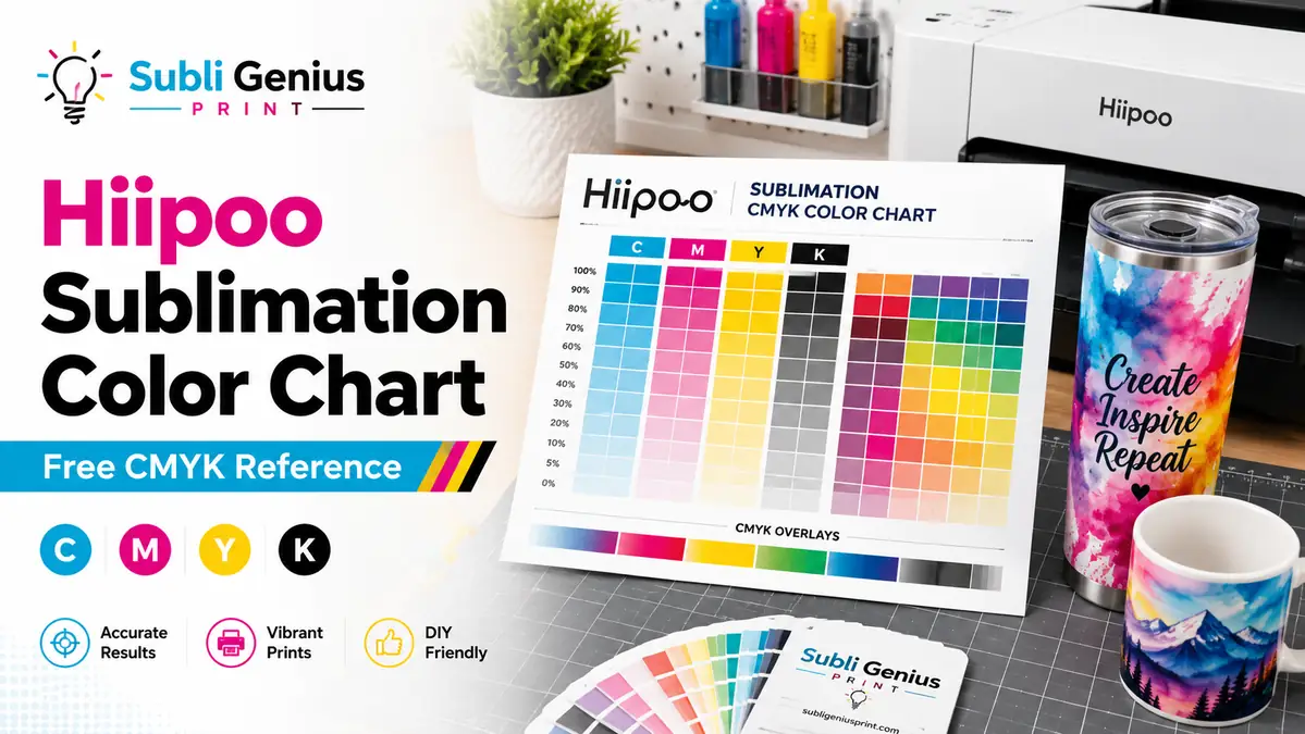
Hiipoo Sublimation Color Chart: Free CMYK Reference

You designed something in bright orange or deep navy, pressed it onto a shirt or mug, and the color that came off the press wasn’t the color you picked on screen.
With Hiipoo ink, that gap has a specific cause. Hiipoo sells two different ink lines that handle color in opposite ways, and printing without a physical reference means you’re guessing every time.
This page gives you a printable color chart built around how Hiipoo ink actually behaves once it’s pressed, plus a short explanation of which chart applies to your setup.
Which Hiipoo Ink Line Do You Have
Hiipoo’s ICC-free (autofill) ink is built to work with your printer’s stock driver settings, no profile installed. Hiipoo’s other line ships with a downloadable, model-specific ICC profile that needs to be installed correctly to get accurate color.
Using the wrong chart, or installing a profile on top of ICC-free ink, usually makes colors worse instead of better. Check your ink packaging or order history first.
If you’re not sure which line you have or need help installing the correct profile, the Hiipoo ICC profile guide walks through both lines and every compatible printer model.
Free Downloadable Hiipoo Color Chart
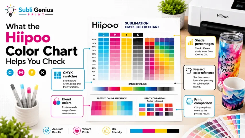
The chart below shows how common colors shift once Hiipoo ink is pressed onto a light polyester substrate. Screen colors are what you see in your design software. Printed colors are what actually comes off the heat press.
Download: Hiipoo Sublimation Color Chart (PDF)
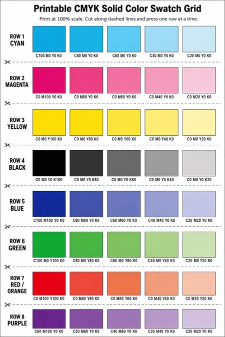
Print the PDF on your Hiipoo-loaded printer at full size, without scaling it down. Cut the sheet into sections if you want to test only a few colors first.
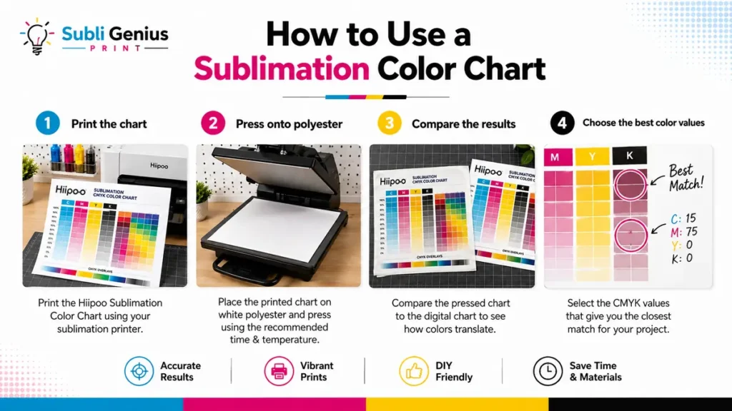
How to Use This Chart Before You Print
Press the printed chart onto a scrap piece of the same material you’ll use for your final project. Fabric, poly-coated metal, and ceramic all shift color slightly differently, so testing on your actual substrate matters more than testing on paper.
Once the chart is pressed, keep it near your workstation. When you’re choosing a color for a new design, match it against the physical chart instead of trusting what you see on your monitor.
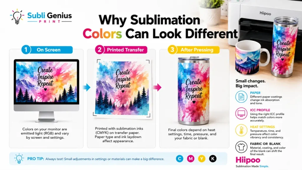
Screens display color in RGB light. Sublimation ink prints in CMYK and then shifts again during heat pressing, so on-screen color is only a starting point.
Why Hiipoo Colors Look Different From Screen
Most Hiipoo color complaints trace back to one of three causes.
Wrong profile for the ink line. Installing a downloadable ICC profile on ICC-free ink, or skipping the profile on ink that requires one, produces colors that look muted, shifted, or inconsistent between print jobs.
File mode mismatch. Designing in RGB and printing without proper conversion causes colors to shift unpredictably, especially in blues and purples. Working in CMYK from the start avoids most of this. The RGB vs CMYK guide explains how to set this up correctly.
Grey tint on white or transparent backgrounds. This shows up specifically with Hiipoo’s ICC profile line when the profile filename doesn’t exactly match what the printer driver expects. The Hiipoo ICC profile guide covers the exact fix for this issue.
If your colors are still off after confirming the right ink line and profile setup, manual adjustment may be needed. The manual color correction guide explains how to nudge specific colors without starting over.
Hiipoo vs Other Ink Brands, Color-Wise
Every sublimation ink brand handles color slightly differently, even when the CMYK values look identical on screen. Comparing brands side by side helps if you’re deciding whether to switch or mix.
| Ink Brand | Profile Approach | Common Color Note |
|---|---|---|
| Hiipoo (ICC-free line) | No profile needed | Consistent but can run slightly muted without a physical reference |
| Hiipoo (profile line) | Model-specific downloadable profile | Sharp color once the correct profile is installed |
| Printers Jack | Free profile, coverage varies by printer model | Profile availability depends on your exact model |
| Cosmos Ink | Markets itself as profile-free | Holds up for most setups, some models still benefit from manual correction |
For a deeper breakdown of each brand, the Printers Jack ICC profile page and Cosmos Ink ICC profile page cover their specific setups.
Printer Compatibility
This chart applies to Hiipoo ink used in the following EcoTank and WorkForce printer models.
| Printer Series | Common Models |
|---|---|
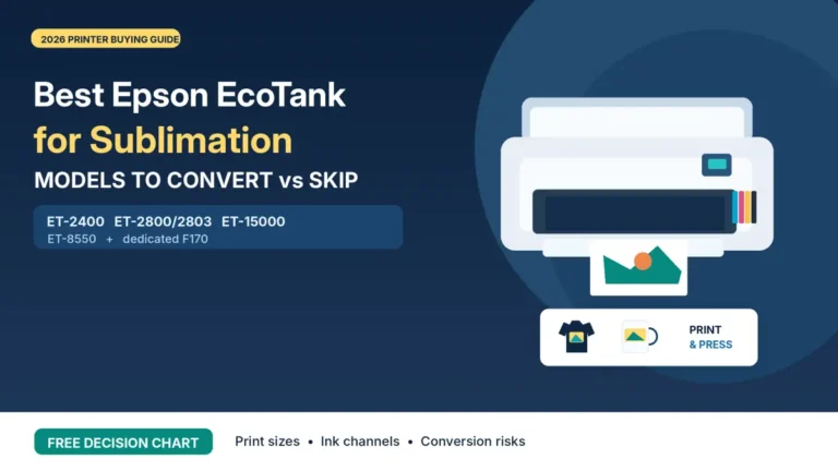
| Epson EcoTank | ET-2800, ET-2803, ET-15000, ET-8550 |
| Epson WorkForce | WF-7710 and similar supertank conversions |
If your printer isn’t listed here, check the full ICC profile roundup for a wider list of Hiipoo-compatible setups.
Frequently Asked Questions
Why do my Hiipoo prints look grey or washed out?
This usually points to an ICC profile mismatch. Either the wrong profile is installed for your ink line, or the profile filename doesn’t match what your printer driver expects. Confirm which ink line you have first, then check the Hiipoo ICC profile guide for the exact fix.
Do I need an ICC profile to use this color chart?
No. The chart works regardless of which Hiipoo ink line you use. It shows you what colors actually look like once pressed, which is useful whether or not a profile is involved in your workflow.
Can I use this chart with a different ink brand?
Not accurately. Every ink brand and printer combination produces slightly different results, even with the same CMYK input. Use a chart printed with the exact ink you’re using.
How often should I reprint the color chart?
Reprint it if you change ink batches, switch substrates, or notice your prints drifting from what the chart shows. Ink and paper can vary slightly between production runs.
Choosing Colors With Confidence
A physical color reference removes the guesswork that causes wasted blanks and mismatched orders. Print the chart, press it onto the material you actually use, and keep it within reach whenever you’re picking colors for a new design. It takes a few minutes to set up and saves far more time than reprinting a job that came out the wrong shade.