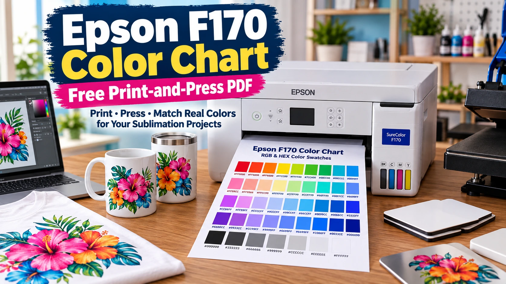
Epson F170 Color Chart: Free Print-and-Press PDF

An Epson F170 color chart gives you a physical reference for how specific RGB and HEX colors look after they pass through your printer, transfer paper, color settings, heat press, and actual sublimation substrate.
Print the free chart with your normal F170 workflow, press it, and keep the finished result near your design computer. When you need a teal, blue, green, neutral, or skin tone, choose it from the pressed chart instead of relying only on the screen.
This is a test reference, not an ICC profile or a promise that every blank will produce identical color.
Download the Epson F170 Color Chart PDF
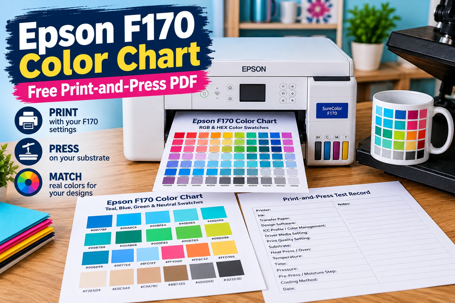
The printable PDF is built for testing your own production workflow rather than predicting a universal finished color.
| Page | What it contains | Best use |
|---|---|---|
| 1 | Broad RGB and HEX color swatches | General color selection |
| 2 | Extra teal, aqua, blue, green, neutral, skin-tone, and shadow swatches | Difficult color matching |
| 3 | Printer, paper, substrate, color-management, and press test record | Keeping your reference repeatable |
If you need a more general reference that is not tied to one printer, use the main sublimation color chart.
Print the chart before changing your artwork
Do not start correcting individual designs before you know what your current workflow is producing. A pressed chart makes that visible.
For example, if the HEX value you expected to look turquoise presses closer to blue, choose a different swatch from the physical chart and use its labeled value in your design. That is more controlled than repeatedly changing hue, saturation, or brightness by eye.
What This F170 Color Chart Can and Cannot Tell You
The chart records the result of your complete production workflow. The printer is only one part of sublimation color.
| The chart can help with | The chart cannot guarantee |
|---|---|
| Choosing colors from an actual pressed sample | Exact Pantone or certified brand-color matching |
| Comparing similar blues, greens, and teals | Identical results on every blank |
| Recording a repeatable workflow | Correcting clogged printhead nozzles |
| Comparing rigid and textile results | Fixing incorrect color management automatically |
| Seeing how your substrate changes color | Making every screen color printable |
| Building a physical color library | Replacing a properly matched ICC profile |
The printed transfer itself is not the final reference. Make color decisions from the pressed sample, not only from the paper coming out of the printer.
Substrate matters too. A swatch pressed onto polyester fabric may not look exactly like the same swatch on coated ceramic or metal. The sublimation color shift chart explains why the same artwork can move visually between substrate types.
How to Print the Epson F170 Color Chart
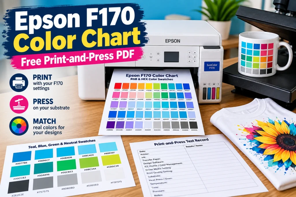
The goal is not to find special settings that make the chart look good. The goal is to reproduce the settings you normally use for production.
1. Check the printer first
Start with a clean nozzle pattern. A missing cyan, magenta, or yellow section can shift an entire group of colors and make the chart unreliable.
If the pattern has gaps, follow the Epson F170 / SC-F100 nozzle check and head-cleaning process before printing the chart. Do not compensate for a nozzle problem by editing the artwork.
2. Open the PDF in your normal print workflow
Use the same computer, software, driver, transfer paper, and color-management method you normally use for sublimation production. Changing the workflow just for the chart introduces another variable.
3. Print at Actual Size or 100%
Avoid shrinking the PDF to fit the page unless your setup requires it. Use Actual Size or 100% scale so the swatches and labels stay consistent and easy to compare.
4. Keep your normal color-management settings
Do not turn profiles on or off only because you are printing a test chart. The chart should record the workflow you actually use.
For F170 driver and color-management setup, use the Epson SureColor F170 settings guide. If your production workflow uses an ICC profile, keep using that profile when printing the chart.
If you are unsure how ICC profiles fit into the workflow, the sublimation ICC profile guide explains the role of profiles and color management.
5. Mirror the transfer when required
If your normal sublimation workflow requires you to enable Mirror Image manually, mirror the color chart before printing so the labels read correctly after pressing.
6. Record the setup
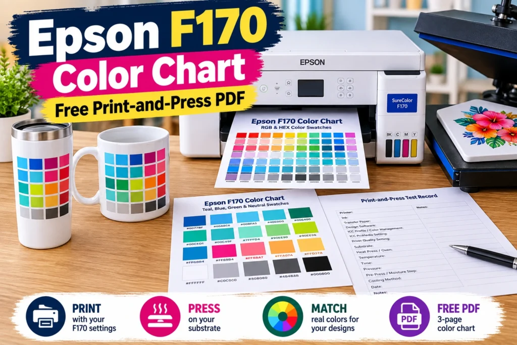
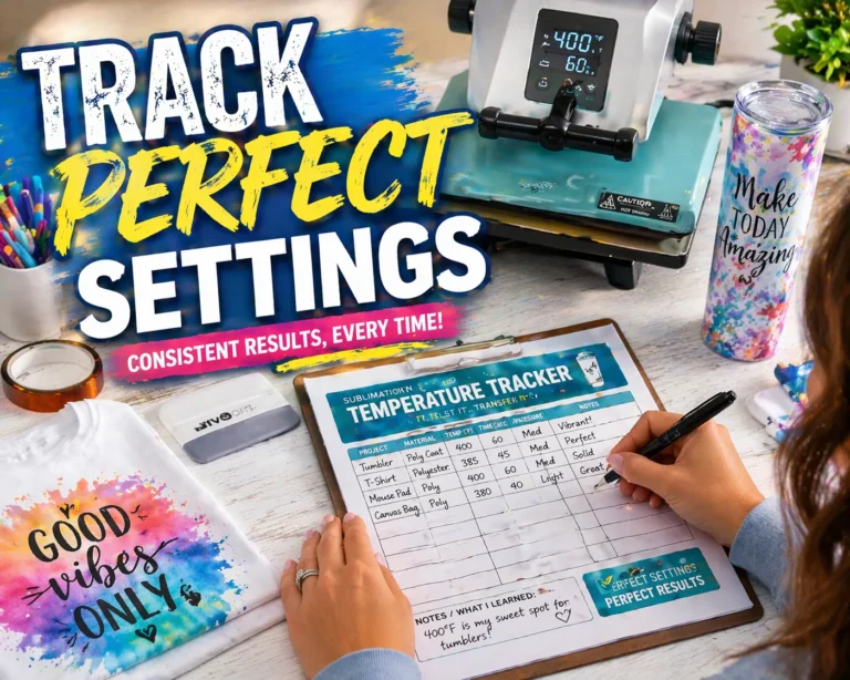
Use Page 3 of the PDF to record the variables that matter:
- printer and ink
- transfer paper
- design software
- color-management method and profile
- driver media and quality settings
- substrate
- heat press or oven
- temperature, time, and pressure
- pre-press or moisture step
- cooling method
- date
That record is what turns a colorful test sheet into a useful production reference.
Press the Chart and Build a Physical F170 Color Reference
Use the same pressing method you normally use for that substrate. Follow the blank manufacturer’s settings when available rather than choosing a different temperature simply because this is a color test.
- Print the chart using your normal F170 workflow.
- Prepare the blank the same way you would for an order.
- Press using your normal time, temperature, and pressure.
- Let the sample cool using your normal workflow.
- Complete the test record on Page 3.
- Store the finished chart where you design artwork.
If textiles and rigid blanks are both important to your business, make separate physical references. A polyester shirt chart should not automatically be treated as a ceramic, coated-metal, or drinkware reference.
How to Pick Sublimation Colors From the Finished Chart
The useful part starts after the chart has been pressed.
- Look at the pressed color chart.
- Find the physical swatch closest to the color you want.
- Read the HEX or RGB value printed beside that swatch.
- Enter that value into your design software.
- Print a small product test before running a large order.
This reverses the normal guesswork. Instead of asking what a screen color might become after pressing, you start with a finished swatch that already looks close to the result you want.
Use the chart for repeat orders
Record the selected swatch for products you repeat. A team tumbler, jersey, logo color, or standard product palette becomes easier to reproduce when the chosen color and production workflow are documented together.
Why Teal, Aqua, and Blue Can Look Wrong on the F170
Teal and aqua are useful test colors because small changes in color balance can move the result noticeably toward blue or green. If turquoise suddenly presses as dark blue, check the workflow before editing every design.
| Symptom | Check first |
|---|---|
| Teal or green shifts strongly toward blue | Nozzle pattern and color-channel output |
| Many colors look too dark | Color management, driver/media setting, then press conditions |
| One color family suddenly changed | Nozzle health and recent workflow changes |
| Transfer looks dull before pressing | Judge the finished pressed sample first |
| Chart looks different on another blank | Substrate and coating |
| Screen and pressed swatch disagree | Use the pressed swatch as the production reference |
| Results changed after a profile change | Print a new chart using the new workflow |
Change one variable at a time, print a small test, press it, and compare the result with your existing reference.
Check the monitor separately
A bright or poorly calibrated display can make a working print workflow look wrong. If the physical chart is consistent but the screen comparison is far off, use the screen calibration guide for sublimation color mismatch before altering printer settings.
A Color Chart Does Not Replace an ICC Profile
An ICC profile and a pressed color chart solve related but different problems.
- ICC profile: helps the color-management system translate digital color into the behavior of a particular printing workflow.
- Pressed color chart: lets you visually choose colors from actual finished samples created by that workflow.
A physical chart is especially practical for flat-color logos, names, text, sports colors, product collections that reuse the same palette, and difficult teal, blue, or green selections.
For strict brand-color work or color-critical photography, visual swatch selection alone may not be enough. A controlled color-management workflow becomes more important.
When to Print a New Epson F170 Color Chart
Do not reprint the chart before every job. Make a fresh reference when the workflow behind the old chart changes enough that it may no longer represent production.
- sublimation ink
- transfer paper
- ICC profile
- color-management method
- major driver settings
- printer
- substrate supplier or coating
- production or press method
A new chart also makes sense if the original reference was printed while the printer had missing nozzles or another confirmed print-quality problem.
Keep Separate Charts for Rigid and Textile Sublimation
A single F170 chart is not always enough for a shop that produces several types of products. Start with the substrate you use most.
If you mainly sell shirts, make a textile reference first. If most orders are coated drinkware, plaques, or other hard goods, start with a rigid-substrate reference.
- F170 Textile Color Reference
- F170 Rigid Color Reference
Label each chart with the date and production setup so an old test sheet does not become an undocumented reference later.
Frequently Asked Questions
Why does my Epson F170 color chart look dull before pressing?
Judge the chart from the finished pressed substrate, not only from the transfer sheet. If the pressed result is still weak, check nozzle health, the substrate, paper, driver settings, color management, and press conditions before changing the design.
Do I need an ICC profile to use the F170 color chart?
No. The chart can document either an ICC-managed workflow or the normal color-management workflow you already use. The key is consistency. Print the chart using the same setup used for production and record that setup.
Should I make separate charts for rigid and textile sublimation?
Yes, if you regularly produce both. Different substrates can change the final appearance of the same printed color. Separate rigid and textile references are more useful for real production decisions.
Can I use this color chart with an Epson F570?
The PDF can be printed on another sublimation printer as a test target, including an F570. Do not use F170 pressed results as the reference for another printer. Print and press a fresh copy through that printer’s own workflow.
Why is my turquoise or teal printing blue?
Start with a nozzle check before changing the artwork. If the nozzle pattern is clean, check color management, driver settings, paper, substrate, and press conditions. Compare each controlled test with your pressed chart.
Can I use the HEX codes from the chart in Canva or other design software?
Yes, if the software lets you enter HEX or RGB values. Choose the color from the finished pressed chart first, then enter the labeled value in the design. For important orders, make a small production sample before committing to a full batch.
Make the Pressed Chart Part of Your Workflow
An Epson F170 color chart is most useful when it becomes a physical shop reference. Print it with the workflow you already use, press it on the substrate you actually sell, record the settings, and choose colors from the finished swatches instead of repeatedly guessing from the monitor.
If a color later changes unexpectedly, start with the printer rather than editing the artwork. The F170 nozzle-check and head-cleaning guide gives you the first diagnostic step.