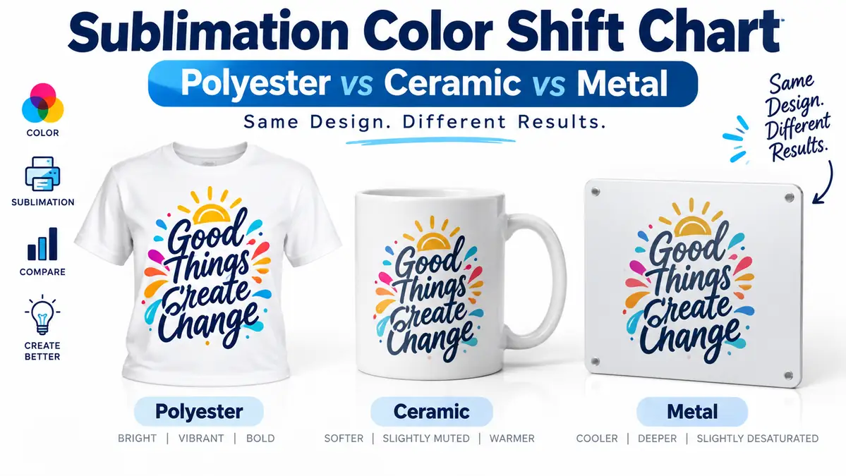
Sublimation Color Shift Chart: Polyester vs Ceramic vs Metal

The same sublimation design can look different on polyester fabric, a ceramic mug, and coated metal even when you use the same printer, ink, paper, and artwork. Can coolers are another useful blank to compare; see our can cooler sublimation guide.
That does not automatically mean your ICC profile is wrong.
The final appearance also depends on the substrate’s base color, coating, surface finish, and heat cycle. Sawgrass specifically notes that the substrate can affect the colors you get, while its current color-management glossary describes ICC profiles as being tied to a specific ink and substrate combination. For related planning, see Why White Sublimation on Black Finally Works.
The most reliable solution is to print one master color chart and create separate pressed references for the materials you actually sell. For related planning, see Halloween Treat Bags with Sublimation HTV.
Sublimation Color Shift Chart: Quick Comparison
Use this table as a starting point, not as a promise that every polyester shirt, mug, or metal panel will behave exactly the same.
| Color factor | White polyester | White ceramic | White coated metal |
|---|---|---|---|
| Surface type | Fabric fibers | Polymer-coated hard surface | Polymer-coated hard surface |
| Surface texture | Soft and textured | Smooth | Smooth |
| Light reflection | More diffuse | Often glossy | Strongly affected by finish |
| Apparent detail | Influenced by weave | Usually crisp | Often very crisp |
| Major variables | Polyester %, weave, moisture, base white | Coating, press contact, time, blank quality | Coating, white/clear base, gloss/matte finish |
| Starting press cycle | Short | Longer | Short to moderate |
| Best color reference | Pressed fabric swatch | Same ceramic type | Same coating and finish |
Sawgrass currently lists 45 seconds at 400°F as a starting point for polyester fabric, 60 seconds at 400°F for metal, and 150 to 300 seconds at 350°F to 400°F for ceramic mugs. Those are only starting points. Sawgrass tells users to follow the substrate manufacturer’s instructions and test their own workflow.
Bottom line: Use one digital chart, but do not expect one pressed chart to predict every material.
Why the Same Sublimation Color Changes Between Materials
Sublimation color is created by the complete production system, not just the RGB value in your artwork.
A color such as deep blue can be identical in the design file and still appear different after pressing onto fabric, ceramic, and metal.
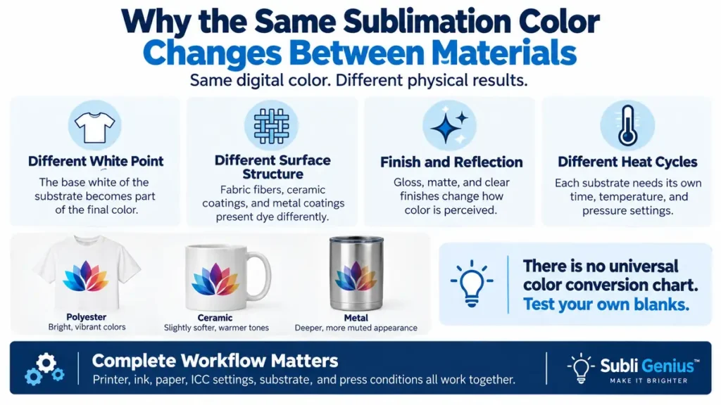
Four factors cause most of the difference.
The substrate’s white point becomes part of the result
Standard sublimation ink does not print an opaque white background.
The white area of your product becomes the visual base underneath the dye.
That means two blanks that are both sold as “white” can still produce slightly different results if one has a cooler, brighter white and the other has a warmer or duller base.
This becomes even more obvious when the substrate itself is not white.
Sawgrass notes that sublimating onto a colored garment changes the resulting colors because the garment color remains visible beneath the transferred dye.
For reliable testing, start with:
- white 100% polyester
- white sublimation-coated ceramic
- white sublimation-coated aluminum
That gives you a cleaner baseline.
Fabric and hard coatings present dye differently
Polyester fabric accepts sublimation dye into its synthetic fibers.
Ceramic and metal need a compatible polymer coating because the raw materials themselves are not used in the same way as polyester fabric.
The visual result therefore comes from different surfaces.
Fabric introduces weave, fiber structure, and texture. A smooth coated mug or metal panel presents the image on a more uniform surface.
This can change how sharp edges, gradients, shadows, and saturated colors appear even when the source file has not changed.
Surface finish changes perceived color
Metal is a good example of why “same substrate” does not always mean “same appearance.”
ChromaLuxe currently offers white and clear aluminum with gloss, semi-gloss, and matte finishes. Its white gloss surface is designed for strong depth and color pop, while matte white reduces glare. Clear finishes allow the natural aluminum surface to remain visible through lighter image areas.
That means these are not interchangeable color references:
- white gloss aluminum
- white matte aluminum
- clear gloss aluminum
- clear matte aluminum
A test chart pressed on white gloss metal should not be used as the only reference for clear brushed aluminum.
Each substrate needs its own heat cycle
The transfer process itself changes between materials.
Sawgrass currently gives these general starting points:
| Substrate | Starting temperature | Starting time |
|---|---|---|
| Polyester fabric | 400°F | 45 sec |
| Metal | 400°F | 60 sec |
| Ceramic mug | 350°F to 400°F | 150 to 300 sec |
These settings show why a fair comparison does not mean pressing every material with identical time and temperature. Each blank needs the conditions required to complete its transfer correctly.
Use the blank manufacturer’s settings first. The Heat Press Temperature for Sublimation chart can help when you need a broader reference.
There Is No Universal Polyester-to-Ceramic-to-Metal Color Conversion
It would be convenient to publish a chart that said:
RGB 20, 120, 200 on polyester becomes RGB 15, 105, 190 on ceramic.
That would look precise, but it would not be reliable.
The final result depends on:
- printer
- sublimation ink
- transfer paper
- print mode
- ICC profile or color-management method
- substrate manufacturer
- coating
- finish
- press temperature
- press time
- pressure
- actual heat-press calibration
Joto’s 2026 testing also shows that transfer-paper behavior changes by substrate category. Its comparison found different performance characteristics across polyester fabric, ceramic/enamel, and coated hard substrates rather than one paper behaving identically on every surface.
The useful chart is therefore not a mathematical conversion table.
It is a physical reference made with your own production setup.
How to Make Your Own Three-Substrate Color Shift Chart
A controlled test lets you see what the substrate changes without guessing.
1. Start with one master swatch file
Use the exact same artwork for all three tests.
A good chart should contain:
- primary colors
- secondary colors
- neutral grays
- black
- near-black
- skin-tone ranges
- pastels
- deep saturated colors
- gradients
Do not alter RGB values between the polyester, ceramic, and metal versions.
The existing Sublimation Color Chart can serve as your master digital reference.
2. Keep the printer workflow unchanged
Use the same:
- printer
- ink
- sublimation paper
- print-quality setting
- color-management method
- ICC profile, if your setup uses one
The goal is to remove unnecessary variables.
If you change the ICC profile for the ceramic test and then compare it with a polyester test made using another profile, you are no longer measuring mainly substrate behavior.
3. Choose comparable white blanks
For your first test, use:
- white 100% polyester
- white sublimation ceramic
- white-coated aluminum
Avoid starting with:
- colored shirts
- clear metal
- dark substrates
- heavily textured materials
Those materials introduce additional variables that make the first comparison harder to interpret.
4. Press each material correctly
Do not force every substrate through one press recipe.
Use the correct settings for each blank.
Sawgrass describes its heat-press chart as a starting point and emphasizes calibrated presses, proper substrates, manufacturer guidelines, testing, and practice.
If the metal manufacturer says 60 seconds and the mug manufacturer says 180 seconds, follow those individual instructions.
The point is to compare each substrate after a correct transfer, not after identical heating.
5. Label every sample
On the back of the sample or in a test record, write:
- date
- printer
- ink brand
- paper
- ICC/profile workflow
- substrate
- blank manufacturer
- finish
- temperature
- time
- pressure
For metal, record the finish specifically.
“Aluminum” is not detailed enough.
Write:
White gloss aluminum
instead of:
Metal
6. Compare the samples under the same lighting
Lighting changes how color appears.
Compare your pressed charts in the same location and under the same light source.
Do not evaluate the polyester shirt beside a sunny window and the mug later at night under warm room lighting.
7. Store the references together
Keep the three samples together so you can compare them when preparing customer artwork.
A physical chart beside your press is usually more useful than trying to remember how a shade looked on your previous order.
What Colors Should Be on the Test Chart?
A useful substrate test needs more than bright red, green, and blue boxes.
Include colors that reveal different problems.
| Test area | What it helps reveal |
|---|---|
| Neutral gray | Unexpected color cast |
| Black | Density and shadow performance |
| Near-black | Lost shadow detail |
| Bright red | Saturation and warm-color shifts |
| Orange | Red/yellow balance |
| Magenta | Magenta strength |
| Cyan | Cyan strength |
| Teal | Cyan/green/blue balance |
| Deep blue | Blue/purple shifts |
| Green | Cyan/yellow balance |
| Skin-tone range | Small warm-color errors |
| Pastels | White point and subtle shifts |
| Gradient | Banding and tonal transitions |
The chart should help you diagnose the workflow, not just create an attractive sheet of saturated colors.
If you want to understand how swatches fit into a production workflow, see Sublimation Color Swatches and Palettes.
How Colors Behave on Polyester
Polyester is the simplest baseline for a soft substrate, but two polyester products can still produce different-looking color.
Polyester percentage matters
Sublimation dye bonds to polyester.
A 100% polyester fabric gives you the cleanest reference because more of the printable fiber can accept dye.
Lower-polyester blends usually produce a more faded or vintage-looking result because the non-polyester portion does not accept sublimation dye in the same way.
The Polyester Sublimation Time & Temp Chart by Blend % covers that relationship in more detail.
Fabric weave changes apparent sharpness
A smooth polyester performance shirt and a textured polyester fabric can both be 100% polyester but still look different.
The dye may transfer correctly to both, yet the visible weave changes how the eye sees:
- fine lines
- gradients
- shadows
- small text
- photographic detail
That is why your permanent reference library should ideally use the same fabric type you sell.
Moisture can interfere with the result
Polyester can hold moisture.
Sawgrass recommends pre-pressing polyester fabric before transfer to remove moisture. Its current guidance lists 45 seconds at 400°F as a general starting point after preparation.
Moisture-related transfer problems should be fixed before you decide that a color difference is caused by the substrate itself.
Fabric usually looks less reflective
Fabric scatters light differently from a smooth gloss-coated hard substrate.
That can make a print appear visually softer even when the dye transfer is strong.
This is one reason a glossy metal panel can appear to have more “pop” than the same artwork on polyester without necessarily containing a universally measurable increase in color saturation.
How Colors Behave on Ceramic
Ceramic sublimation blanks normally use a polymer coating designed to receive the dye.
The coating is therefore part of the color system.
Coating consistency matters
Two white mugs can look almost identical before pressing but come from different coating systems.
If one mug brand repeatedly produces a different color result than another under the same printing workflow, test the blanks separately before changing your ICC profile.
A physical mug reference is more useful than assuming every white ceramic product behaves identically.
The heat cycle is much longer
Ceramic mugs typically require a much longer heating cycle than polyester fabric or flat metal.
Sawgrass currently lists 150 to 300 seconds at 350°F to 400°F as its general ceramic mug starting range.
That extended cycle is another reason you cannot isolate the substrate by forcing a mug to use a polyester pressing recipe.
Press contact matters
A curved mug depends on even contact around the printable area.
If one section is lighter or shifted while the rest looks correct, investigate:
- mug-press pressure
- heater contact
- wrap tension
- cold spots
- blank coating
before changing your color-management workflow.
Ceramic is not always darker
You may hear that ceramic “prints darker” than polyester.
That can happen in a particular production setup, but it should not be treated as a universal rule.
Coating, ink, paper, color management, blank quality, and pressing conditions all affect the result.
Your own pressed mug chart is the reference that matters.
How Colors Behave on Sublimation Metal
Metal needs more specific labeling than most substrates because the visible finish can dramatically change how the image is perceived.
White gloss metal
White gloss aluminum gives the image a bright white base and a reflective surface.
ChromaLuxe describes its gloss white finish as producing strong vibrancy, depth, and color pop.
For photographs and saturated artwork, this can make the print appear very crisp and high contrast.
White matte metal
White matte metal still gives you a white base, but the surface reduces glare.
ChromaLuxe describes matte white as a smooth, low-reflection option where color appears with more subtlety.
If your customer will display the print under bright lighting, this difference can matter as much as the actual color settings.
Clear metal
Clear-coated aluminum behaves differently.
There is no opaque white layer hiding the underlying metal.
ChromaLuxe says its clear finishes allow the natural silver aluminum to show through, including in lighter portions of the image.
A white-gloss reference chart cannot accurately predict that effect.
Maintain separate charts for:
- white metal
- clear metal
and ideally for different finishes when color appearance is important.
One Substrate Looks Wrong but the Other Two Look Right
This comparison is useful for troubleshooting because the pattern of failure can narrow the cause.
| What you see | Check first |
|---|---|
| All substrates have the same color cast | ICC/profile, printer settings, ink, nozzle output |
| Polyester alone looks weak | Polyester %, fabric color, moisture, weave |
| Ceramic alone looks wrong | Coating, mug press contact, time, temperature |
| Metal alone looks wrong | Coating, finish, protective film, settings |
| One new batch behaves differently | Blank/coating consistency |
| One area of a mug is lighter | Pressure/contact |
| Transfer paper looks dull but final products look good | Normal sublimation behavior |
| All substrates have missing lines/colors | Printer/nozzle problem |
Sawgrass likewise recommends looking at blank quality, substrate composition, time, temperature, pressure, and color-management settings when troubleshooting incorrect color.
For problems that affect the entire workflow, use Sublimation Color Problems & Fixes.
Do You Need a Different ICC Profile for Every Substrate?
Not every small sublimation shop needs a custom ICC profile for every product.
However, the final substrate is part of serious color management.
Sawgrass currently defines an ICC profile as a file that describes color reproduction for a specific ink and substrate combination.
The practical approach depends on how accurate you need to be.
For most craft and small-business workflows
Start with:
- a stable printer/ink/paper setup
- the correct manufacturer or ink-supplier color workflow
- separate pressed reference charts for your main substrates
For many sellers, that solves the more common problem:
“What will this color actually look like on the product I sell?”
For color-critical production
A more controlled workflow may need:
- substrate-specific characterization
- custom profiling
- calibrated monitor
- controlled lighting
- standardized press conditions
- repeatable blank sourcing
Do not create custom profiles while your production variables are still changing.
If you are switching inks, paper, blank brands, temperatures, and printer settings every week, profiling that unstable workflow will not solve the underlying inconsistency.
For more detail, see RGB vs CMYK and Choosing the Right ICC Profile.
Build a Permanent Sublimation Color Reference Library
The most useful color chart is the one your shop can reuse.
Start with one master digital file.
Then build separate physical references as your product catalog grows.
For example:
Soft substrates
- 100% polyester performance fabric
- polyester fleece
- 65/35 polyester blend
- polyester-coated specialty fabric
Ceramic
- your main 11 oz mug
- your main 15 oz mug
- ceramic tile
- ornament, if the coating differs
Metal
- white gloss aluminum
- white matte aluminum
- clear gloss aluminum
- clear matte aluminum
Other repeated substrates
- MDF
- hardboard
- glass
- slate
- coated wood
Label each sample with the exact blank and production settings.
Your reference shelf then becomes a real production tool.
When a customer chooses a navy blue for a polyester shirt and later wants the same branding on ceramic mugs, you can compare both physical charts before production rather than promising an exact match based only on the monitor.
Use One Master Chart, Not One Universal Pressed Reference
There is an important distinction:
One digital chart: useful.
One pressed chart for every substrate: not reliable.
Keep your original RGB or design chart consistent. That lets you trace every physical swatch back to the same source color.
Then press that chart onto each important substrate separately.
Your system becomes:
Master digital color → polyester reference → ceramic reference → metal reference
This keeps color decisions tied to real output rather than screen guesses.
The 3 Before-and-After Color Chart Comparisons guide can also help when you want to isolate other production variables such as color-management settings, print quality, and pressing conditions.
Downloadable 3-Substrate Color Shift Test Kit
For a repeatable test, the downloadable resource for this page should include:
Page 1: Master RGB swatch chart
Print this exact page for every substrate.
Page 2: Polyester record
Record:
- fabric type
- polyester percentage
- manufacturer
- time
- temperature
- pressure
- visible color notes
Page 3: Ceramic record
Record:
- mug/tile manufacturer
- coating/product type
- press method
- time
- temperature
- pressure
- visible color notes
Page 4: Metal record
Record:
- metal manufacturer
- white or clear base
- gloss, semi-gloss, or matte finish
- time
- temperature
- pressure
- visible color notes
Page 5: Side-by-side comparison
Compare the same colors across all three pressed references.
Page 6: Production setup log
Record:
- printer
- ink
- paper
- ICC/color workflow
- print setting
- test date
Do not edit the chart between tests.
That consistency is what turns it into a useful production record.
Sublimation Color Shift Questions
Why does the same sublimation design look different on a mug and shirt?
The materials present the transferred dye differently.
Polyester fabric has fibers and texture, while a ceramic mug uses a smooth polymer coating. The base white, surface reflection, coating, and different press cycle can all change the final appearance.
Is sublimation brighter on metal than polyester?
Not universally.
White glossy metal can appear brighter or more contrasty because of its smooth reflective finish. ChromaLuxe specifically describes white gloss metal as producing strong color depth and vibrancy. Polyester fabric reflects light differently, so the visual result may appear softer.
Test the actual materials before making color promises.
Does ceramic always print darker than polyester?
No.
A particular mug, coating, ink, paper, profile, or press setup can produce a darker-looking result, but that is not a universal ceramic rule.
Use a pressed ceramic reference from the same blanks you normally sell.
Can I use one sublimation color chart for every material?
Use the same digital source chart, but create separate pressed charts.
A polyester reference is best for polyester. A ceramic reference is best for that ceramic blank. A white gloss metal chart is best for that metal finish.
Does glossy versus matte metal change the color?
It changes how the color is perceived.
Gloss increases reflection and can create stronger visual depth and color pop. Matte reduces glare and produces a softer presentation. Clear finishes introduce the visible aluminum base as another variable.
Should I change RGB values for each substrate?
Only after controlled testing shows that compensation is needed.
Do not copy correction values from another shop unless its printer, ink, paper, profile, substrate, coating, and pressing process match yours.
Use your physical reference chart first.
Why does my sublimation color look dull on transfer paper?
That is normally not the best stage at which to judge the final result.
The dye changes appearance after heat activates it and transfers it into the compatible substrate.
If you are comparing colors, compare pressed samples, not only the printed transfer sheets.
See Why Sublimation Prints Look Different After Pressing for the full explanation.
Press the Chart on the Material You Actually Sell
A screen cannot tell you exactly how one RGB value will look across every sublimation product.
Neither can a generic internet color chart.
The useful reference is the one produced by your own:
printer + ink + paper + color management + press + blank
Print one master chart, press it onto the substrates you sell repeatedly, label the results, and keep those samples beside your production area.
For a shirt order, use the polyester reference.
For mugs, use the ceramic reference.
For metal prints, use the chart made on the same coating and finish.
That approach turns a sublimation color chart from a design aid into a practical production tool.