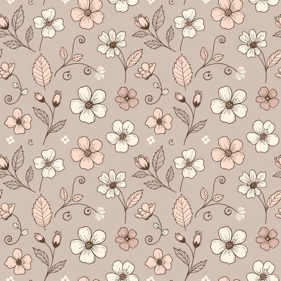
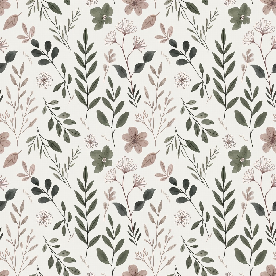
Sublimation Designs for Shirts, Jerseys, Polos, and Tumblers
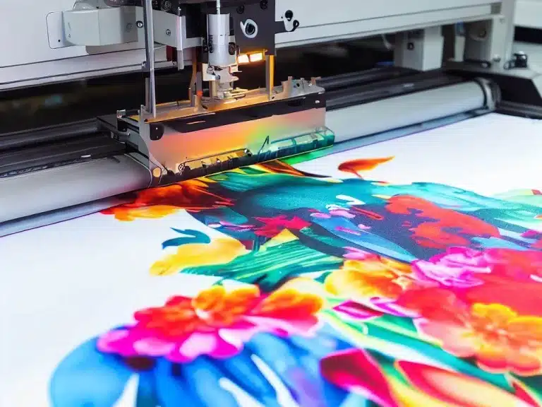
If you’ve ever compared a sublimated shirt to a vinyl or screen print, the difference is obvious right away. Sublimation designs don’t sit on top of the product. They become part of it. That’s why they feel smooth, don’t crack, and stay vibrant wash after wash.
Sublimation works by turning ink into gas under heat, letting it bond directly with polyester fibers or polymer-coated surfaces. That’s the real reason designs look so clean on shirts, jerseys, polos, and tumblers.
Once you understand the basics of the sublimation process, everything else about design choices starts to make more sense.
If you want a deeper breakdown of how it works from start to finish, this guide on what sublimation printing is explains it clearly.
What really matters for designers is knowing where sublimation shines the most.
Why Sublimation Designs Look Better on Shirts and Jerseys
Sublimation designs work best on:
- Polyester and poly-blend fabrics
- Light-colored shirts and jerseys
- Full-coverage apparel like sports uniforms
Unlike other printing methods, sublimation doesn’t add texture or thickness. That’s why athletic jerseys and performance shirts almost always use sublimation. It keeps the fabric breathable while still allowing bold colors, gradients, and edge-to-edge designs.
Choosing the right fabric is just as important as choosing the design itself, and this breakdown of the best fabrics for sublimation helps avoid common mistakes.
Why Polos and Uniforms Are a Great Fit for Sublimation
Polo shirts and uniforms need to look clean and professional, not flashy or heavy. Sublimation makes that easier. Logos stay sharp, colors stay consistent, and there’s no peeling over time.
For businesses, schools, and teams ordering uniforms in bulk, sublimation also solves durability issues. You don’t have to worry about cracking logos or uneven prints after repeated washes.
If you’re creating designs specifically for uniforms or branded apparel, understanding the long-term benefits covered in this guide on the benefits of sublimation printing helps set realistic expectations for clients.
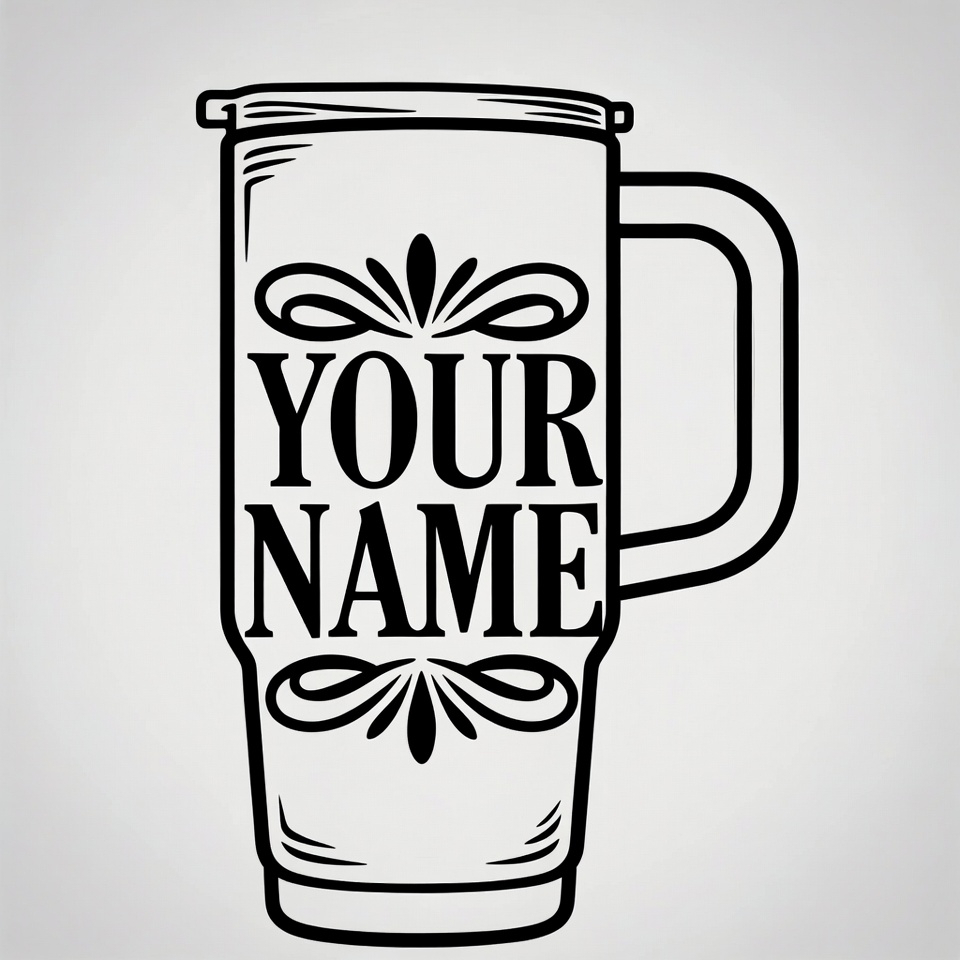
Why Tumblers Are Perfect for Sublimation Designs
Tumblers are one of the most popular sublimation products for a reason. The smooth, coated surface allows designs to wrap cleanly around the cup without texture or raised edges.
Sublimation tumbler designs are ideal for:
- Full-wrap artwork
- Personalized names
- High-detail graphics

The key difference with tumblers is layout planning. You’re designing for a curved surface, not a flat one. Getting the sizing and wrap right makes a huge difference in the final look.
If you’re working with drinkware often, this guide on sublimation tumbler blanks is a helpful reference when choosing the right products.
Sublimation Designs for Shirts and T-Shirts
Quick takeaway:
If shirts and tees are your main sellers, your design choices matter way more than fancy effects. Simple layouts, smart colors, and the right fabric combo usually win every time.
Sublimation designs for shirts work best when you design with the fabric in mind, not against it. Since sublimation ink becomes part of the shirt fibers, what you see on screen isn’t always what you get on press. That’s why experienced sellers design lighter, cleaner, and more intentional graphics.
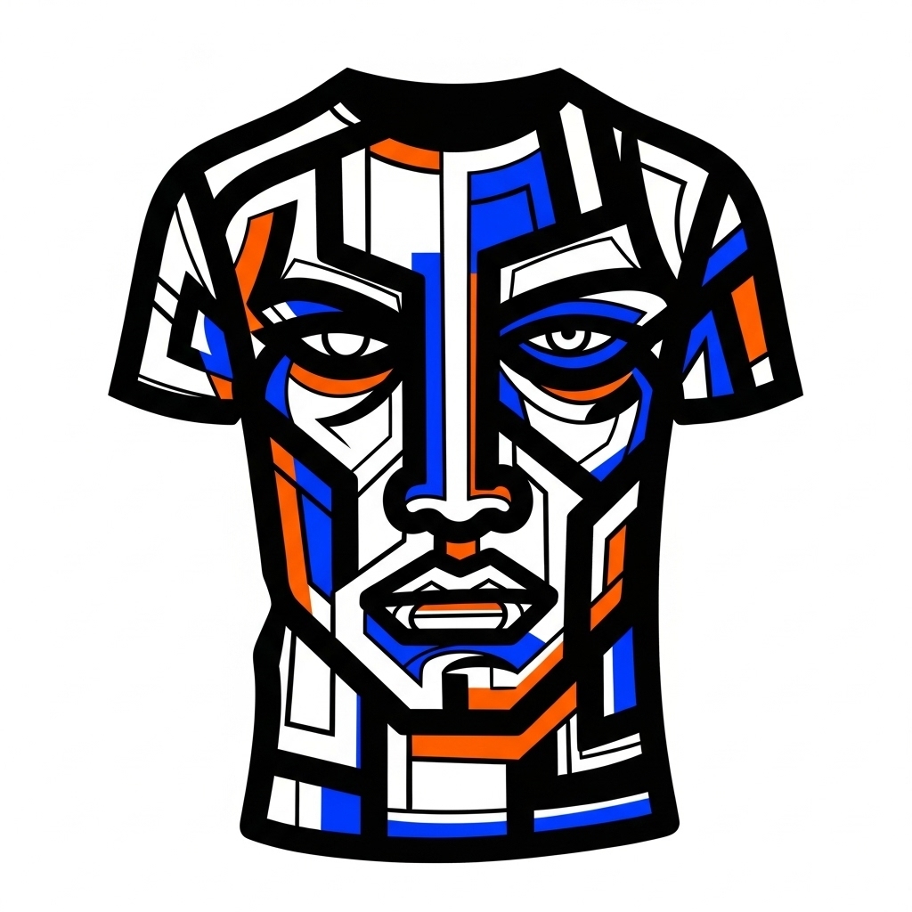
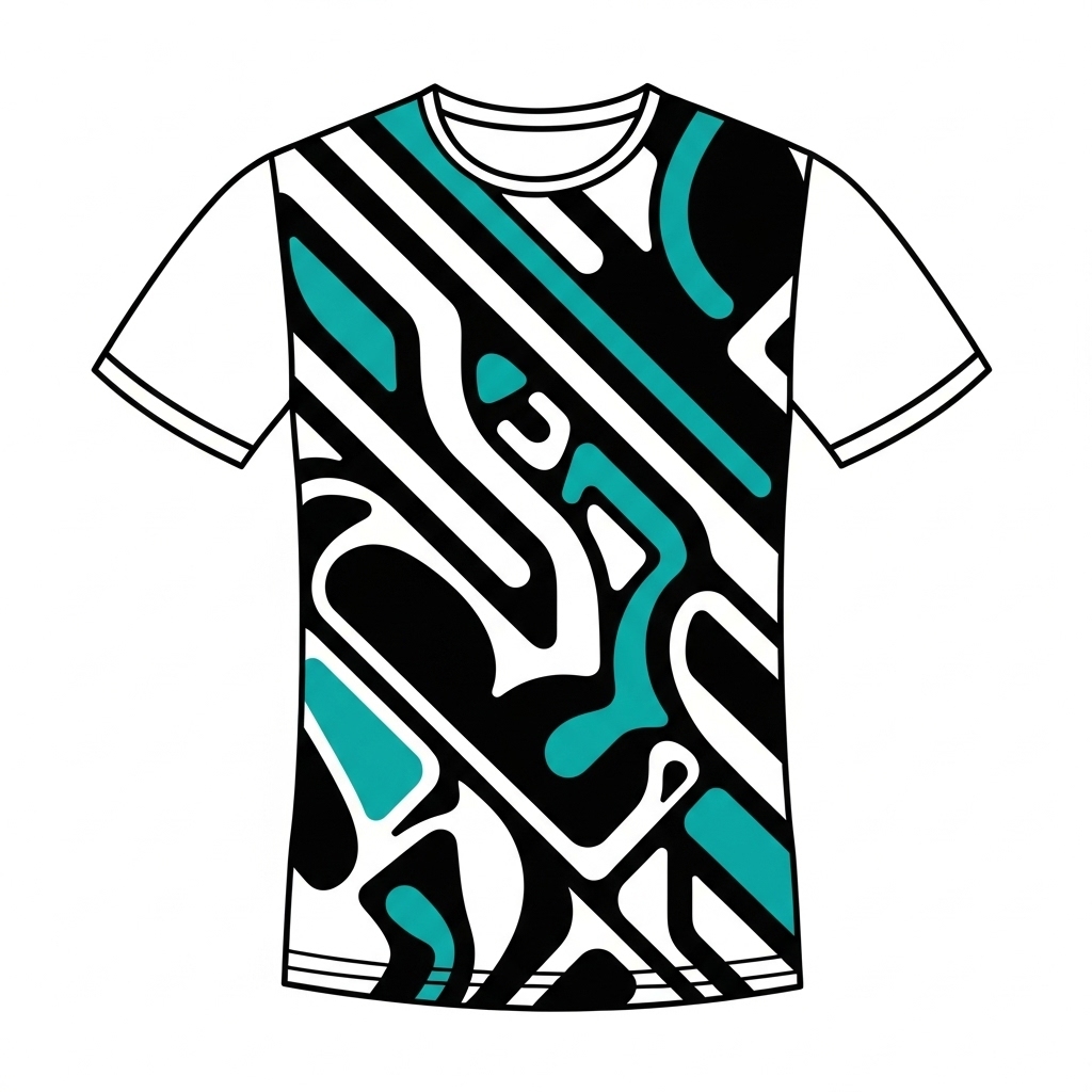
Popular Shirt Design Styles That Sell Well
Some styles just perform better, especially for men’s shirts and everyday wear.
High-performing sublimation shirt styles include:
- Bold text and typography designs
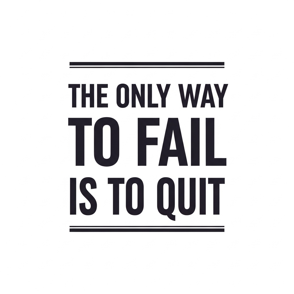
- Minimal graphics with strong contrast
- Gym, motivation, and lifestyle quotes
- Clean line art and badge-style logos
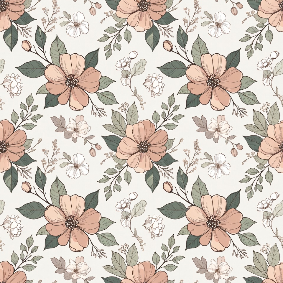
These designs stay readable, don’t look washed out, and age well after multiple washes. If you’re unsure what trends actually convert, this list of creative sublimation ideas gives a realistic sense of what people are buying right now.
Best Shirt Colors and Fabrics for Sublimation Designs
This part trips up a lot of beginners. Sublimation ink has no white, so the shirt color matters more than the design itself.
Best options:
- White or very light-colored shirts
- 100% polyester or high-poly blends
- Performance and athletic tees
Avoid dark cotton shirts unless you’re using special workarounds. If fabric selection feels confusing, this guide on polyester sublimation basics explains why polyester behaves so differently from cotton.
Design Placement Tips for T-Shirts
Where you place the design can make or break the shirt.
Common placement options:
- Center chest for bold statements
- Left chest for minimalist or logo designs
- Oversized prints for streetwear-style tees
Always test placement on a mockup before printing. A design that looks centered on screen can shift visually once worn. Using the correct canvas size also helps avoid scaling issues, and this walkthrough on perfect canvas setup for sublimation is a solid reference when sizing designs correctly.
Sublimation Polo Shirt Designs for Professional and Uniform Use
Polo shirts aren’t about loud graphics. They’re about looking clean, consistent, and professional, especially when they’re used for uniforms or branding.
Sublimation designs for polo shirts work best when you think like a brand owner, not just a designer. These shirts represent a business, a school, or a team. That means balance, spacing, and color control matter more than flashy artwork.


What Makes a Good Polo Shirt Sublimation Design
A strong polo design usually feels simple on purpose. Too many elements can make the shirt look busy or cheap.
High-quality polo sublimation designs focus on:
- Clean logo presentation
- Limited color palettes
- Clear contrast against the shirt color
- Easy readability from a few feet away
Because sublimation dyes into the fabric, clean vector-style logos and sharp text hold up better long term. If you’re designing for clients who care about durability and consistency, this overview on the benefits of sublimation printing helps explain why polos are such a strong use case.
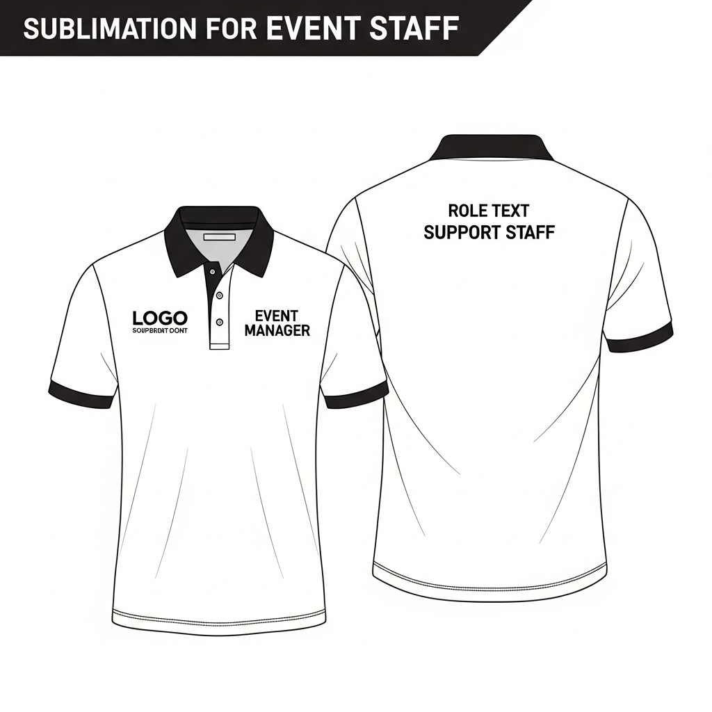
Logo and Text Placement for Polo Shirts
Placement is everything with polos. Even a great logo can look off if it’s in the wrong spot.
Most common placements:
- Left chest for logos and brand names
- Sleeve prints for secondary branding
- Upper back for events or staff roles
Avoid oversized front prints. Polo shirts aren’t t-shirts, and treating them like one is a common mistake. Always account for collars and button plackets when positioning artwork so nothing looks cramped once worn.
Sublimation Polo Designs for Businesses, Schools, and Events
Uniform sublimation polo shirt designs are popular because they scale well. Once a layout is finalized, it’s easy to produce consistent results across dozens or hundreds of shirts.
Popular use cases include:
- Company staff uniforms
- School polos and team apparel
- Trade show and event shirts
For bulk or uniform work, planning color accuracy early saves headaches later. This guide on sublimation printing basics is helpful when you’re setting expectations for clients who care about matching brand colors.
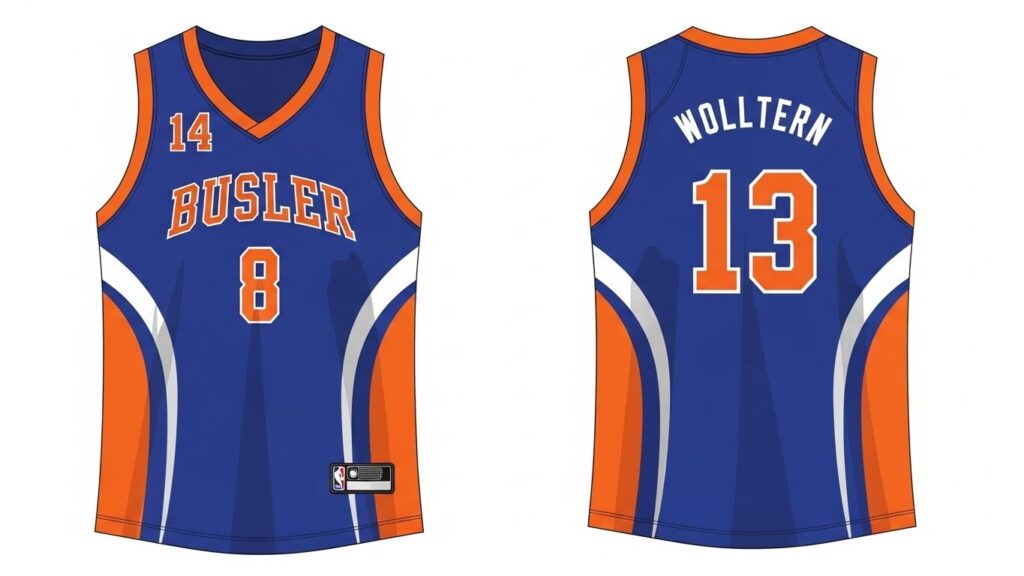
Sublimation Jersey Designs for Sports Teams
Jerseys are where sublimation really shines. Full coverage, bold colors, and zero cracking make it the go-to choice for sports teams.
Sublimation jersey designs are very different from regular shirt graphics. You’re not just decorating fabric, you’re building a full uniform. That means every panel, seam, and angle matters once the jersey is worn and in motion.

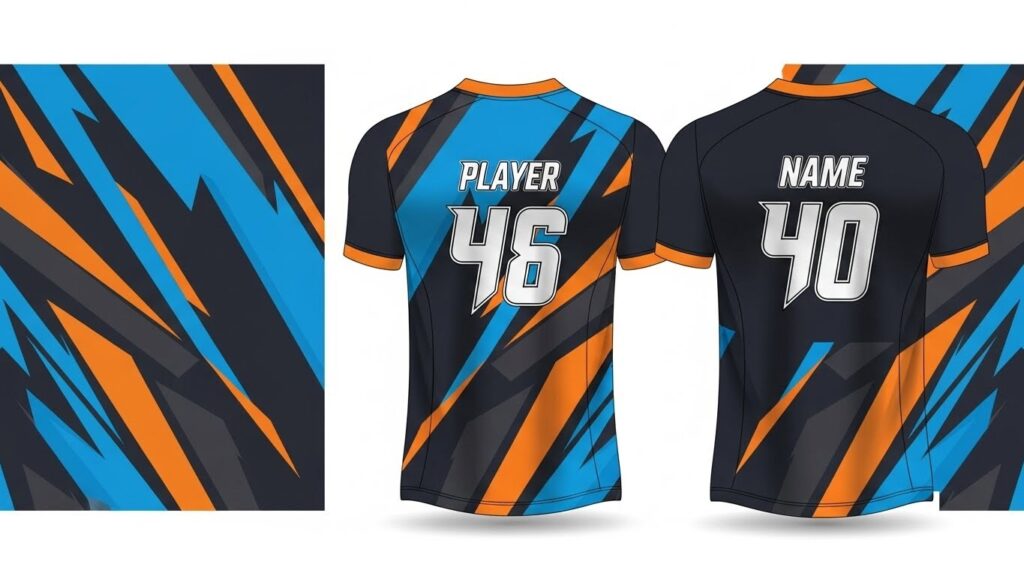
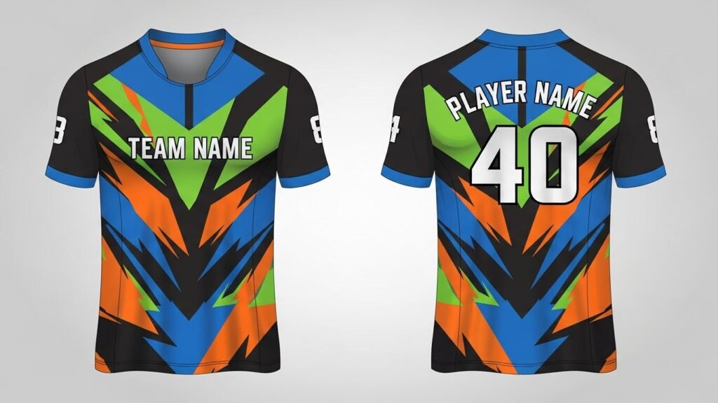
Full-Coverage Jersey Design Basics
Most sublimation jerseys use edge-to-edge printing. This allows for gradients, patterns, and color blocks that would be hard or impossible with other printing methods.
Key jersey design elements include:
- Consistent patterns across front, back, and sides
- High-contrast numbers and names
- Team colors that stay readable under stadium lighting
Because jerseys are often printed in bulk, getting the setup right from the start avoids costly reprints. Understanding the full sublimation process helps when planning complex, multi-panel layouts.
Basketball Jersey Sublimation Design Ideas
Basketball jerseys usually favor bold, high-energy designs. Large numbers, sharp lines, and strong contrast are essential since players are constantly moving.
Popular basketball jersey features:
- Large front and back numbers
- Vertical or angled striping
- Minimal text beyond team name and number
Designs should remain readable from a distance. Overly detailed backgrounds can distract from the name and number, which are the most important elements on a basketball jersey.
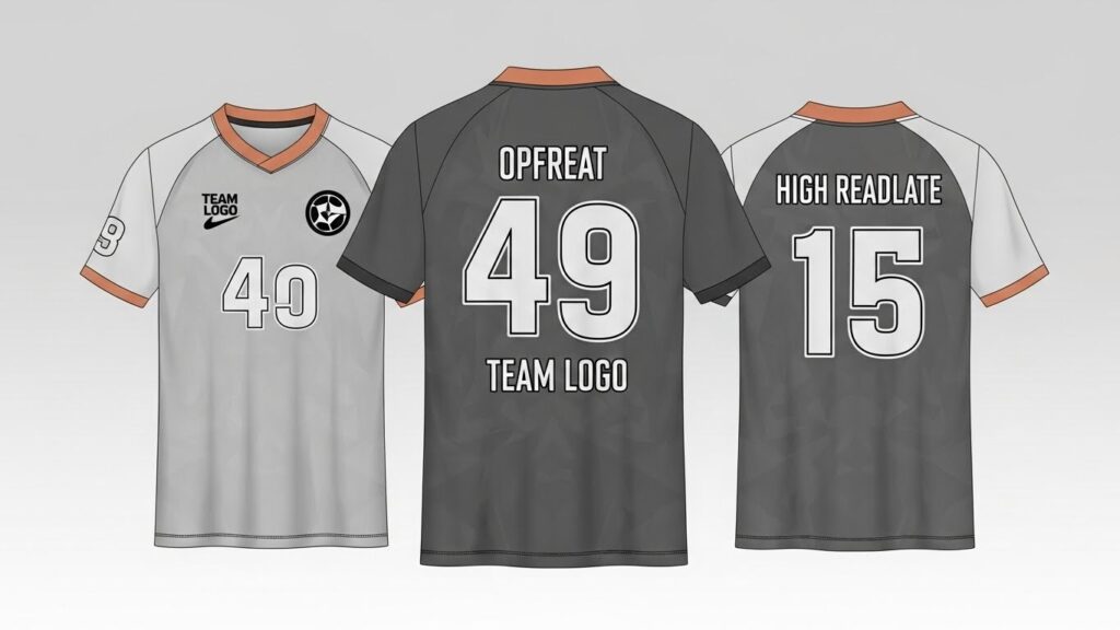
Cricket Jersey Sublimation Design Concepts
Cricket jerseys tend to be more refined but still benefit from full sublimation coverage. Collars, sleeves, and shoulder panels often carry subtle patterns or gradients.
Common cricket jersey design traits:
- Clean chest branding
- Sleeve accents and side panels
- Sponsor-friendly spacing
Because cricket jerseys are worn for long periods, breathable fabrics paired with sublimation printing keep the jersey lightweight and comfortable without sacrificing style.
Sublimation Designs for Tumblers
Tumblers sell fast because they’re personal, practical, and perfect for full-wrap sublimation designs. But layout mistakes show up fast if you’re not careful.
Sublimation designs for tumblers are all about planning for a curved surface. Unlike shirts or jerseys, there’s no natural “front” once the cup is in someone’s hand. That means spacing, alignment, and wrap flow matter more than flashy graphics.
Full-Wrap vs Partial Tumbler Designs
Most popular tumblers use full-wrap designs because they feel premium and intentional. When done right, the design looks seamless from every angle.
Common design approaches:
- Full-wrap patterns that repeat cleanly
- Centered logos with negative space
- Text-based designs that wrap smoothly
Partial designs work too, especially for minimalist brands, but they still need careful placement to avoid awkward gaps. If you’re choosing blanks for this kind of work, this overview of sublimation tumbler blanks helps match design style to the right product.
Tumbler Design Niches That Perform Well
Certain niches consistently sell better than others, especially at craft fairs and online stores.
High-performing tumbler themes include:
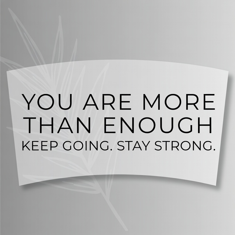
- Personalized names and initials
- Motivational and lifestyle quotes
- Sports, team, and fan designs
- Gift-focused designs for birthdays and holidays
Because tumblers are often impulse buys, clear readable designs usually outperform complex artwork.
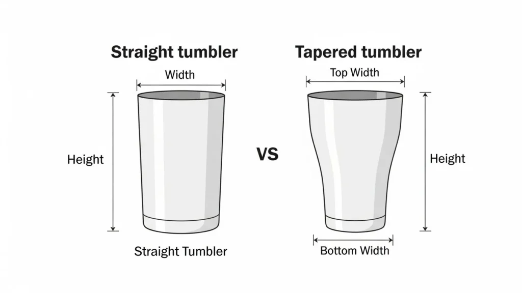
Tapered Tumbler Sizing Formulas (Print-Safe)
Tapered tumblers can’t use one flat rectangle like straight tumblers. You have to size based on the top and bottom circumference.
Quick Reference Table
| Tumbler Size | Width (in) | Height (in) | DPI |
|---|---|---|---|
| 20oz Straight | 9.3 | 8.2 | 300 |
| 30oz Straight | 10.8 | 9.3 | 300 |
Step 1. Measure the Tumbler
You’ll need:
- Top diameter
- Bottom diameter
- Printable height
Use a flexible tape or wrap a strip of paper around the tumbler and measure it flat.
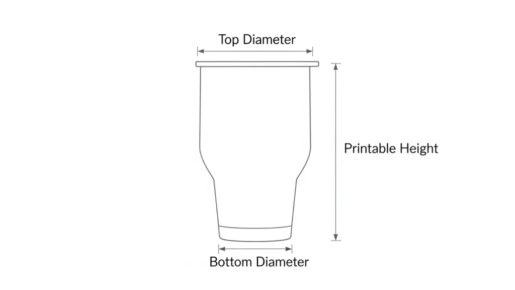
Step 2. Convert Diameter to Wrap Width
Use this formula:
Circumference = Diameter × 3.14
- Top wrap width = Top diameter × 3.14
- Bottom wrap width = Bottom diameter × 3.14
This gives you the true wrap size at both ends.
Step 3. Create the Tapered Canvas
Most design programs don’t support curved canvases, so use a trapezoid layout.
Canvas setup approach:
- Top width = Top circumference + 0.25 in bleed
- Bottom width = Bottom circumference + 0.25 in bleed
- Height = Printable height + 0.25 in bleed
Design from top to bottom so artwork flows naturally when wrapped.
Example: 20oz Tapered Tumbler
Typical measurements:
- Top diameter: 3.3 in
- Bottom diameter: 2.7 in
- Printable height: 7.8 in
Calculated sizes:
- Top width: 3.3 × 3.14 = 10.36 in
- Bottom width: 2.7 × 3.14 = 8.48 in
- Canvas height: 8.05 in (with bleed)
Design Tips That Prevent Seams and Distortion
- Keep text horizontal and centered
- Avoid vertical patterns near edges
- Use gradients or soft patterns for easier alignment
- Always test print before full production
Common Mistake to Avoid
Never use a straight tumbler wrap on a tapered tumbler.
That’s the fastest way to get stretched artwork and visible seams.
Getting the canvas size right from the start saves material and time. This guide on setting up the perfect canvas for sublimation is especially useful when switching between different tumbler sizes.
How to Choose the Right Sublimation Design for Each Product
A design that looks perfect on a t-shirt can fall apart on a polo, jersey, or tumbler. The product always comes first. Design follows.
Sublimation isn’t one-size-fits-all. Fabric type, surface shape, and how the product is used all change how a design should be built. When you match the design style to the product, prints look cleaner, last longer, and feel intentional instead of forced.
Product-Specific Design Differences
Here’s a clear side-by-side look at how sublimation designs should change based on the product.
| Product Type | Best Design Style | Key Focus Areas | Common Mistakes |
|---|---|---|---|
| Shirts & T-Shirts | Simple graphics, bold text | Readability, contrast, fabric color | Too much detail, dark backgrounds |
| Polo Shirts | Minimal logos, clean layouts | Placement, professionalism, balance | Oversized prints, collar interference |
| Sports Jerseys | Full-coverage, bold layouts | Numbers, movement, team colors | Low-contrast numbers, cluttered panels |
| Tumblers | Seamless wraps, centered designs | Alignment, curvature, spacing | Visible seams, stretched artwork |
This mindset shift alone fixes most sublimation design problems. If you’re ever unsure why a print looks dull or off-center, it usually comes back to ignoring how sublimation behaves on different surfaces. Understanding the full sublimation process makes these design decisions feel way more logical.
How to Pick the Right Design Style Every Time
A simple rule that works in practice:
- The more movement, the bolder the design should be
- The more professional the product, the cleaner the layout
- The more curved the surface, the simpler the alignment
That’s why jerseys thrive with loud colors, polos look better with restraint, and tumblers need breathing room around text and graphics.
Common Sublimation Design Mistakes to Avoid
Even experienced designers run into these issues.
Avoid:
- Designing once and resizing for every product
- Forgetting that sublimation ink has no white
- Placing important elements too close to edges
- Ignoring how the product is actually worn or held
If something ever feels off after pressing, it’s usually not the printer. It’s the design choice. Revisiting the basics of how sublimation printing works often explains why certain designs succeed and others don’t.
Sublimation Design File Tips Before Printing
Most print issues don’t start at the heat press. They start in the design file. Clean files save ink, time, and frustration.
Before you print anything, your design file should already be set up for how sublimation behaves. A solid file setup makes colors look better, edges sharper, and alignment easier across shirts, polos, jerseys, and tumblers.
Best File Formats for Sublimation Designs
Not all file types behave the same once printed.
Most reliable formats:
- PNG for designs with transparent backgrounds
- PDF for full-layout and uniform designs
- SVG for clean logos and scalable artwork
Avoid low-quality JPEGs whenever possible. Compression artifacts can show up after pressing, especially on large prints. If you’re working with different design sources, this guide on how to print sublimation images correctly helps avoid quality loss.
Resolution and Canvas Setup That Actually Works
Blurry prints almost always come from low-resolution files or incorrect canvas sizes.
Safe setup rules:
- Design at 300 DPI
- Match the canvas to the final product size
- Don’t upscale small images
A tumbler wrap needs a completely different canvas than a shirt or jersey. Starting with the right dimensions prevents stretched designs and white gaps. This walkthrough on setting the perfect canvas for sublimation is especially useful if you switch between products often.
Color Mode and Print Settings Basics
Sublimation colors don’t look the same on screen as they do after pressing. That’s normal.
A few smart habits:
- Expect colors to look dull before pressing
- Stick with consistent color profiles
- Test new designs before bulk runs
Color confusion is one of the most common frustrations in sublimation. If you’ve ever wondered why prints don’t match your screen, this explanation of why sublimation colors look dull and how to fix it clears things up fast.
FAQs
Can I use the same sublimation design for shirts, polos, jerseys, and tumblers?
You can reuse the idea, but the layout usually needs adjusting because each product has a different shape, fabric, and viewing angle.
Do I need 100% polyester shirts for sublimation designs?
No, but higher polyester content gives brighter and longer-lasting results, especially for shirts and jerseys.
Is it okay if my sublimation design looks dull before pressing?
Yes, that’s normal. Sublimation ink activates under heat, so colors pop after pressing.
What’s the best way to avoid seams on sublimation tumblers?
Design using the exact tumbler dimensions and leave small safety margins on both sides of the wrap.
Can sublimation designs crack or peel over time?
No, sublimation ink becomes part of the material, so it won’t crack, peel, or fade like surface prints.
Do I need different design sizes for polos and t-shirts?
Yes, polos usually need smaller, cleaner designs because of collars and button plackets.