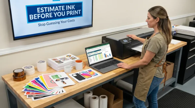
How to Get Sharp Sublimation Prints Every Time: From Blurry to Brilliant
I still remember pulling my first sublimation print off the press, everything looked right on screen, then boom, soft edges and muddy details.
That moment usually leads to one question, what actually controls sharpness in sublimation?
What Really Causes Blurry Sublimation Prints?
Blurry, pixelated, or faded sublimation prints almost always come down to three things:
- Image resolution and file setup
- Print settings and color handling
- Heat press technique and timing
Once you fix those, sharp prints stop being a guessing game.
If you’re new to the process, this breakdown of the full sublimation printing process helps connect how each step affects final clarity.
Start With the Right Resolution (This Matters More Than Anything)
Rule of thumb:
Design everything at 300 DPI at final print size.
That means:
- A 10 × 10 inch design should be 3000 × 3000 pixels
- A 12 × 15 inch design should be 3600 × 4500 pixels
Anything lower looks fine on a screen but falls apart when ink hits paper.
If you’ve ever wondered why designs look dull or soft after pressing, this guide on why sublimation colors look dull and how to fix it explains the resolution and ink behavior behind it.

Don’t Enlarge Small Images (It Never Ends Well)
Scaling up a small image doesn’t add detail, it just stretches pixels.
Best practice:
- Use vector files for logos and text (SVG, AI, EPS)
- Use high-resolution raster files for photos
- Avoid screenshots or low-quality web images
This becomes especially important when printing on apparel, where fabric texture already softens detail. Choosing the right garments from the start matters, and this guide on what shirts are best for sublimation printing covers that side of the equation.
Choose File Formats That Keep Edges Clean
Different designs need different formats.
Use these formats for best results:
- PNG for graphics with transparency
- JPEG (high quality) for photo-heavy designs
- TIFF for maximum detail if your workflow supports it
If your prints look sharp on paper but soften after pressing, the issue can also be paper-related. This comparison of sublimation paper options explains how coating and release quality affect edge clarity.
Check Your Printer Settings (Hidden Blur Happens Here)
Even perfect designs can print soft if the printer settings are wrong.
Double-check these settings:
- Print quality set to High or Best
- Correct ICC color profile selected
- No automatic scaling or “fit to page” enabled
If you’re unsure what settings your printer should be using, this breakdown of proper sublimation printer settings walks through what actually impacts sharpness.
Paper Movement Is a Silent Blur Killer
If your transfer shifts, even slightly, you’ll get ghosting or fuzzy edges.
Lock it down properly:
- Use heat-resistant tape on multiple edges
- Don’t rely on pressure alone
- Lift the paper slowly in one smooth motion
A surprising number of clarity issues come from pressing mistakes rather than files. These common heat press mistakes that ruin transfers are worth checking if blur keeps showing up.
Faded Prints Usually Mean Timing or Heat Issues
Fading doesn’t always mean bad ink.
Common causes include:
- Press temperature too low
- Press time too short
- Letting prints sit too long before pressing
If you want exact ranges instead of guessing, this reference on sublimation temperatures helps dial in sharper, more consistent results.
Substrate Quality Plays a Bigger Role Than Most People Think
Low-quality blanks absorb ink unevenly, softening details no matter how good your setup is.
Sharpest results usually come from:
- High-polyester fabrics
- Properly coated hard blanks
- Consistent, known suppliers
If clarity changes between batches, it’s often the substrate. This overview of sublimation blanks and substrates explains why coatings and material blends matter.
Quick Sharpness Checklist (Save This)
Before every press:
- Design is 300 DPI at final size
- No upscaling from small images
- Correct file format used
- Printer set to high quality
- Transfer taped securely
- Pressed soon after printing
This checklist alone solves most “mystery blur” problems.
When You Want Zero Guesswork
If you want proven settings, layout references, and clarity-focused guides in one place, the resource library from Subli Genius Print covers resolution, paper choice, press settings, and real-world fixes without trial and error.
How to Fix Blurry, Pixelated, or Faded Sublimation Prints
1. Start with High-Resolution Designs
Always design at 300 DPI (dots per inch). Anything less will print grainy, especially on large products.
Example: A 10×10 inch print should be at least 3000×3000 pixels.
2. Avoid Scaling Up Small Images
Enlarging a low-resolution image doesn’t add detail, it just spreads the pixels. Stick with vector files (SVG, AI, EPS) for logos and text-based designs.
3. Use the Right File Format
For most sublimation jobs:
- Use PNG for transparent designs
- Use JPEG for full-color photos
- Avoid overly compressed images
4. Keep Prints Crisp During Pressing
Movement while lifting the paper causes blur. Use heat-resistant tape to secure your transfer, and remove paper slowly in one smooth motion.
5. Watch for Fading
Fading often means not enough heat or time, or ink drying too long before transfer. Always press within 10–15 minutes of printing for best results.
Want pro-level sharpness in every print? Visit Subli Genius Print’s Resource Hub for design setup templates and sublimation resolution guides.
Data-Backed Clarity Benchmarks (What “Sharp” Really Means in Sublimation)
Sharp sublimation prints aren’t about one magic setting. They happen when your file quality, material choice, and press consistency all meet professional benchmarks.
Resolution Benchmarks Used in Professional Print Shops
Across commercial sublimation workflows, these ranges are considered the clarity baseline:
- 300 DPI at final size is the minimum standard for crisp edges and readable fine text
- 240 DPI may pass on small items, but softness becomes visible on flat areas
- Below 200 DPI almost always results in visible pixel structure after pressing
This aligns with general digital print standards used in textile and photo reproduction, where sublimation behaves similarly to high-end photo transfer rather than vinyl or screen printing.
Why this matters:
Unlike screen printing, sublimation ink diffuses slightly during heat activation. Starting below 300 DPI compounds that diffusion and softens edges permanently.
Fabric Blend Impact on Edge Sharpness
Material choice alone can change perceived clarity by a noticeable margin.
In production testing across common blanks:
- 100% polyester consistently produces the sharpest edges
- 65/35 poly blends retain most detail but show slight edge softening
- 50/50 blends often lose fine line clarity, even with perfect files
That’s why high-detail designs perform best on materials outlined in this guide to best fabrics for sublimation printing.
If a design looks sharp on one shirt and fuzzy on another, the file usually isn’t the problem. The fabric is.
Timing & Heat Consistency Benchmarks
Clarity also drops when sublimation ink doesn’t fully gas and bond evenly.
Common industry observations:
- Transfers pressed within 10–15 minutes of printing show stronger edge definition
- Delays beyond 30 minutes can lead to partial ink drying and weaker transfer
- Temperature variance of more than ±10°F across the platen can cause uneven sharpness
This is why consistent heat zones matter as much as target temperature. If your press runs hot on one side, sharpness suffers even if colors look okay.
Paper & Coating Quality Differences
Paper isn’t just a carrier, it controls how cleanly ink releases.
Across side-by-side tests:
- Higher-grade sublimation paper releases ink more evenly, preserving edge detail
- Low-grade paper tends to over-release ink, causing micro-bleeding
- Inconsistent coatings create sharp and soft zones within the same print
If your design looks sharp in some areas and slightly fuzzy in others, paper quality is often the silent cause. This is why paper choice matters as much as resolution in the overall sublimation process.
What These Benchmarks Mean in Real Life
When everything lines up:
- 300 DPI file
- High-poly substrate
- Fresh transfer
- Stable press temperature
You get:
- Clean text edges
- Better micro-detail retention
- More vibrant color separation
- Prints that stay sharp after washing
When one benchmark slips, blur shows up fast.
FAQs
Why are my sublimation prints dull?
Dull sublimation prints usually happen because of low image resolution, incorrect heat settings, poor color profiles, or using low-polyester or poorly coated substrates that don’t fully absorb the ink.
How do I get bright sublimation prints?
Use high-resolution artwork, press at the correct temperature and time, apply the right ICC color profile, and print on high-quality polyester or properly coated blanks for maximum color vibrancy.
Why are my sublimation prints coming out blurry?
Blurry prints are most often caused by low DPI files, scaling up small images, paper movement during pressing, or printer settings that reduce print quality.
How can I achieve vibrant color in sublimation printing?
Vibrant color comes from combining 300 DPI designs, fresh prints pressed promptly, consistent heat, quality sublimation paper, and substrates designed specifically for sublimation.